E-commerce is growing at a meteoric pace, and there is no doubt about it.
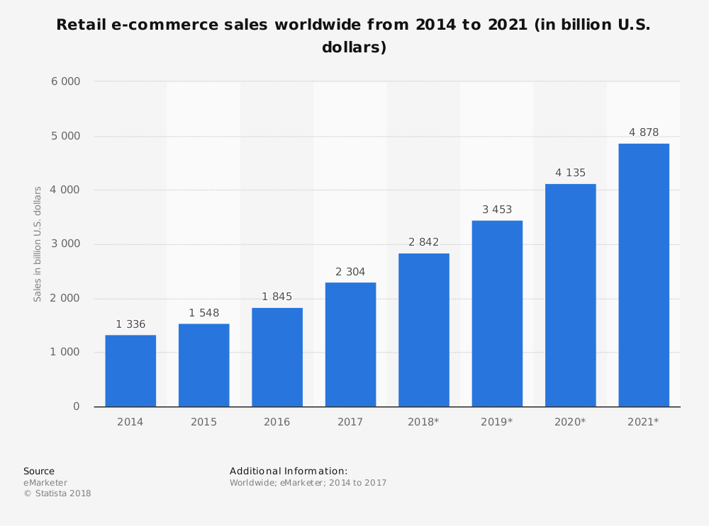
According to a recent study by Statista, retail e-commerce sales worldwide reached $2.4 trillion in 2017 and are expected to reach 4.9 trillion in 2021.

Interestingly, this growth pattern is not solely a retail B2C phenomenon.
In fact, B2B e-commerce worldwide sales in 2017 peaked at $7.7 trillion, which is 235% higher than B2C.
Sounds pretty impressive, right?
And these figures do tell us a lot about major changes in consumer behavior that will continue to evolve in 2018.
The shopper is more technologically advanced than ever before and is empowered to drive disruptive changes in traditional retail business.
So if consumers increasingly prefer e-commerce over brick-and-mortar shopping, why do we still need physical stores? Why do businesses still want that foot traffic?
There are a number of reasons why, but let’s just start with another very simple, yet very loud statistic.
In-store sales accounted for 91% of all retail sales in the US in 2017.
This means that brick-and-mortar is still the most popular way to shop for most Americans.
And it comes as no surprise.
The in-store shopping experience is incomparable to browsing items on a desktop or mobile screen. The ability to see, touch and try products before purchase remains the biggest motivator for consumers to shop offline.
And that’s not the only thing stopping consumers from buying online.
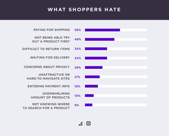
According to 2017 BigCommerce study, 58% of US consumers hate paying for shipping, and 34% think product return process is difficult when shopping online.

All of these are e-commerce pain points that can actually serve as huge growth opportunities for brick-and-mortar retailers.
But ultimately from a business perspective, you want to provide seamless and consistent customer experience across all sales channels and reach that omnichannel zen.
You have probably heard the term omnichannel before.
Google defines it as: “ensuring retailer marketing strategies are geared toward enabling customers to convert on any channel.”
Sounds too sophisticated.
But the main idea behind omnichannel retail marketing is to simply provide shoppers what they want, whenever and wherever they want.
That said, there are many ways you can use local e-commerce insights and marketing tactics to drive foot traffic to your store, and I will show you exactly how you can do this.
But before we dive into the realm of local e-commerce marketing tactics, you might want to check out Neil Patel’s 4 Local SEO Marketing Strategies to Build Your Brick And Mortar Business.
1. Buy online, pick up in store (BOPIS)
Since customers hate to pay for shipping, the first thing you can do to ease their pain is to offer an in-store pickup option, also known as BOPIS.
This is a very popular service offered by almost every major retailer, and it is something you can easily implement for your customers as well.
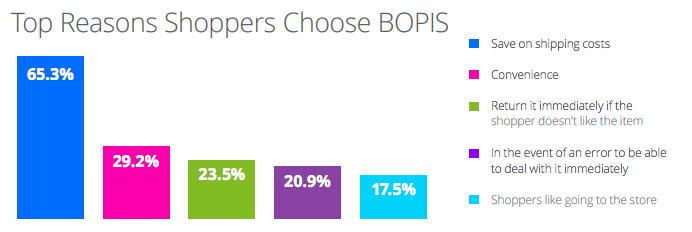
In fact, according to the Great Omnichannel Expectations 2016-2017 Shopper Survey Report by iVend, 57% of US shoppers say that they use the “buy online, pick up in store” option.
And 65.3% of those consumers say they do so to avoid delivery costs.

Another thing you can offer to drive foot traffic is the ability to reserve the product online and collect it in-store. This options works best for new product releases and can help build excitement.
Think new Apple product launches. Usually, they are sold out even before official sales date.
Although BOPIS is an attractive alternative for most shoppers, it still makes sense to provide some extra incentives, like faster shipping or even an in-store redeemable coupon.
An important thing to consider when implementing buy online pick up in store service is to make sure the whole experience is as smooth and convenient as possible.
How?
- Use a multichannel integration platform to connect your store inventory to your website and make sure they are always in sync.
- Train your in-store sales staff to serve BOPIS customers with special care and in case of immediate returns or exchanges be ready to offer more profitable alternatives.
- Put up proper in-store signage and make it extremely easy for customers to navigate the store and find the pickup location without getting overly frustrated.
2. Provide local inventory availability information
There is a common myth that consumers who search online will only visit online shops.
That is not entirely true.
In fact, three out of four consumers are more likely to visit physical stores if they find local information in search results helpful.
So why not give your consumers what they look for?
First of all, make sure your store locator is up and running. Let your shoppers easily find their local store and make sure to provide all details, like phone numbers, email, and address.
Then go one step further and provide local inventory availability information for each item and each local store.
You might be wondering why customers even need this if they can buy products online and pick up them in the store?
Well, it turns out that a lot of shoppers do not want to pay upfront, especially for specific products, like personal hygiene and care items, that are more difficult to return and get a refund for.
So informing your website visitors about the stock availability at your local store can be a great foot traffic driver for undecided customers.
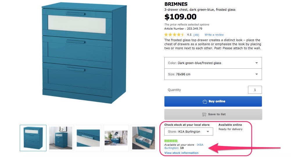
Ikea is one of the biggest retailers to have successfully implemented this on their website.
It offers website visitors to choose the local store and see the inventory of a particular product in that store.
This information can be especially helpful if your customers tend to buy items in bulk.

3. Buy in store and walk out hands-free
This is a relatively new approach to retail marketing and comes as a result of shopper behavior changes as well. It serves as a good way to respond to consumer “showrooming.”
What is showrooming and why does it matter?
Showrooming has become a common way of shopping for a lot of deal hunters and simply shoppers who like to compare prices or try out products before purchasing.
Customers now can come into your store, get all information they need about the product, see and touch it, but then buy it online from another web store. How sad, isn’t it?
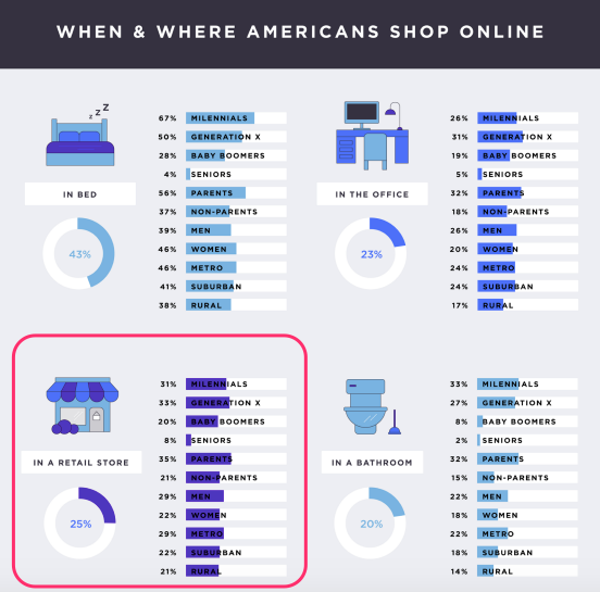
25% of Americans even admitted purchasing while standing in a brick-and-mortar store.

The good news is you do not need to fight this behavior. You can embrace it.
What if your customers could try products in your store and then have them delivered straight to their preferred address?
It’s an entirely new approach to retail, and a few brands have already implemented it.
For instance, Bonobos, have opened “guideshops” across the US, where you can find the perfect fit and style with the help of a professional guide.
When you’re done shopping, your orders are delivered to your home or work free of charge.
You can do this too.
4. Offer in-store redeemable mobile promotions
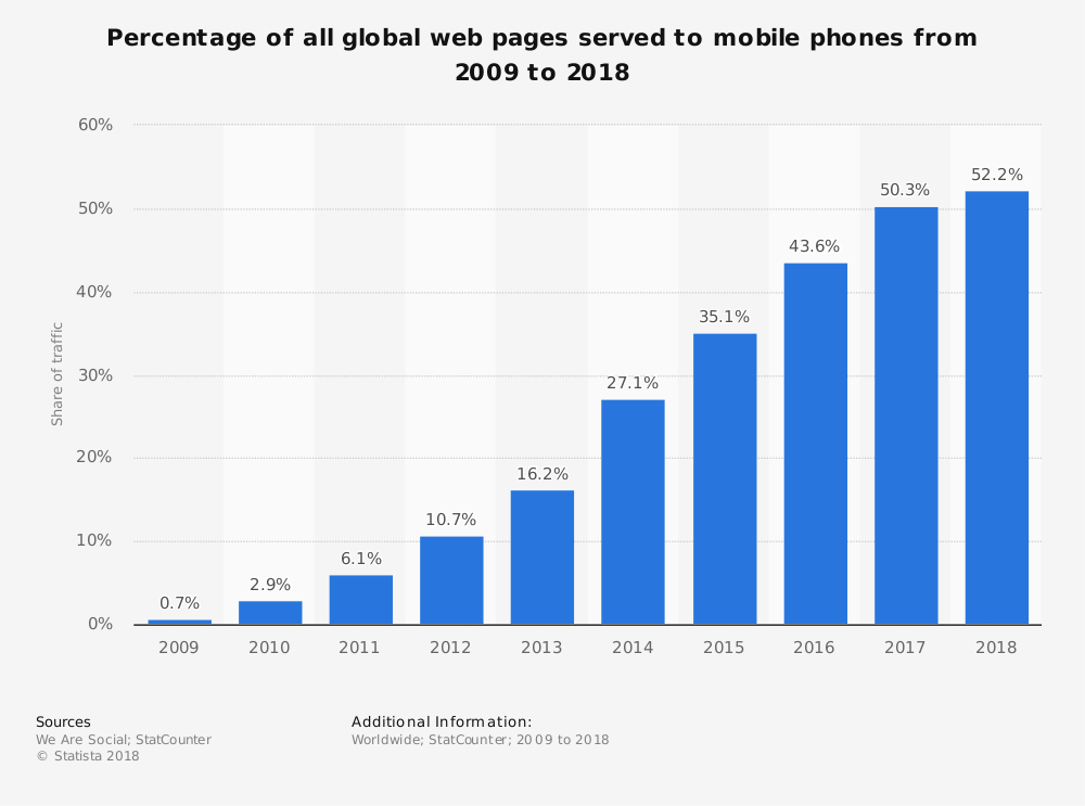
Did you know mobile users spend more than 4 hours a day on their phones?
Just look at this graph from Statista.
In 2017 mobile accounted for more than half of worldwide website traffic and is projected to grow even more this year.

Consumers rely more on their mobile devices to research even the smallest decisions on the go. But they also are more susceptible to mobile communication than, for instance, email.
Research shows that text message open rate in the US is 82%, which is a mind-boggling number if we compare it to email open rate, hovering at around 24%.
This once again proves that SMS marketing is not only alive but thriving. You should really consider implementing mobile marketing solutions, including phone number collection program.
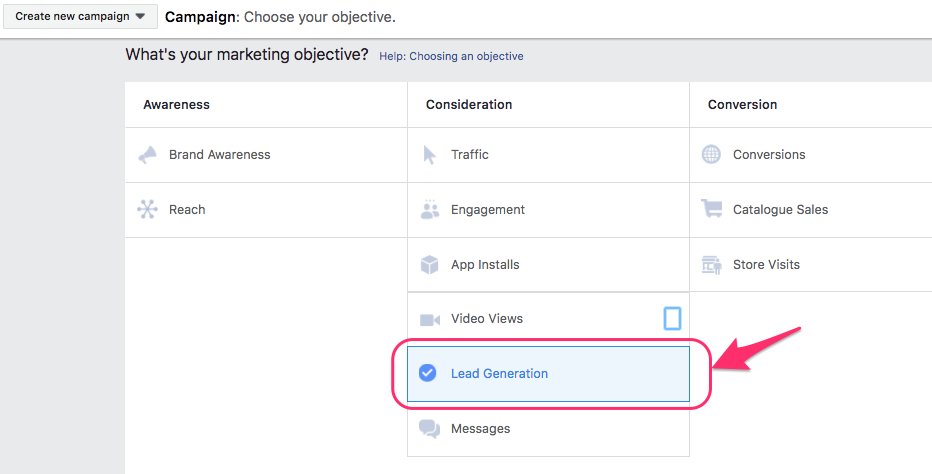
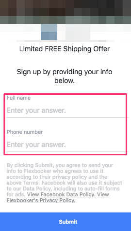
If you want to speed things up a little bit, you can go for Facebook Lead Ads to collect phone numbers fast by offering something enticing in return.
Here’s how it works.
Open your Facebook Ad manager and choose your marketing objective to be “Lead Generation.”

Next, fill in all your targeting, budget, placement and scheduling details and head straight over to building the ad.
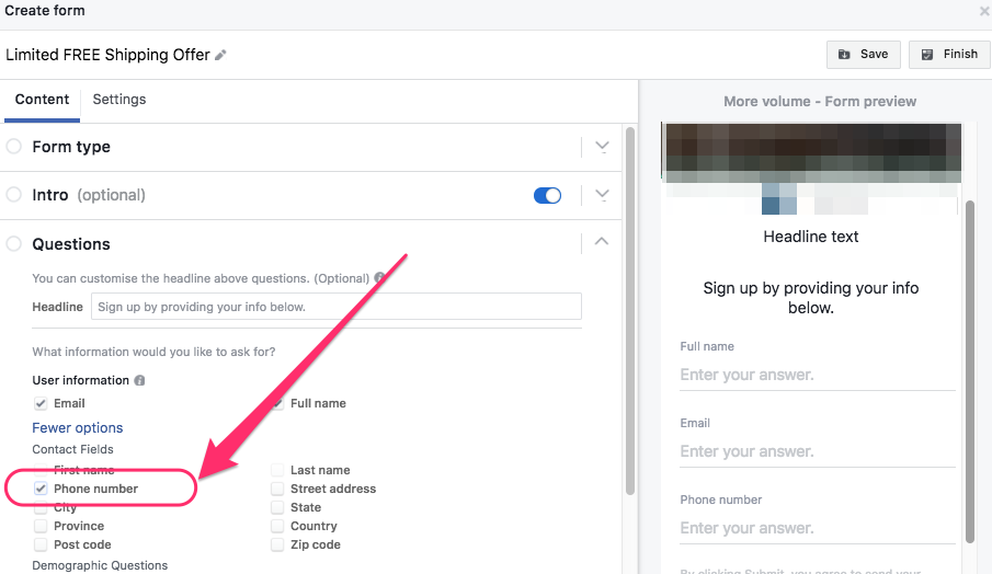
Scroll down a little bit until you see the “Create Form” section of your ad builder.
Create a new form and describe the special something your customers will receive when they sign up.
Then click the “More options” in Questions section of the form creation menu and tick “Phone number.”

It’s a good idea to have essential information fields to improve the conversion rate of your form. So keep it short and attractive.
When you’re done, your form will look something like this:

There you have it.
This will allow you to legally grow and maintain a list of your customer phone numbers to fuel your mobile marketing initiatives.
Once you have your first batch, you can start sending coupons and gift codes to your list via SMS and encourage customers to visit your brick-and-mortar store and redeem them.
Another great way to collect customer phone numbers is to incentivize them upon check out on your website, by offering free shipping or even the in-store redeemable coupon itself.
5. Optimize for near-me searches
Following the explosive growth of mobile, consumers now expect to receive specifically tailored and personalized search results whenever and wherever, using near-me queries.
So what are those near-me searches anyway?
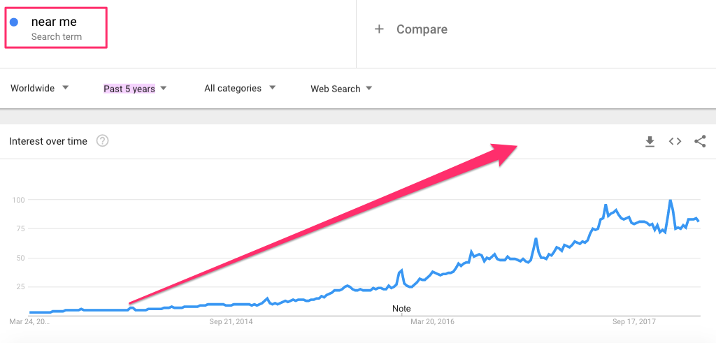
Near-me searches are location specific search queries, usually aimed at getting quick results nearby.
This is what they look like.

Near-me searches have been growing steadily in past five years and are only taking off.

The tricky part is that it’s not enough to be geographically near the searcher to rank high in search results.
You need to really tap into local search optimization to get a piece of the “near-me pie.”
Here are some quick local SEO tips to get you started.
- Make sure your website is mobile ready, as Google will be rolling out mobile-first indexing anytime soon.
- Perfect your Google My Business listing as it is critical for local search rankings. Verify your listing and keep it up to date at all times.
- Optimize your website meta data with “near me” keywords. Do not overdo, but rather keep it relevant and user-friendly.
- Get geographic anchor backlinks from authority websites.
- Encourage customers to leave reviews on your Google My Business listing. Luckily, Google does not prohibit direct communication with customers to solicit reviews.
Shortlist your happiest customers who use Gmail and reach out to them with a quick link to review your business on Google.
6. Offer in-store exchanges and returns
Did you know that 30% of all e-commerce purchases are returned versus 8.89% of brick-and-mortar purchases?
Sounds like a lot. But it is not surprising.
Despite all technological advancements, online shoppers still do not have the opportunity to see, touch and try products before purchase.
Hence the high return rates.
There is little you can do to minimize order returns, but if you want to drive foot traffic to your store and also improve customer experience, you can offer in-store returns and exchanges.
A recent study by Invesp Conversion Rate Optimization Company, reveals that 9 out of 10 consumers will buy something again if returns are easy and hassle-free.
And 62% of shoppers are more likely to purchase online if there is an option to return items in-store.
This means that having a great in-store return and exchange experience will not only drive your customers from the web to your store, but it will also give them another reason to shop with you next time.
And this is true not only for North American shoppers but Europeans as well.
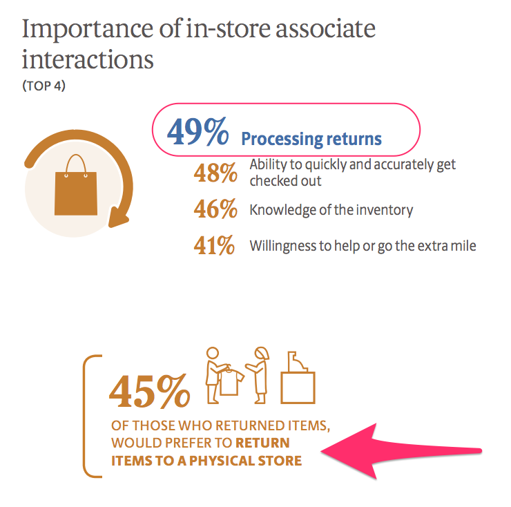
The 2017 UPS Pulse of the Online Shopper study shows that almost half of consumers would prefer to return items to a brick-and-mortar store.
And 49% of them would prefer to work with an in-store associate to process returns.

7. Organize in-store events and workshops
Having a physical store has some advantages for an e-commerce retailer, and it would be a wasted opportunity not to make use of those.
One of the best things you can do to drive foot traffic and as a result, in-store sales, is to organize various events, like new product launches, runway shows, shopping festivals, etc.
The reason why this is important and why it works so well is because consumers still view shopping as entertainment.
Having the right atmosphere and mood in your physical store can work wonders.

According to that 2017 Mood Media study, music is a crucial element for a great in-store shopping experience.
In fact, 81% of shoppers globally agreed that shopping experience is more enjoyable if a store is playing music. This figure rockets to 90% among those 18-24.
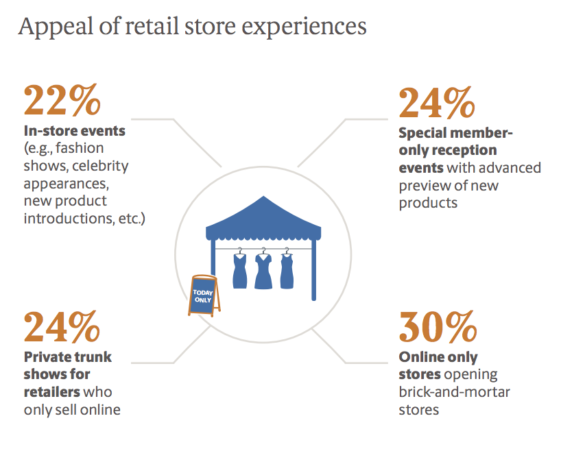
The same study suggests that consumers love in-store events, especially brick-and-mortar store openings of online-only brands.

So why not organize a shopping night with live music and cocktails? Power these events with heavy promotion on your website and social media and your store will be jam-packed.
8. Localize your digital ads
Digital advertising is a big part of your marketing budget, and you want to make sure you utilize it properly and with maximum ROI.
Luckily, there are many local advertising solutions on most ad networks and particularly on Google.
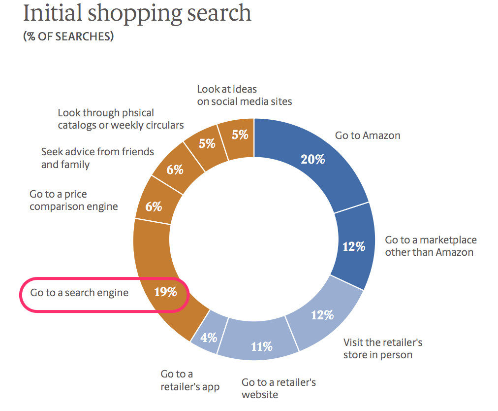
On average shoppers search and purchase via multiple channels almost 40% of the time and the majority of these shoppers go to a search engine to start their research.

So it really is important to target and convert these consumers at the early consideration stage.
Here’s how you can do it using local advertising on Google.
If you already have active search ads, go ahead and set up location extensions in your Adwords account.
This will allow you to show local search ads with your address, a map to your location, or the distance to your store.
While these ads will help increase foot traffic, there is an even more powerful ad type that is specifically designed to bring online searchers straight to your local store.
I am talking about Local Inventory Ads. These ads show the stock availability of an item at your local store along with the typical product information that shows up in a regular Google shopping ad.
When you click on a Local Inventory Ad, it takes you to a digital storefront with your local store information, including stock availability, address, phone number, email, and hours.
9. Create unique and compelling in-store experiences
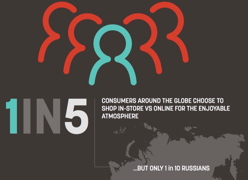
The power of in-store experiences is incomparable to online shopping in any way. It is the top reason for consumers around the world to choose brick-and-mortar over e-commerce.
Let’s look at both sides of the coin.
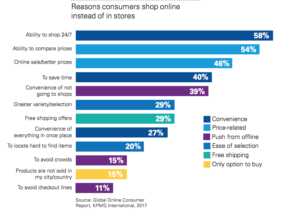
What motivates consumers to buy online instead of going to a local store? What really drives this huge shift to online?

The 2017 KPMG Global Online Consumer Report shows that the main advantages of online shopping are 24/7 availability, easy price comparison, and better deals.
Now let’s see how physical stores beat these powerful facts.

As expected, more than half of consumers globally still prefer to see the product with their own eyes, 55% want to try it on before purchase, and 22% simply enjoy the experience of going to the shops.
So how can you make your in-store experience a blast?
Easy.
Start with eliminating the main consumer pain points.
Did you know that waiting in line is the number one in-store frustration for 60% of shoppers around the world?
Leverage the advantages of having (more) mobile POS devices to cut the lines at cash registers and accept card payments on the spot.
This will serve you particularly well during in-store sales.
Another thing you can do to ease the hectic atmosphere in your store is create an immersive brand experience with uplifting background music, proper lighting, and smell.
Yes, the smell is actually even more powerful than you think.
Scent travels to your brain immediately and is closely linked to memory, that is why it is widely used by major retailers to influence consumer behavior in-store.
It turns out there is even research on which scents are more likely to drive sales.
It suggests that people tend to spend more when they smell warm scents, such as vanilla and cinnamon.
Whichever scent you choose, keep it very light and ambient so that it adds up to the overall in-store experience and not vice versa.
Conclusion
E-commerce is on the rise and will continue to grow remarkably in the near future. It changes the way consumers shop and influences offline sales as well.
However, traditional brick-and-mortar retail is far from dead and is going through an exciting yet transformative change.
This change will require an omnichannel approach to marketing and a sound web-to-store strategy, focusing on the following key aspects.
Bring online and offline together by combining the major advantages of these two channels.
Provide your customers with the convenience to pick up their order at your local store. Let them see your stock availability and then shop offline.
Allow shoppers to enjoy the experience of seeing, touching, trying your products before purchase, checking out and walking out of the store hands-free.
Be there when your customer needs you.
Optimize your web presence for near-me searches. Experiment with local search ads and Google Inventory Ads to gain visibility and drive more in-store traffic.
Consider investing in mobile marketing solutions to accurately and legally collect customer phone numbers and send deals and special offers at the right time.
Create an unmatched in-store experience.
This is the biggest strength of your brick-and-mortar store.
Build excitement around real-life shopping experience by organizing one-of-a-kind fun events that every shopper would love to attend.
Take advantage of the latest tech solutions to provide exceptional customer service and encourage brand loyalty.
What e-commerce marketing tactics have you seen drive foot traffic to your store?
About the Author: Neil Patel is the cofounder of Neil Patel Digital.

from The Kissmetrics Marketing Blog https://ift.tt/2pQ8T2Y
via
IFTTT

