I see this problem all the time when I’m consulting businesses. They are getting tons of traffic to their websites, but visitors just aren’t converting.
If this sounds like your situation, don’t hit the panic button yet.
Look on the bright side. At least you’re having success when it comes to driving people to your website. But if you want to design a homepage that converts, you have to look at how visitors navigate through your pages.
Every day I see websites with design flaws.
Brands spend much time trying to improve their SEO rankings and don’t spend enough effort improving their websites. Creating a website that converts isn’t an overnight process.
This takes time, effort, and patience. You need to learn how to run A/B tests and analyze your design elements so that you can make calculated improvements.
That said, there are certain changes you can implement sooner rather than later.
I’ve taken the time to identify the top 7 navigation mistakes I see on a regular basis. Use this list to analyze your existing website to make sure you’re not making the same blunders.
1. Labels and headlines that don’t drive conversions
When someone visits your website, it’s all about making a first impression. Think about what people see on your menu bar and headline tags.
I don’t like to throw businesses under the bus. So I’m not going to show you a specific example of a website that’s doing this wrong. But I’m referring to headlines and labels with terms like:
- who we are
- what we do
- about our hiring process
- places we work
While this information should be included on your website, it shouldn’t be the focal point of your design. None of these will lead to conversions.
Let’s take a look at a brand that understands this concept and has appropriate labels and headlines on its site. Check out the homepage for Knockaround:
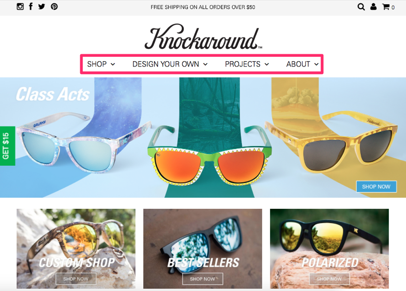
The navigation menu has only four options, which is perfect.
We read from left to right, so the first two choices we see are “shop” and “design your own.” Both of those labels were written to help drive conversions.
Information about the brand’s history, staff, and operation are reserved for the “about” headline.
I don’t want you to think your brand story isn’t important. In fact, I’ve written an extensive guide on how to create an about us page that generates leads.
But when it comes to driving conversions, you need to shift your focus. Nearly all the clickable links in the example above from Knockaround will drive conversions.
The website has a clean and simple design, so it’s easy for visitors to be drawn to these conversion buttons. The result is increased sales.
2. Using a non-standardized layout
People have been browsing the Internet for years. Over time, there are certain standards we have grown to expect when we land on a web page.
It’s important for you to come up with a differentiation strategy for your marketing campaigns to help you stand apart from your competition. But when it comes to your website navigation, stick with a standard layout.
For example, where do you expect to see a navigation menu when you visit a new website?
You’ll assume it’s at the top of the screen. Burying your menu in the middle of the screen will look strange for your visitors.
They may not spot it right away, and it’s not something they are expecting to see. Here’s an example of a standardized website layout from Unbounce:
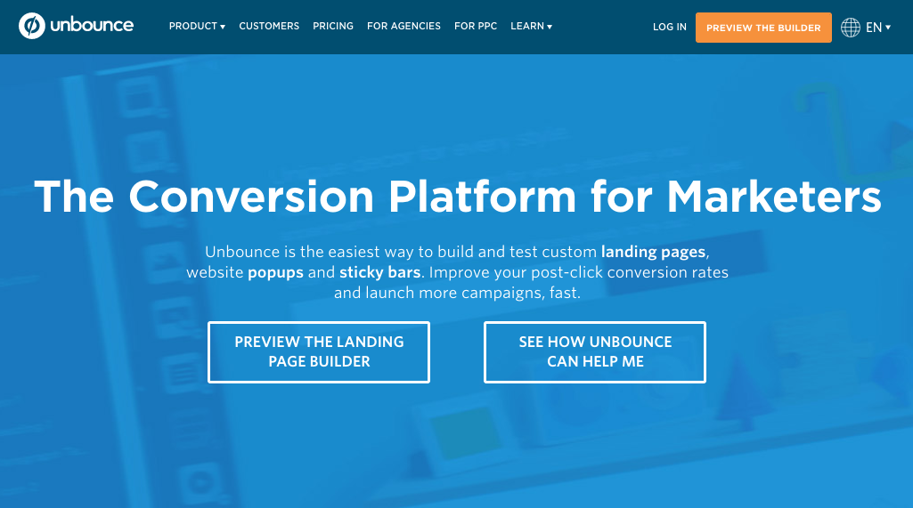
As you can see, it follows the format of most websites you see on a daily basis. The standard typically follows this progression:
- menu bar at top of screen
- large headline
- short description sub header
- CTA button
You might be thinking this is too boring. Think again. Using a standardized page layout will help you drive conversions. Visitors will know exactly where to navigate without having to think too hard.
Let me give you an analogy to further illustrate the point. When you are looking at a picture on your smartphone or tablet, how do you expect to zoom in on the image?
You use two fingers on the screen and spread them apart. That’s what you’ve grown accustomed to.
But what if that command didn’t work for certain websites? You’d be thrown off and probably wouldn’t convert. Plus, you’ve been using smartphones for far less time than you’ve been browsing the Internet.
So stick with what people are familiar with, and don’t stray too far from a standard layout.
3. Conflicting CTAs
Having call-to-action buttons on your website is necessary to drive conversions. But too many CTAs not related to each other will confuse the visitor.
Most people think that adding multiple CTA options to each page of their websites will increase the chances of one getting clicked. But it actually has the opposite effect.
These are the typical CTAs:
- buy now
- sign up today
- join our email list
- refer a friend
- click here to receive your discount
What’s wrong with these CTAs? Nothing. Unless they are all on the same screen at the same time.
Take a look at the BuildFire homepage:
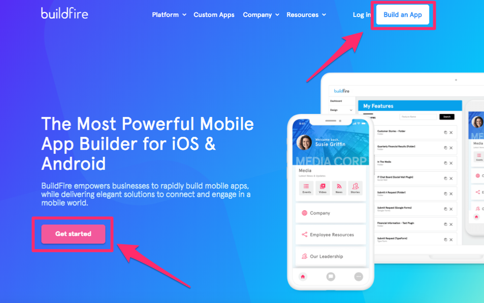
BuildFire specializes in custom mobile app development. When you land on its website, you’ll see two call-to-action buttons.
Although the wording of each button is different, they both drive the same type of conversion.
The “get started” button is intended for people to start building their mobile apps. If they click the “build an app” button, they’ll be accomplishing the same thing.
In fact, both CTAs bring the website visitor to the same landing page. So it’s all about which button speaks to the user. Those are the only two options they need to choose from.
If this website had additional buttons, e.g., to try to get email subscribers, sign up for a free trial, or receive a coupon code, it would hurt its conversions.
It’s all about your priorities. For some of you, getting more email subscribers may be the priority of your current marketing strategy. If that’s the case, eliminate any other CTAs on your page that conflict with your conversion goals.
4. Too much clutter
Your web design needs space to breathe.
Don’t try to fill every inch on the screen with text and images. Empty space can be just as effective.
Empty space in your web design will ultimately help direct the visitor’s attention to your focal points. Now they won’t have a problem spotting your value proposition.
Websites with simple designs have higher conversion rates.
Having too many elements on your website will slow down the page loading time.
Pages that take more than four seconds to load can expect to see bounce rates increase by 100%. Websites that take eight seconds to load will have an additional 150% increase in bounce rates.
Consider removing images from your pages. Research from Google Analytics suggests that websites with fewer images have higher conversion rates.
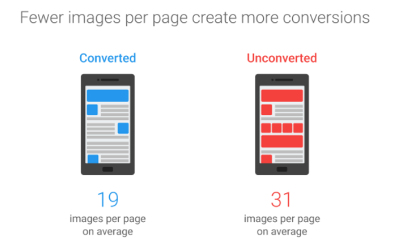
Based on everything we just discussed, this makes sense.
Lots of images will slow down your page loading time, increase bounce rates, and ultimately kill your conversions.
But if you remove clutter, simplifying your design, users won’t have an issue navigating through your pages.
5. Not accounting for scrolling
Most pages will require the visitor to scroll.
That’s fine. I’m not saying you shouldn’t have scrollable pages, but it’s important you recognize how your screen will change as the visitor navigates by scrolling.
Think about the current placement of your CTA buttons.
When someone scrolls down a page of your website, are the CTA buttons still visible? If the answer is no, it’s going to hurt your conversions.
Scrolling through a page is great because it gives the visitor more information about your brand, products, or services. But let’s say they get halfway down the screen and decide they want to convert.
If the conversion link is all the way back up at the top of the screen, they’ll need to scroll back and go hunting for it. That’s not a good scenario for you.
Each additional step people take to convert is going to hurt you. Let’s take a look at the Square website to give you a great example of what I’m talking about:
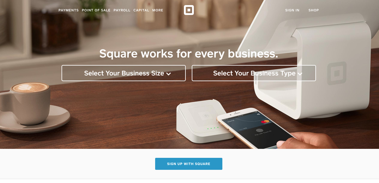
This is its homepage. As you can see, it follows a standard layout and doesn’t have any clutter, which are two of our previous discussion points.
But what happens when you scroll lower on this page?
Let’s see if you can still locate the CTA button at all times:
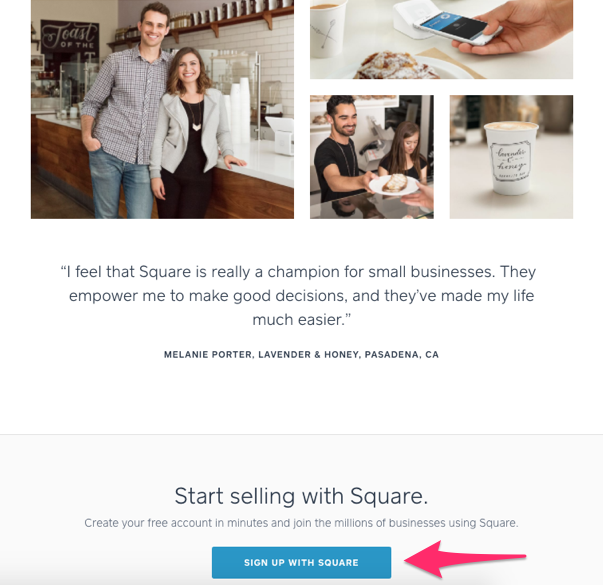
This screenshot is from the same page.
The way the CTA fits on the screen makes it appear as if the visitor is on a new page. As you can see, the CTA button is still clear and visible.
Now, as the visitor learns more information about the product, they can click on the link and convert.
But that’s not the end of the page. Let’s continue scrolling to see whether this pattern continues:
 The pattern is indeed the same.
Keep in mind we’re still looking at Square’s homepage. I haven’t navigated to another screen yet or made any clicks. But as I continue to scroll, I always have an option to convert.
This statement holds true all the way to the very bottom of the homepage.
I think I’ve made my point clear.
Square has perfectly designed its navigation to ensure that website visitors always have an option to convert.
Use this as a reference for your pages as well. Keep in mind that each scrolling screen should almost appear as a completely new page to be as effective as possible.
You could also consider implementing a fixed menu bar with a CTA button at the top of your screen. That way, when a visitor scrolls, the menu is visible at all times.
6. Complicated checkout process
If you sell products or services on your website, you need to put shopping cart optimization at the top of your priority list.
Consider all the design elements on your checkout page.
If the buttons required to complete the transaction are hidden or mis-written, it’ll kill your conversions.
Furthermore, you need the checkout process to happen in as few steps as possible. Take a look at the top reasons for shopping cart abandonment:
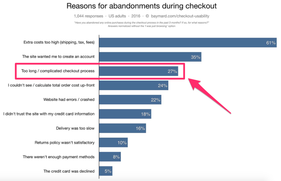
A checkout process that is long and complicated ranked third on this list.
Your navigation elements play a huge role in how customers finalize their transactions. So analyze your site, and figure out where customers are abandoning the page.
Make sure your purchase buttons are big, bold, and clearly displayed on the screen.
7. Forgetting about mobile users
Navigation on smartphones and tablets differs from navigation on computer screens.
Just because you implemented changes on your desktop site doesn’t mean your navigation is perfect. You still need to optimize your design for mobile users.
Remember earlier when I discussed the importance of speed? Well, speed is even more important when it comes to mobile browsing.
Mobile sites that take longer than three seconds to load have a 53% abandonment rate. Furthermore, 50% of mobile users expect pages to load in less than two seconds.
If you have an ecommerce site, this is extremely important for you to recognize. That’s because 70% of all mobile transactions are completed from smartphones.
When you optimize your mobile site, you need to make sure it encompasses all the previous design elements we discussed:
- labels that drive conversions
- standardized layout
- similar CTAs
- no clutter
- scrolling-friendly
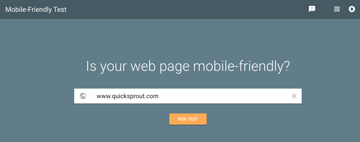
To check whether your mobile site is properly optimized, you can use tools such as the mobile-friendly test from Google:
But just because the site is mobile optimized doesn’t mean all your navigation elements are perfect.
It’s up to you to manually make all those design changes if you want to increase your conversions.
Conclusion
Having lots of website traffic is great.
But traffic doesn’t automatically translate to conversions. If you think your page conversions are below satisfactory or have room for improvement, you need to take the time to analyze your navigation elements.
Recognize how visitors browse on your site. What do they see?
Their eyes will be drawn to your labels and headline options. Write them so they drive conversions.
Your website design isn’t the place to experiment with your differentiation strategy. Use a standardized layout for a smooth navigation. That’s what people are used to, so don’t confuse them.
The CTAs on your screen need to be related to each other. Too many conflicting CTAs will lower your conversion rates.
Remove clutter on the screen. Use blank space to your advantage.
Check what the users see when they scroll through your pages. There should always be a CTA button visible to drive conversions.
Simplify your checkout process. Don’t ignore mobile users.
If you avoid making these 7 navigation mistakes, you’ll see a significant improvement in your website conversion rates.
What navigation elements on your website need to change to increase conversions?


from Quick Sprout https://ift.tt/2J8k8yy
via IFTTT
