Is your pricing page designed to drive conversions?
There are some common problems I see all the time when I’m analyzing these landing pages. It’s a tricky situation for businesses.
On the one hand, you want your pricing page to be informative, useful, and beneficial to your prospective customers. But at the same time, you want to make sure it’s designed to make people spend as much money as possible.
All too often, I see pricing pages that are either on one end of the spectrum or the other. You need to find that middle ground.
You’ve spent a lot of time learning how to generate more profits by focusing on your pricing strategy. Now you need to learn how to properly display those prices.
What types of pricing pages will encourage website visitors to convert?
Pages that are transparent and build trust will ultimately be your best bet. Here’s why.
If your pricing page is honest and doesn’t withhold any information from prospective customers, you can still implement tactics that encourage people to spend more money.
In fact, 73% of consumers are willing to pay more for products and services that promise complete transparency. Furthermore, 39% of consumers say they’re willing to switch brands to pursue transparency.
Both you and the customer will benefit from trustworthy and transparent pricing pages.
Those of you who need help increasing conversions on your ecommerce platforms will learn how to create profitable pricing pages by reading this guide. Here’s what you need to know.
Create a comparison table
The best way to show customers their options is by displaying a comparison table.
This makes it easy for them to make a decision without having to navigate to different pages or do too much scrolling. Ideally, your comparison table can be displayed on one screen.
Here’s an example of how Netflix uses this strategy on its pricing page:
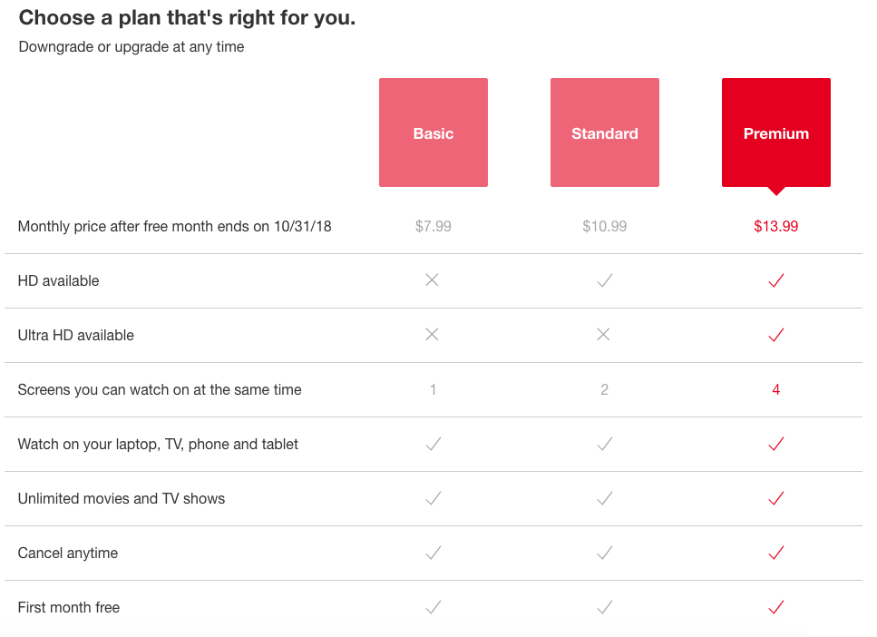
As you can see, this is an extremely simple yet effective design.
Netflix offers three different subscriptions:
- basic
- standard
- premium
The first line of the table shows the price. It’s obvious and transparent how much each option will cost. There are no surprises or secrets here.
After that, it lists seven features. The comparison table shows whether each price point has the listed feature.
This is the perfect size for a comparison table.
According to research on short-term memory, the brain can store only about seven items at a time. Most adults have the capacity to store five to nine pieces of information in their short-term memory bank.
If your comparison table has 30 lines, you’ll need to cut that down significantly.
It’s just too much for people to process, and you’ll struggle to get conversions.
Plus, if they have to keep scrolling to see information, it’ll be difficult for them to keep track of which option is the most appealing to them.
If you don’t know how to shorten your comparison table, here’s what I recommend. Only include line items that are different for each price point.
For example, if all your options come with a 30-day free trial, don’t add that to your table. Instead, find another spot on your pricing page to showcase that feature.
Showcase your value proposition
For your business to be successful, you need to create a highly effective value proposition.
Your value proposition will explain how your brand, products, or services will benefit your customers. Highlight what makes your company better than your competitors.
Here’s a look at how Constant Contact displays these benefits on its pricing page:
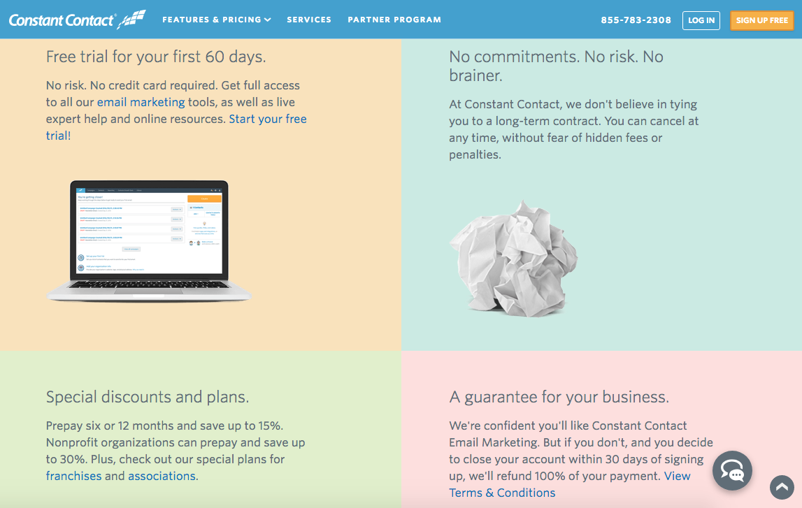
The platform offers a 60-day free trial.
Nothing says trust and transparency like the offer of two free months. This gives customers a chance to get to know the software without having to pay for anything. It shows that this company stands behind its product.
Constant Contact also gives its customers the option to cancel any time. It doesn’t make anyone commit to long-term contracts, and it doesn’t charge cancelation fees.
In addition to the 60-day trial period, Constant Contact will refund customers 100% of their payments if they cancel within 30 days of signing up.
The company guarantees satisfaction.
As you continue to scroll down this page, you’ll find the pricing options. But the website visitor is already primed to convert after reviewing the company’s value proposition.
If your value proposition isn’t on your pricing page, you need to put it there right away.
This will help you build trust with your customers and increase their chances of converting.
Highlight the top option
Tell your customers what to buy.
There are a few different ways to approach this.
If you look at the Netflix comparison table above, you’ll see the highlighted top choice. The premium service was red, while the other options were grey. The red color jumps out at the customer more than grey.
Plus, the premium subscription was the most expensive. Obviously, you want your customers to spend as much money as possible.
I know what some of you are thinking. Is this strategy trust-building?
Yes. Your most expensive option will likely still be the most beneficial to your customers.
Continuing with the Netflix example, spending the most money gives people the option for ultra HD and the ability to stream videos on four devices simultaneously. These features aren’t available with the other subscriptions.
Let’s take a look at another example. GoDaddy highlighted its top option by referring to it as the best value:
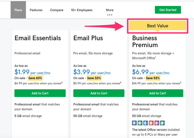
Obviously, everyone wants a bargain.
As you can see, the best value choice is also the most expensive. But again, this gives its customers the most bang for their buck.
But your top option doesn’t always have to be your most expensive.
A great way to get your customers to convert is by putting your top option next to a choice that’s significantly more expensive. This will make it look even more appealing.
You can also entice consumers to select a certain option by telling them it’s your best seller or most popular choice.
Implementing this strategy helps create social proof, which I’ll discuss in greater detail shortly.
Encourage people to spend more money
Your top option likely won’t be the cheapest.
But you can still encourage your customers to spend.
Here’s an example from the Litmus pricing page that illustrates my point:
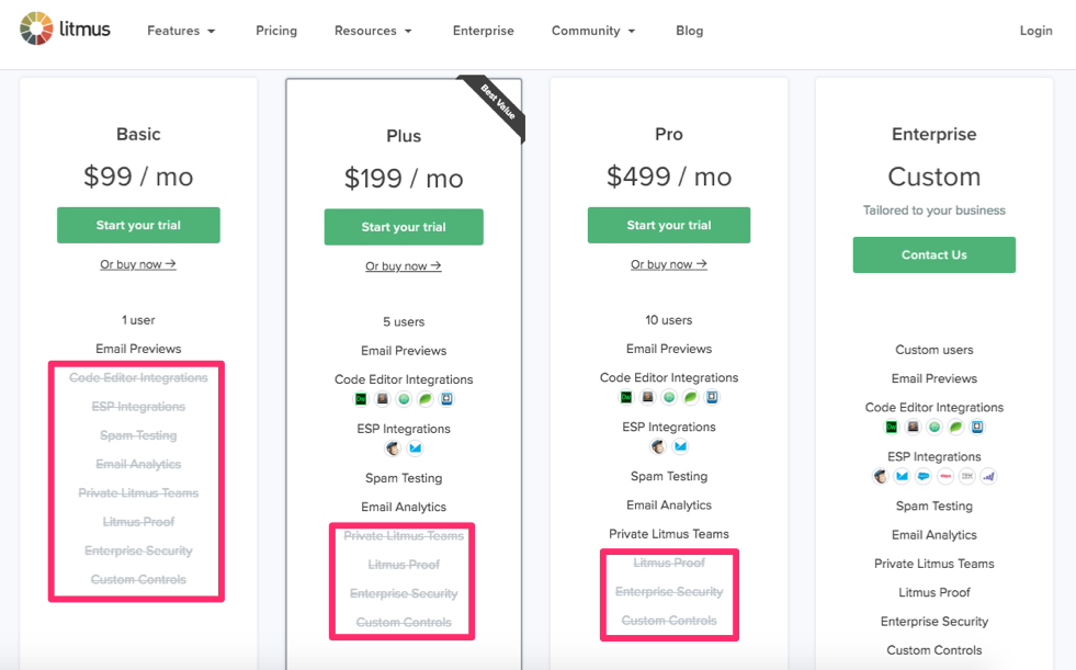
As you can see, this comparison table shows customers what’s not included in each plan.
It conveys this message by listing those features in a light grey color with a line going through the text.
Litmus is being completely transparent here. Now its customers won’t expect those features in a particular plan since it was clearly shown that certain options aren’t included in the selection.
If people want certain features, they’ll be encouraged to spend more money.
Take a closer look at this pricing page. Litmus also highlighted its top option by calling it the best value selection.
By positioning it between the least expensive and most expensive option, the value choice seems more appealing.
Offer free trials based on cost
You already saw a couple of examples of free trials so far in this guide.
Netflix offers a free trial period to all new customers. Constant Contact has a 60-day free trial for new customers as well.
Including a free trial establishes trust with your customers. But how long should your free trial last?
I like the idea of increasing the free trial length based on the cost.
For example, let’s say you offer a service that costs $10 per month and another one that costs $100 per month. Setting both of these trials at 14 days would be ineffective.
For a customer to dish out $100 per month, they need to be absolutely certain that the cost is worth it to them. Give those people an extended trial.
Pandora uses this strategy on its pricing page:
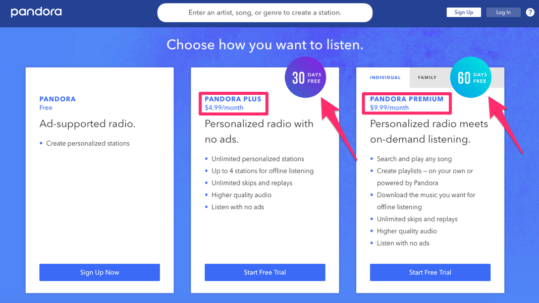
By offering a free trial, Pandora doesn’t force customers to pay for its services without testing them out first.
Customers who sign up for the $4.99 monthly service get their first 30 days free.
If someone signs up for the service that’s double the price, their free listening period is double the length as well.
Consider using this strategy on your pricing page.
You may not be initially thrilled about offering your service free, but it will pay off in the long run.
In fact, research shows that the overall conversion rate for monthly and annual plans is roughly 60%.
That’s pretty good if you ask me. Don’t hesitate to offer extended trials.
Understand the paradox of choice
Less is more. That’s the paradox of choice.
The more options you give your customers, the less likely they will convert.
Look back at all the examples I showed you so far. All these pages have three options for customers to consider, with the exception of Litmus, which had four.
However, that fourth option from the Litmus pricing page was for enterprises that need custom pricing. Basically, it offered three choices to most people.
If you have five, six, or seven different plans for people to select, it’s hurting your conversion rates.
Researchers conducted a study on this concept.
When customers in a grocery store had the option to sample six flavors of a product, the conversion rate was 30%. However, when they had the choice to sample 24 flavors of the same product, only 3% converted.
Another study found that decreasing the availability of product choices resulted in a 10% increase in revenue.
Limiting choices also helps build trust and transparency. It shows people that everything your company has to offer can be found in just a few different options. They won’t have to sift through dozens of choices to find what they’re looking for.
Create social proof
When designing your pricing page, you need to learn how to effectively use social proof to increase conversions.
The concept behind social proof is simple. If other people are doing something, it must be right.
That’s what you want your prospective customers to think.
Take a look at how Pipedrive creates social proof at the bottom of its pricing page:
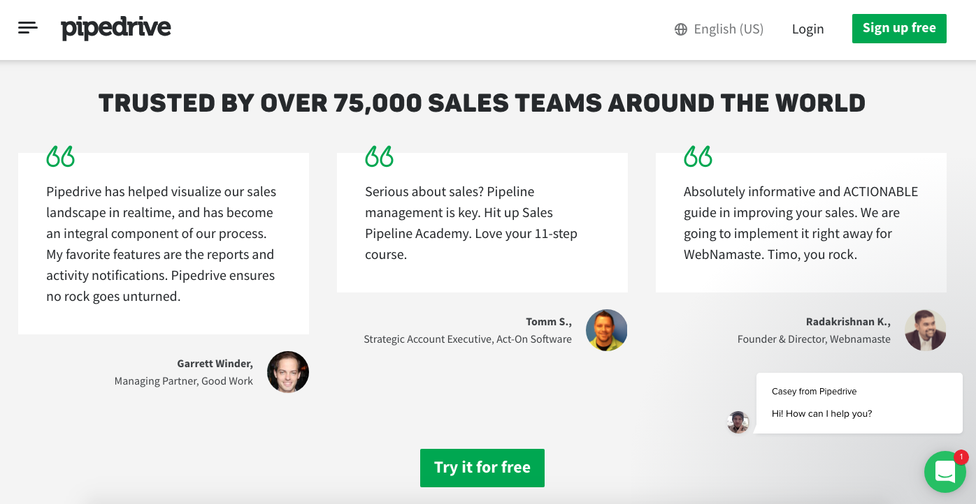
After people have a chance to review the pricing options for Pipedrive, they’ll see this screen as they continue scrolling.
More than 75,000 sales teams use this service. Pipedrive has customers all over the world.
The product must be good if more than 75,000 people are using it, right? That’s the idea behind social proof.
Furthermore, the company features customer testimonials on its pricing page.
It lists the name, company, and position and includes a photograph for each testimonial.
For a more in-depth analysis of this, review my guide on how to correctly manage customer testimonials to increase your brand credibility. This will help you build trust with your customers.
Here’s something else to consider. Take a look at the bottom right corner of this pricing page.
Do you see the little message box? This gives the company’s customers a chance to communicate via live chat. I’ll discuss this tactic in greater detail next.
Add a live chat feature
You need to communicate effectively with your customers.
As you just saw in the Pipedrive example, adding a live chat feature to your pricing page shows that your brand is available to assist prospective customers on demand.
This will help you build trust and show how transparent your pricing is.
If a customer has any questions or needs clarification, your live chat support team can offer solutions.
Let’s look at another example. Here’s the HubSpot pricing page:
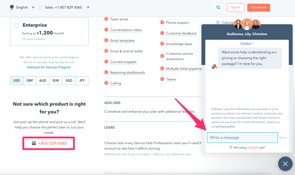
It has a chatbot that automatically pops up.
The note encourages visitors of the page to write a message if they need help understanding any of the pricing options.
In addition to the live chat function, HubSpot also includes its phone number on the page.
This adds more credibility to the website and improves its customer service.
Having both live chat and phone support available will appeal to a wider range of customers based on their preferences for customer service communication.
Justify your pricing
Depending on your business, some of you may have high prices for your services.
If your most expensive option is only $5 per month, you may not need to justify that price. However, if you’re charging hundreds or thousands of dollars for your products or services, some justification may be necessary.
This is important for B2B companies.
Unlike the average consumer, businesses need to see a return on their investments. Spending money on your service is an investment for them.
What will they get in return? Show them.
Buffer added case studies to its pricing page to justify its pricing:
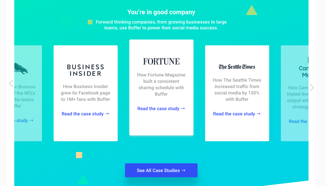
These case studies explain how other companies benefited from the product.
Business Insider reached 1 million Facebook fans. The Seattle Times increased its traffic by 150%.
In addition to justifying the prices for the company’s services, this strategy also creates social proof, which I previously discussed.
Build an interactive estimation tool
This isn’t applicable to all of you, but it’s a useful strategy for some brands.
Depending on your pricing model, the cost of your service may not be the same for everyone for each billing cycle.
Some businesses base their prices on usage and other metrics. However, this strategy can sometimes appear untrustworthy since the prices aren’t set in stone.
Adding an interactive estimation tool to your pricing page helps with transparency.
For example, MailChimp has prices that fluctuate based on the number of subscribers their customers have.
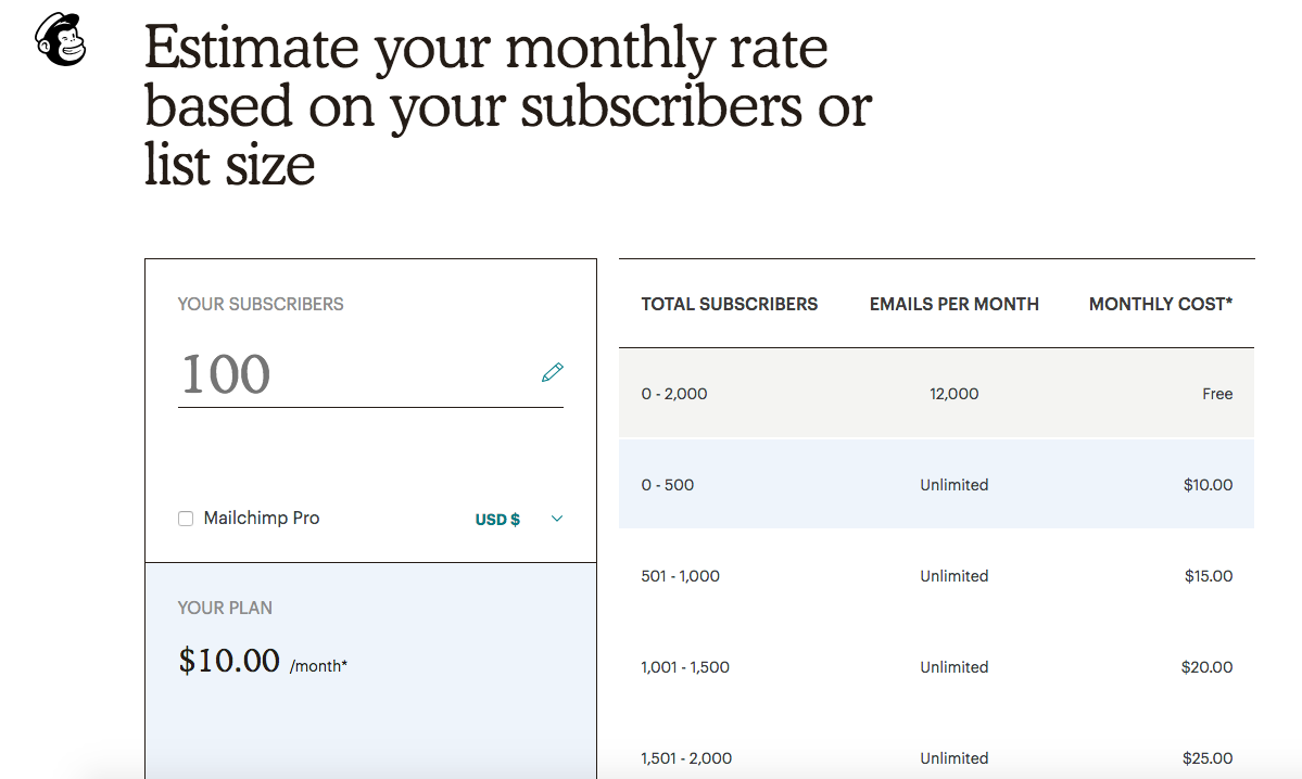
Its pricing tool gives people a chance to see how much they’ll get charged if they add subscribers to their mailing lists.
As you update the number of subscribers, the prices for the plan change accordingly.
Prioritize security
Security needs to be a top priority for your business.
Why?
Research shows that 69% of consumers say they are concerned about their privacy and security. And 68% of people do not trust brands to appropriately protect their personal information.
With so many people concerned about security, use your pricing page to showcase how you protect your customers’ information.
Check out how Highrise accomplishes this on its pricing page:
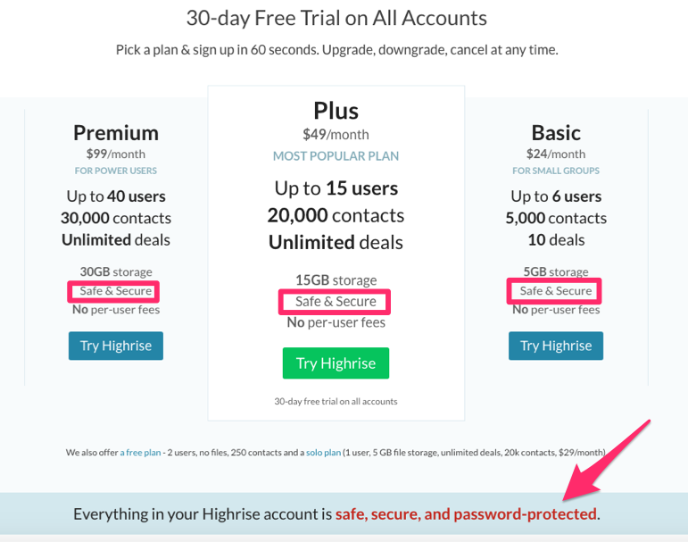
The pricing page features the words “safe and secure” all over it.
Highrise goes above and beyond to explain to prospective customers that it prioritizes security.
This strategy will help you establish trust with your customers and ultimately increase the chances of them converting.
Conclusion
If you want the conversion rates on your pricing page to increase, you need to make sure your page promotes trust and transparency.
Build a comparison table that lets customers view all their options on one screen.
Leverage your value proposition.
Tell your customers what to buy by highlighting your top option. Use this strategy and other tactics to encourage people to spend more money.
Offer a free trial. The more expensive the service, the longer the trial should be.
Limit choices on your pricing page. Fewer options will result in higher conversions.
Create social proof and justify your prices. Make sure your customers know their security is a top priority for you.
If you follow the tips I’ve outlined above, you’ll be able to increase conversions on your pricing page.
How does your company’s pricing page promote trust and transparency?


from Quick Sprout https://ift.tt/2NVI0nn
via IFTTT