FAQ pages represent a crucial component of the customer conversion funnel. Anyone who lands on this page has already identified the need for whatever you’re selling and is now entering the consideration phase of the purchase process.
Your FAQ page can provide them with the information required to finalize their buying decision.
However, I see so many websites that overlook the importance of this landing page. I read lots of FAQ pages that sound more like an afterthought, as opposed to a page that’s been designed to drive conversions.
FAQ pages must have a purpose. Don’t just add one to your website because you feel like it’s a requirement and you want to fill up space.
While most websites should have a FAQ page, yours could be doing more harm than good if it doesn’t have any clear intentions. It’s possible that your FAQ page is driving people away from buying, as opposed to drawing them in. Obviously, you don’t want that.
For those of you who are currently neglecting your FAQ page, it’s time to make changes. The rest of you might not have an existing FAQ page and want to add one from scratch.
Regardless of your situation, you’ve come to the right place. I’ll show you how to address common problems with FAQ pages and learn how to optimize them for conversions.
Ask the “right” questions
I’ve seen plenty of FAQ pages that have a great design, layout, and optimal user experience. But to be blunt, the questions are awful.
Somewhere along the line, so many sites have lost the meaning behind frequently asked questions.
Anything related to where your company was founded, how many employees you have, or where your CEO was born does not belong here. You can include details about the history of your company on your about us page. I have a separate guide on how to create an impactful about us page on your website.
But adding irrelevant or useless questions and answers to your FAQ page is just going to confuse your visitors.
They’ll end up having a more difficult time finding information that will answer their actual question. So you need to have questions that are more related to conversions.
Check out some of the questions on the Allbirds FAQ page.
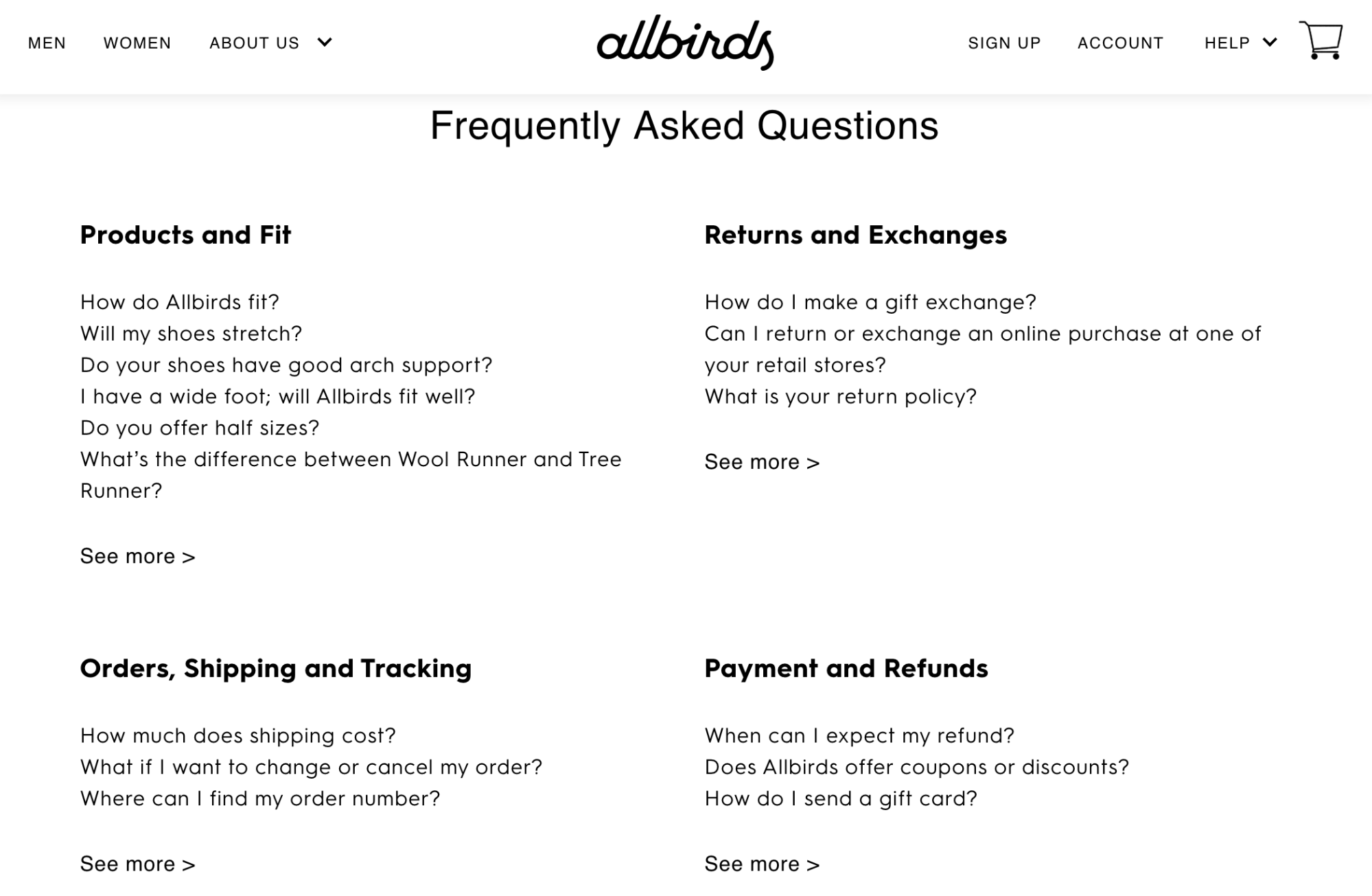
This company has an ecommerce platform for selling shoes direct to consumer. So all of the questions are intended to drive sales.
They have questions related to how the shoes fit, sizing, returns, exchanges, refunds, and shipping. All of these are important to the consumer buying decision.
Allbirds does not offer half sizes in their shoes, which is definitely something that might throw some of their shoppers off. But they have questions directly made to address this potential concern.
Do you offer half sizes? Will the shoes stretch? Do the shoes fit a wide foot?
These are all logical questions that someone would ask before buying. You want your customers to feel confident when they’re shopping.
Buying a product, such as sneakers, online can be a challenge. Customers don’t get a chance to try on different sizes, walk around, and see what feels good like they would in a store.
But Allbirds alleviates any uneasiness by asking the right questions on this FAQ page.
If you’re still unsure about how to ask the “right” questions, just see what your customers are actually asking. Take a look at questions and comments from:
- Submission forms
- Customer emails
- Live chat
- Social media comments and messages
- Phone support
Keep a database to track all of these questions and group similar ones. If lots of people are asking the same thing, it definitely belongs on your FAQ page.
Simplify the navigation
Like the rest of your website, Your FAQ page must be frictionless.
You might have great questions and answers, but if your site visitors can’t find them, then your FAQ page is going to fail.
Do your best to try and emulate an in-person shopping experience. If a customer was in a physical store, all they would need to do is find an employee and ask their question. Sure, sometimes that employee might direct the customer to another department or something like that. But in the end, the question is answered directly and timely.
Don’t make people hunt for answers on your website.
If the format of your FAQ page is just questions followed by answers repeating all down the page, visitors will have to keep scrolling to find what they’re looking for. This is not ideal. They might even overlook their question, which wouldn’t solve their problem.
Take a look at how Microsoft simplifies things on their FAQ page for software downloads.
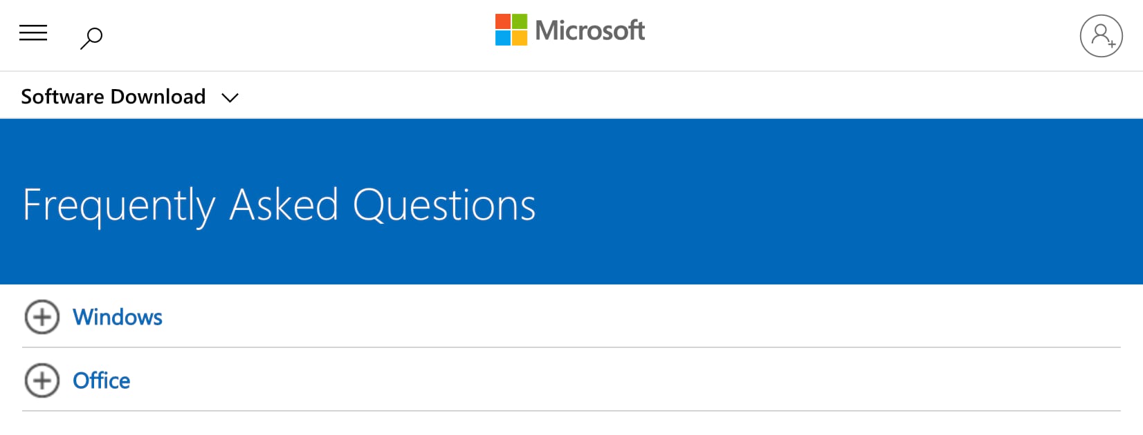
Right away, you’ll see that there are two categories to choose from.
So the website visitor can narrow the results depending on if their question is related to Windows or Office. That way any Office questions won’t have irrelevant Windows questions that need to be sifted through.
When a user clicks on one of the options, the menu expands, without redirecting to a new page.
Here’s what it looks like if I click on Office.
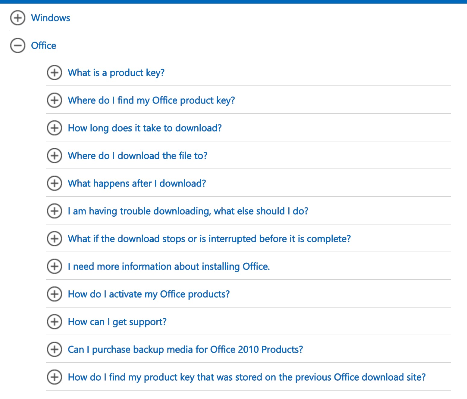
All 12 questions can be read without having to scroll. This makes it extremely easy for people to find exactly what they’re looking for.
Now, imagine if there was an answer directly below each of these questions. It would take up probably four or five times the amount of space on the page.
That layout would be much more challenging and require additional scrolling and text to read through. But this approach by Microsoft is clean and simple.
If you want to know something specific, like how long it takes for software to download, just click on the question and the answer will expand below it.
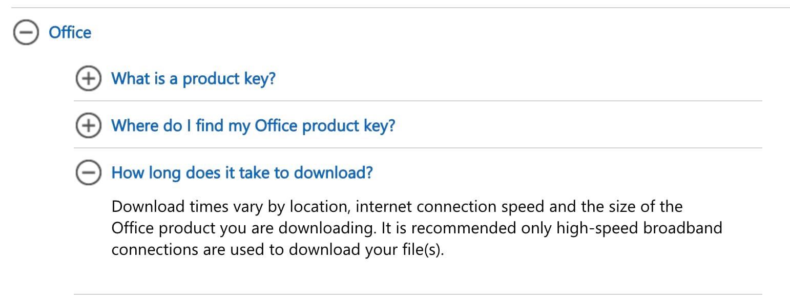
Frictionless.
If a site visitor has multiple questions, it’s still easy for them to navigate and find answers to everything.
Here’s the way you need to look at your FAQ page. If a site visitor has a question and it does not get answered, they aren’t going to convert. It’s that simple.
So if you approach your FAQ page trying to design the navigation in a way that’s optimized for user-experience, then it will increase the chances that people will find what they’re looking for.
Keep the answers short
Another common mistake that I see made on FAQ pages is the length of the answers. Everything needs to be clear and concise.
For the most part, your FAQ page should be fairly broad. You want everything to appeal to as many people as possible.
So you won’t have super-specific questions that require in-depth explanations.
But even for a general question that most people would ask, you still need to keep the answer concise. You don’t need to answer everything. Certain details can be left out.
I’d rather see FAQ pages with 30 questions that have short answers, as opposed to 15 questions with long answers. So if you currently have long paragraphs on your FAQ page, see if you can take one question and break it down into two or three.
This will provide a much better user experience.
Visitors shouldn’t have to read through an essay or short blog post to get a simple answer.
Let’s say that a website visitor is able to locate their question and ends up reading through a long answer. They might end up having additional questions, based on the length and details of that answer. You don’t want that to happen.
So sharpen your writing skills and only include the most important information related to the question.
Check out this example from the PayPal FAQ page.
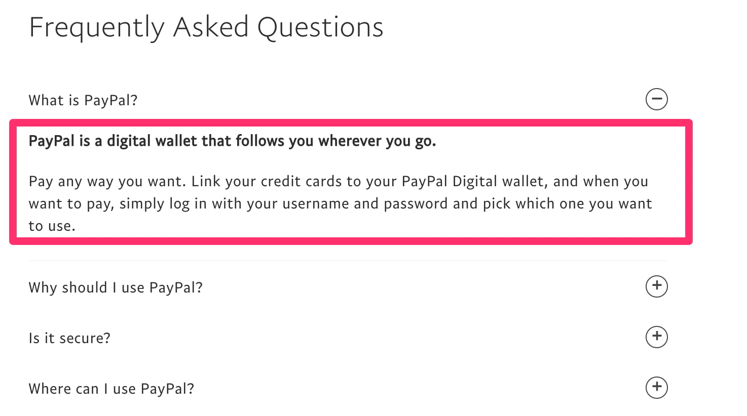
Look at the first question—what is PayPal?
Talk about a loaded question. PayPal is so many different things. They offer services for businesses, consumers, and websites. They could probably answer this question in 50 pages if they wanted to, going into details comparing PayPal and Stripe for ecommerce.
But no, they take a much simpler approach. The entire answer is just three sentences.
If they got into all of the specific details of PayPal, what it is, what it does, and who it’s for, it would only confuse the initial question. The answer above is clear, concise, and still answers the question.
Offer added support
While a FAQ page should be written to help most of your website visitors with broad questions, sometimes it’s just not enough.
No matter how good your questions are, how great the answers are, or how simple the format is, some people will still need additional assistance. That’s OK.
If it’s going to take a little bit of extra support to get people to convert, then give it to them.
Just make sure that all support options are available. Here’s how Samsung approaches this on their FAQ page.
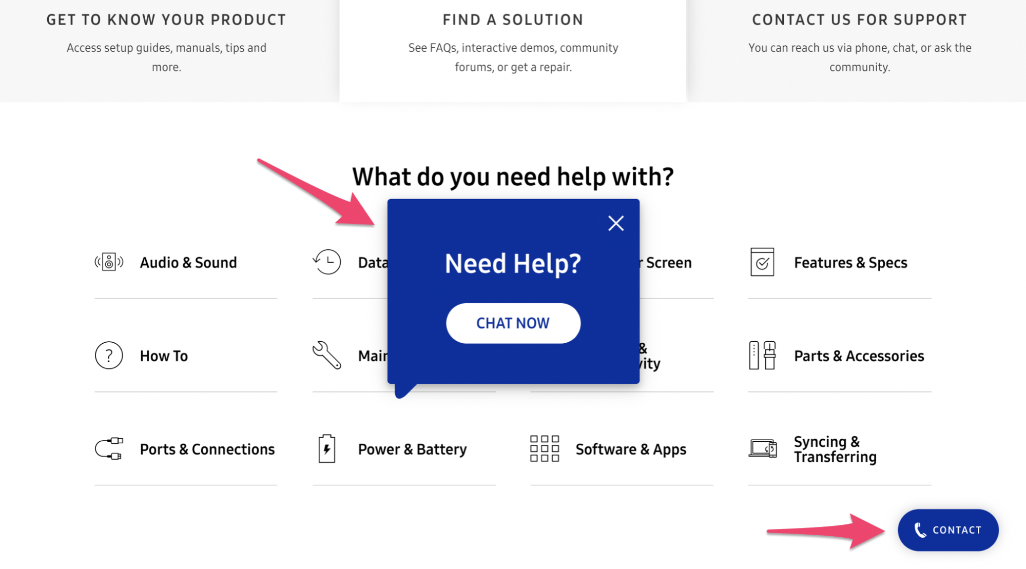
The first thing I noticed when I landed on this page was the list of categories. Samsung is a huge company, so it makes sense for them to start this way.
But as I stayed on the screen without making any actions for a while, this pop-up window appeared prompting a live chat session.
They obviously have this triggered to appear whenever someone doesn’t scroll or click since the implication would be that they can’t find what they’re looking for. I love this approach.
It’s much better than forcing the site visitor to go back and find another support page or make them go through countless questions manually until they find an answer. That’s just too many added steps.
Put a live chat window directly on your FAQ page.
Furthermore, Samsung has a phone support button in view at all times as well, as I pointed out in the screenshot above. So the customer has options.
Can’t find a solution on the FAQ page? No problem. Just pick up the phone or speak with one of our live chat representatives. This strategy should be incorporated into your FAQ page if you want to drive as many conversions as possible. The extra effort will go a long way.
Optimize for SEO
When you’re crafting a high-converting FAQ page, you need to keep the big picture of your website in mind. Nothing screams big picture louder than SEO.
For the most part, FAQ pages are designed with the idea that a visitor will land somewhere on your website, have a question, and then navigate to the FAQ page. In many cases, this very well might be the case.
However, you can set up your FAQ page to get traffic directly from organic searches as well.
So every question doesn’t need to be brand-specific. For example, let’s say your website offered web hosting plans for small businesses. Your FAQ page could ask, what is shared web hosting?
This question isn’t exclusive to one of your products or services. But it’s definitely something that one of your prospective customers will search for online. Your question could end up in the SERPs, driving more traffic to your website, and ultimately leading to conversions.
A great tip for finding SEO questions is to just use Google.
Let’s say you sell sneakers. Type in keywords that you’re trying to rank for, like “sneakers for travel,” and then scroll to the bottom to view related searches.
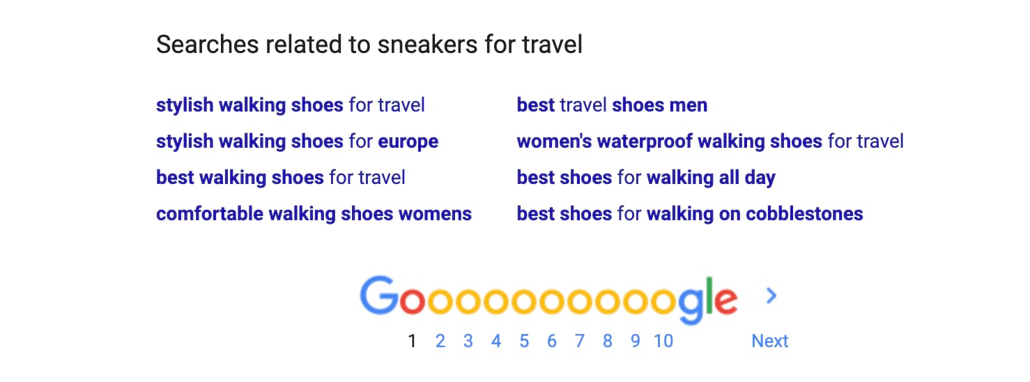
Based on these search suggestions, you can get SEO-inspired questions for your FAQ page.
So you can add questions related to shoes for walking all day or stylish shoes for Europe.
Another way to improve your SEO is by creating dedicated landing pages for your questions. Now, this slightly contradicts what we talked about earlier in terms of user experience. Redirecting people every time they want to see a new question could be a bit annoying.
However, these dedicated landing pages that interlink with each other can give you a boost in terms of SEO, if your website architecture and sitemap are optimized properly.
Conclusion
FAQ pages are critical resources for your website visitors.
Anyone who lands on this page is on the verge of converting. Sometimes getting a question answered is all it takes for them to finalize a decision.
So stop wasting time and space with FAQ pages that don’t add real value to your site.
Focus on questions that are related to conversions. Keep the user experience in mind by simplifying your design and writing concise answers. Offer additional support options for people who still have questions. Go the extra mile and optimize your FAQ pages for SEO.
If you follow the tips that I’ve covered in this guide, you can turn your FAQ page into a conversion machine.


from Quick Sprout https://ift.tt/3310yvh
via IFTTT