As an optimizer, there’s nothing that excites me more than using design to change on-page behavior. By “change”, I mean to positively influence visitors to achieve their (and your) goals more effectively, and sticky navigation is a great way to increase your odds of driving behavioral change.
The best way I know to design experiences that change on-page behavior is to use my Data-Driven Design (3D) framework to gather and observe available data, and use the Micro Metrics Method (3M) to guide design exploration.
This is what I’ll be showing you today by using sticky navigation on a long landing page and also on this blog post.
It’ll help you move around the content while secretly showing you the cool things you can do with Unbounce ;)
What is Data-Driven Design? (3D)
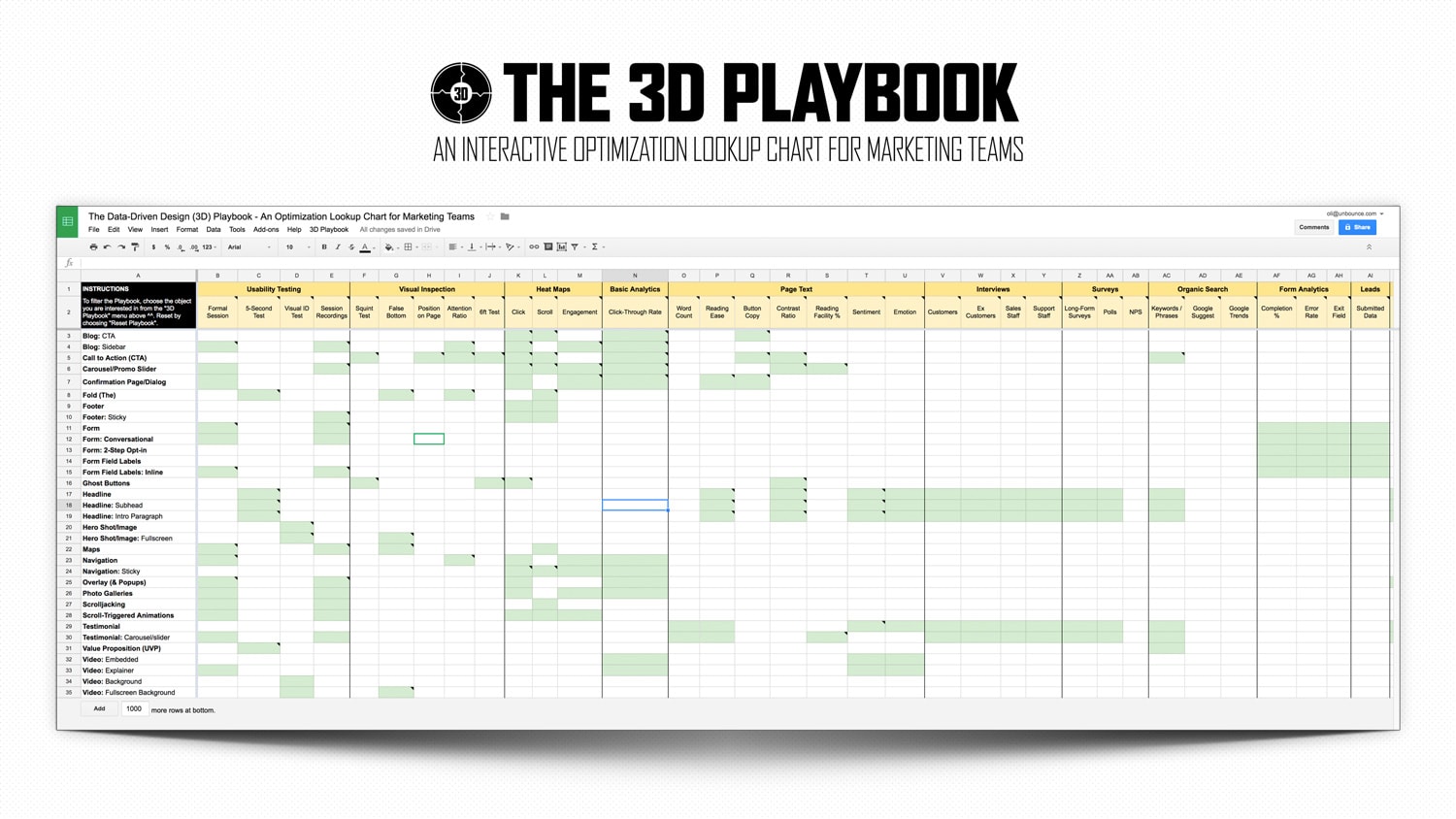
Data-Driven Design is an 8-step collaborative optimization process designed to help your marketing team work together to increase conversions, but more importantly, to develop empathy for your customers and your coworkers. It begins with The 3D Playbook, which is an interactive lookup table that helps narrow down the data types you should be looking at when trying to optimize your landing pages, websites, and more.
It looks like the screenshot below, and you can check it out at this link. The process for using it needs more explanation that I can give in this post, but I am doing a webinar at Marketing Optimization Week where I’ll cover it in depth.
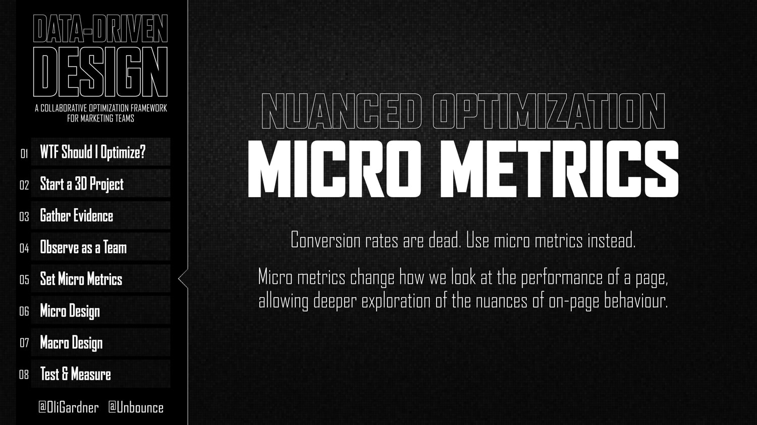
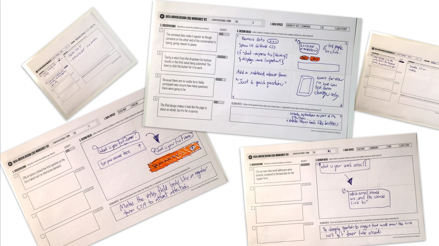
One of the most important steps in the process is taking the observations we make looking at data (analytics, heatmaps, usability tests etc.), and working as a team to design solutions to each of the problems you observe. Measuring the impact that these design changes have is called the Micro Metric Method (3M).
What is the Micro Metrics Method? (3M)
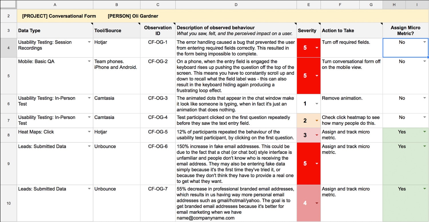
When you make observations as a team (I recommend you include a designer, copywriter, and marketer), not only are the solutions better, but the collaborative nature helps with team/client/executive buy-in for the changes you’ll propose. You can see a session I ran recently below. We watched usability test videos and took notes about the observations we were making in a shared doc that is created for you as part of the 3D Playbook (when you choose a page element from the menu it will create a series of worksheets for you and your team – the instructions on the first page of the sheet explain how).
A marketing team following the Data-Driven Design process

A definition of micro metrics
A completed worksheet with observations, severity ratings, and those assigned as micro metrics
The design solution sketches the team came up with to solve the problems identified by the micro metrics
Watch Me Give the Data-Driven-Design Talk Feb 23rd
I’m actually giving my Data-Driven Design for Marketing Teams talk for Marketing Optimization Week, so you should definitely register for that and I’ll run you through the whole process. MOW is a 4-day event from Feb 20-23 and I’m on the last day.
How to Use Sticky Navigation to Change On-Page Behavior
I’ve set up a demo page that shows a long landing page with a sticky nav that I created using an Unbounce Sticky Bar with some CSS to hide the close button. The goal of sticky navigation is to increase the level of engagement with your page by presenting persistent options that explain what’s available on the page.
I really love this approach to landing page design, where it’s standard – and recommended – to not have navigation (that takes you away from the page). In particular, it’s great because it’s persistent. It scrolls with you so the opportunity for behaviorally interesting clicks doesn’t go away. What I mean by that is that there’s so much more data to collect when the navigation follows you down the page. When it’s fixed to the top of the page, you have very few opportunities beyond the very first click, to get a sense of which items trigger intent.
According to The 3D Playbook, for sticky navigation, we should first look at heatmap data and the click-through rate of each navigation link, as well as the primary call to action you have on your page.

In the Unbounce app, I used a sticky bar to create a navigation bar, assigning each link to the ID of a page element on the landing page that it would reside on.
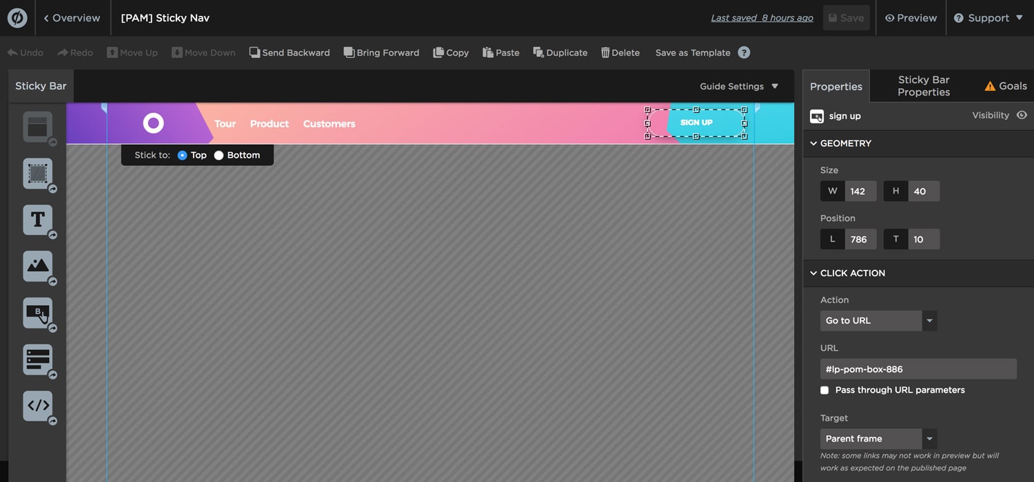
Below is a screenshot of the sticky nav that shows up on every post of Product Awareness Month (except this one and one other where I’m demoing sticky bars). I’ll be sharing the data I collected from this, and a gazillion other data sources, in the end of month results show.

Sticky nav helps increase engagement with your content, bringing people further down the page to sections they may otherwise not see, and almost as importantly, it lets you measure what people ate interested in.
DEMO: How to Use Sticky Navigation to Increase Blog Engagement
You can click here to show a sticky nav on this blog post. I’ve set it up so that the nav links connect to different “chapters” of the post. It’s a great way to direct your readers, and also to gather valuable engagement data by looking at click heatmaps and analytics.
It’s very easy in Unbounce to duplicate a Sticky Bar and apply it to another page! Huzzah! Product awareness in action. Remember to click here to show the sticky nav.
Notice the CSS ID shown for the click target in the screenshot below (it says URL: “#register-for-mow”). This makes the nav link jump to the corresponding section of the blog post that I set up by adding an ID to a page element.
Sticky Nav in Unbounce: links to #register-for-mow
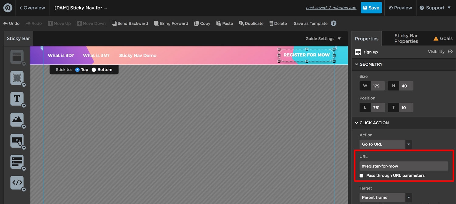
#register-for-mow as a target ID in the blog post

Do me a favour and click on the nav so I get some heat map data. It won’t be legitimate as I’m asking you to do it, but hey, shits and giggles amiright?
This post wandered a bit into a few directions, but I hope you got a sense for how I like to think about optimization, why sticky nav is awesome, and why we need more collaborative frameworks like Data-Driven Design.
Cheers
Oli
p.s. Register for Marketing Optimization Week to see 4 days of the most badass content including my Data-Driven Design framework, plus Larry Kim from Mobile Monkey, Dana DiTomaso form KickPoint, Purna Virji from Microsoft, David Gerhardt from Drift, and many more.
from Unbounce http://ift.tt/2DDgASS
via IFTTT
