Okay, so perhaps only one of these use cases will blow your mind, but it’s worth risking being labeled as click-bait to get this in your hands. Read on for the coolest things you can do with website popups. Ever. Including augmented reality. Yup.
Example #1: The Augmented Reality Customer Postcard
Alright, people. Prepare to have your minds blown. This example comes from one of our designers, and chief hackers, at Unbounce, Luis Francisco.
Imagine the image below is a postcard you sent to your customers.
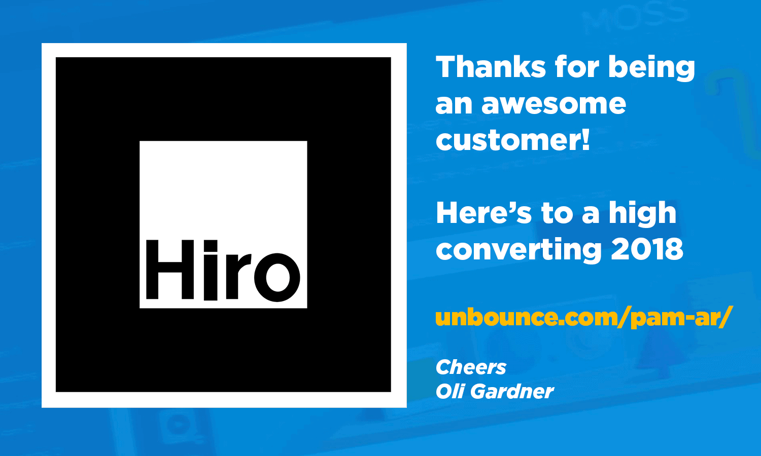
They visit the URL printed on it, and then this happens!
Watch me blow my own mind
Try it yourself
Note: This demo uses your laptop’s camera (it won’t work without one). Follow these instructions to see how it works!
- Print out the postcard image (opens in new tab)
- Open this landing page (opens in new tab)
- Grant access to your camera when asked by the browser.
- Hold the postcard in front of your camera to see the magic! (Stand a few feet back).
Example #2: The Website Login Hijack
35% of all visitors to Unbounce.com are only there to log in to the app. You read that correctly. Thirty-five percent. You can see the details in this GA screenshot from the month of January 2018.
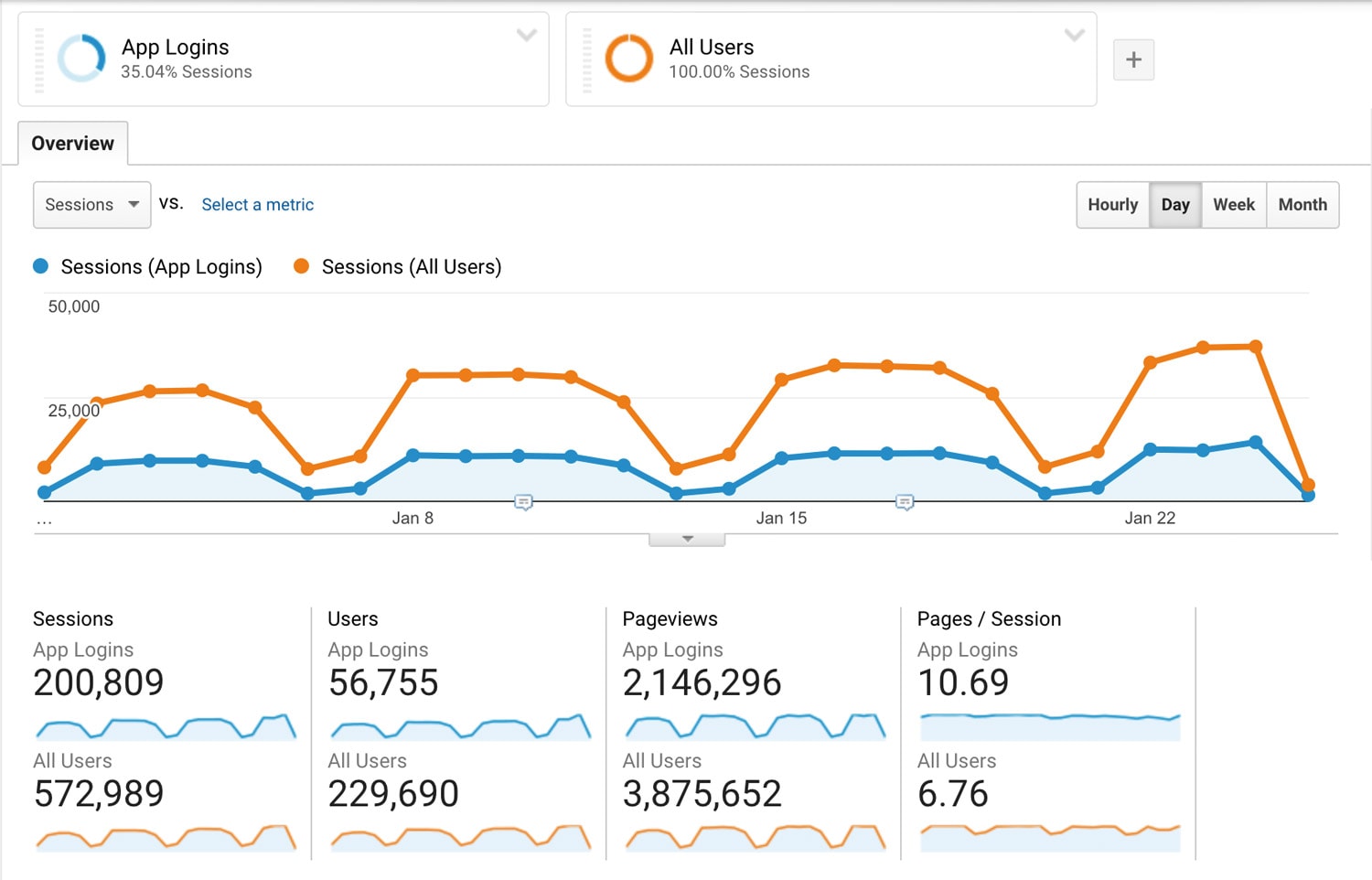
This is an incredibly common thing for SaaS businesses, where customers will visit the homepage to click the login link. You’ll want to create a segment in Google Analytics for this, so you can remove it from your non-customer website behavior analysis.
It’s a huge opportunity for product marketing.
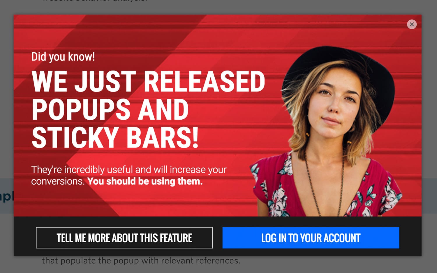
If you drop a cookie on your login screen that identifies the visitor as someone trying to log in, you can then use the cookie targeting built into Unbounce to target returning account holders with a website popup containing new product release info, along with a large login link that makes their experience even easier.
Click here or the image below to see an example popup.
Example #3: Social Referral Welcome
Are you doing as much as you can to convert your visitors from social? Probably not, but that’s okay. For this idea you can add an extra level of personalization by detecting the referring site (an Unbounce popup feature) and present a welcome experience relevant to that source.
You can take it a step further and have custom URL parameters on the social link that populate the popup with relevant content.
This is made possible by the Dynamic Text Replacement feature in Unbounce.
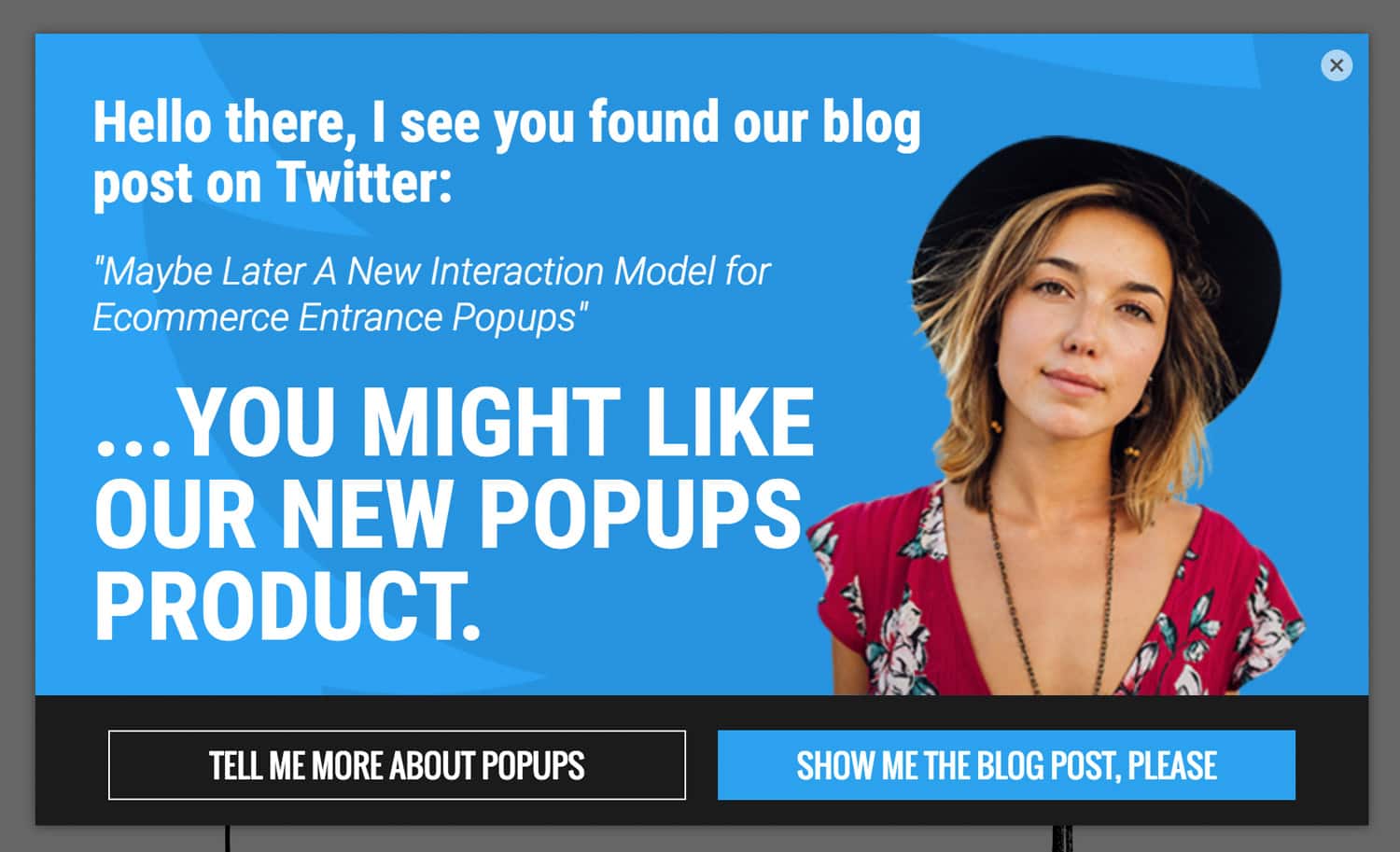
Check out the Tweet below. When I shared the blog post on Twitter, I added a URL parameter to the end of the URL so it reads:
https://postURL/?postTitle=“Maybe Later” - A New Interaction Model for E-commerce Entrance Popups
“Maybe Later” – A New Interaction Model for Ecommerce Entrance Popups >>https://t.co/ZoxZOvYFY4
— Oli Gardner (@oligardner) January 26, 2018
Try clicking the link in the Tweet. It will take you to our blog, and will show you a popup that’s only triggered when the referrer is Twitter (specifically a URL that contains t.co which is the Twitter URL shortener).

This is a really powerful way of connecting two previously disparate experiences, extending the information scent from one site to another. All without writing a single line of code.
Example #4: Preferred Social Network Share Request
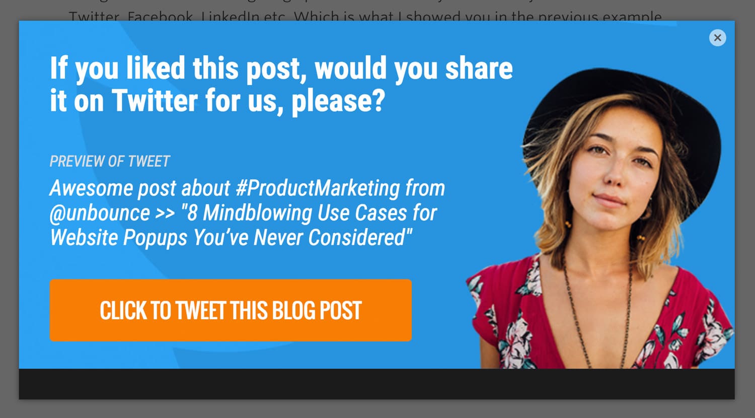
If someone comes to you from twitter it’s a strong signal that Twitter is a social network of choice – or at least somewhere where they look for and respond to, socially shared content. As such you can give them a customized tweet ready for that network when they’ve demonstrated some engagement with your blog.
Using the referrer URL targeting option in Unbounce you can easily detect a visit from Twitter, Facebook, LinkedIn etc. Which is what I showed you in the previous example.
You can use different triggers for this concept that are likely to be more indicative of someone who’s engaged with the post. I’d suggest the scroll trigger (either up or down), time delay, or exit.
The reason I like this approach is that most people have a preferred social network. Mine is Twitter. If you give me a specific task, such as “Would you share this on Twitter for me, please?” with a Tweet button and prepared Tweet text, I’m more likely to engage versus having 5 social share buttons at the side or bottom of the post with no instructions.
Click here or the image below to see this concept in a popup.
You’d then craft a really good Tweet, with text or links specific to this tactic so you can measure its impact.
BTW: the button in that popup is functional and will actually Tweet about this blog post. I’d really love a share from you, just so you know. Show the popup again so you can Tweet it.
Example #5: Joke of the Day
Let’s end the post with a fun one. I’m sure you’ve all seen those messages or jokes that appear on Slack as it’s loading (it’s a thing). It can be fun to have that unusable time filled with something delightful.
Well, this is kinda like that, except that it’s not appearing during a loading sequence, it’s just straight up thrown in the face of your visitors. Because we need to experiment, people!!!!!!!!!
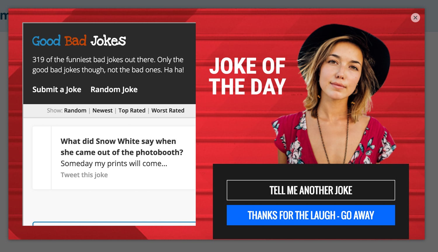
For bonus points, only show this to folks who have the cookie set in example #2 – “The Website Login Hijack” cos they’re customers and might appreciate it.
To do this, I took Unbounce co-founder and Chief Product Officer, Carter Gilchrist’s pet project “Good Bad Jokes” and embedded a random joke into an iframe in a popup. Boom!
Fair warning, some of these jokes are a little NSFW.
Click here for your Joke Of The Day.
Now go back to the top and try the augmented reality example again, and then share it on your preferred social network because it’s awesome, and that’s an awesome way to do business!
Cheers my dears,
Oli
from Unbounce http://ift.tt/2DPMoTU
via IFTTT
