After running thousands of a/b tests across hundreds of different companies in our research services program, we’ve seen significant patterns emerge. These patterns have led to some helpful tools like our conversion heuristic and our design of experiments planning method.
But they have also led to several page templates we use regularly to achieve wins inside of companies in every industry and of every business model.
Landing Page Template
One page that is generally consistent in almost any business is the main offer page for a product or service. This “landing page,” as it is often called, accounts for the main idea behind the offer.
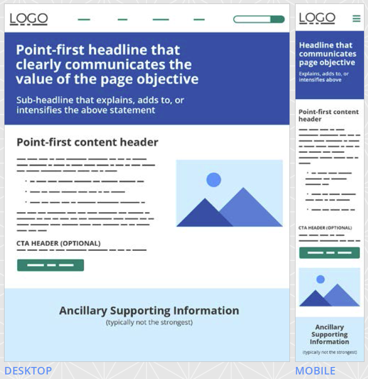
After thousands of a/b tests, we’ve meticulously put together a template that draws from a meta-analysis of these tests. We examined the patterns common among most landing page tests we’ve run that have achieved a business result. What we found was a series of common denominators that we then integrated into our offer page template.
We’ve also added explanations into the template on how to conform it to meet your own marketing needs. For example:
Headline and Sub-Headline
An online interaction with a prospect is like a conversation with a potential love interest. You hopefully do not begin the conversation with, “I am available for dates. Here is my number. Call me.” That is too vague and offers no reason to actually call — also it is rude.
You need a pick-up line that clearly communicates your value proposition and a sub-headline that further delineates that value proposition and how this page helps the prospect obtain that value.
Image
If your page is going to include an image, which is worth a test, the image must be instantly recognizable and reinforce the value proposition raised in the headline and sub-headline.
It must not tax the prospect’s mental faculties trying to make sense of the image. You do not want to slow down their cognitive momentum.
Primary Information Column
This is where your main body copy goes, including some easy-to-scan bullet points. You want the reader to be able to skim through this copy and pick out the main details they need to come to an informed purchase decision.
It is one column because multiple columns of vital information disperse attention and confuse. One column creates simplicity and velocity toward the call-to-action.
One Emphasized Call-to-Action
The call-to-action should emphasize in the actual wording the value proposition of the offer. In other words, “Get Instant Access Now” is preferable to “Click Here.”
There should not be multiple equally weighted calls-to-action because this forces the prospect to weigh the options, which decreases momentum and often stalls purchase intent.
Supporting Content
The primary information column will not suffice for some prospects. They will want more information before coming to a decision.
For these prospects, you can include additional information below the call-to-action. Supporting content can also include elements like testimonials, trust logos and additional copy and images.
Also, if you would like to get the other funnel-specific page templates we’ve put together along with a few case studies and explanation for how we conducted our research, you can download the complete PDF here.
The templates also include the following:
- The case studies these templates draw upon
- A walk-through of each template explaining how to use every element
- An overview of the methodology behind each template so you can iterate and make them fit your own marketing needs
Please let us know in the comments if you find it helpful or if you see any way to improve it.
You might also like …
Landing Page Optimization on-demand certification course
Landing Page Optimization: Simple, short form increases leads 40%
Landing Page Optimization: Free worksheet to help you balance segmentation and resources
The post Use this Research-backed Landing Page Template for Your Next Offer Page appeared first on MarketingExperiments.
from MarketingExperiments http://bit.ly/2WsiXhq
via IFTTT


