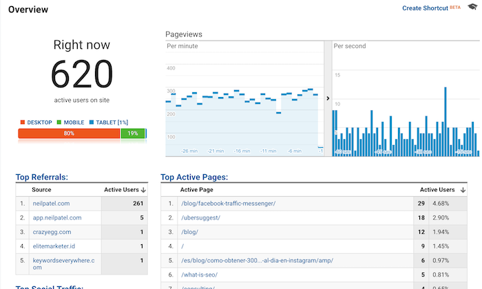
When you log into Google Analytics, what do you look at?
Chances are you see something like the image above that shows you how many people are currently on your blog.
Well, that was easy to guess because that’s the report Google Analytics gives you once you log in. 😉
But which reports do you look at on a regular basis?
I bet you look at two main reports…
The “Audience Overview” report and the “Acquisition Overview” report.
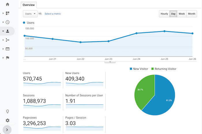
Sure, every once in a while, you may dive into your top pages or the specific organic keywords that drive your traffic. But even if you do that, what are you actually doing with the data?
Nothing, right?
Don’t beat yourself up over it because most content marketers just look at reports and numbers and do little to nothing with the data.
If you want to figure out how to grow your blog and, more importantly, your revenue from your blog, there are 7 reports that you need to start looking at on a regular basis.
Here they are and here is how you use them…
Report #1: Cohort Analysis
What do you think is easier to accomplish… get new visitors to your blog or getting your visitors to come back?
It’s easier to get people to come back to your blog, yet everyone focuses on new visitors.
I bet less than 99% of your blog readers turn into customers or revenue, so why not focus on getting those people back and eventually converting them?
Before we get into how to get people back to your blog, let’s look at how many people are returning to your blog.
Within the Google Analytics navigation, click on “Audience” and then “Cohort Analysis”.
Once you land on that report, you’ll see a graph that looks similar to this:
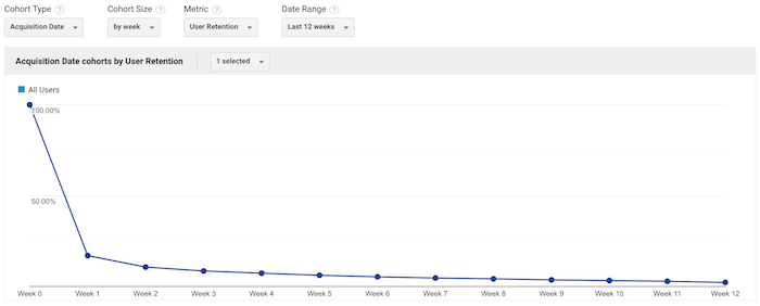
Under the “Cohort Size” drop-down menu, select “by week”. Under “Date Range”, select “Last 12 weeks”.
Once the data loads, you’ll see a table that looks something like this:
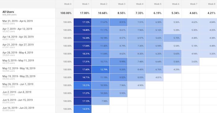
What this table shows is the percentage of your visitors that come back each week.
On the very left it will always show 100%. Then in the columns to the right, you’ll see week 1, week 2, week 3, etc.
This shows the percentage of people who come back to your blog each and every week after their first visit.
For example, if this week you had 100 people visit your blog and in the week 1 column, it shows 17%. That means of the initial 100 people, 17 came back. Under week 2 if you see 8%, that means of the initial 100 people, 8 people came back in week 2.
Naturally, this number will keep getting smaller, but the goal is to get people back as often as possible. That increases trust, social shares, potential people linking to you, and it even increases the odds that the visitor will convert into a customer.
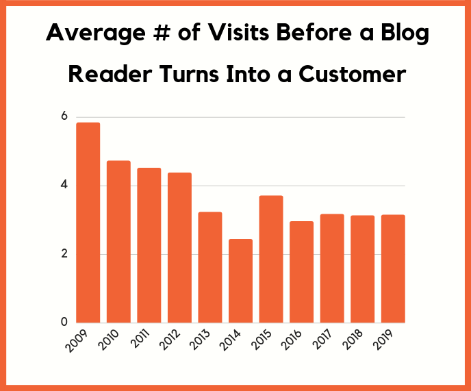
The average blog reader needs to come back 3.15 times before they turn into a customer. That means that you need to retain readers.
Just think of it this way: If you get thousands of new people to your blog each and every single day but none of them ever come back, what do you think is going to happen to your sales?
Chances are, not much.
You need to look at your Cohort Report and continually try to improve the numbers and get people coming back.
So the real question is, how do you get people to come back?
There are 2 simple ways you can do this:
- Start collecting emails – through free tools like Hello Bar, you can turn your blog readers into email subscribers. Then as you publish more content, you can send an email blast and get people back to your blog.
- Push notifications – by using tools like Subscribers, people can subscribe to your blog through their browser. Then every time you release a new blog post, you can send out a push and people will come back to your blog.
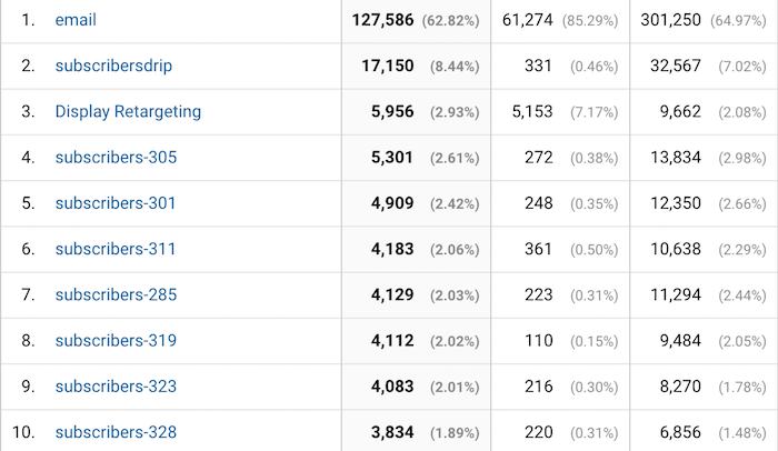
These 2 strategies are simple and they work. Just look at how many people I continually get back to my blog through emails and push notifications.
Report #2: Benchmarking
Ever wonder how you are doing compared to your competition?
Sure, you can use tools like Ubersuggest, type in your competitors URL, and see all of the search terms they are generating traffic from.
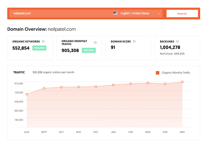
But what if you want more? Such as knowing what percentage of traffic your competitors are getting from each channel. What’s your bounce rate, average session duration, or even pageviews per channel?
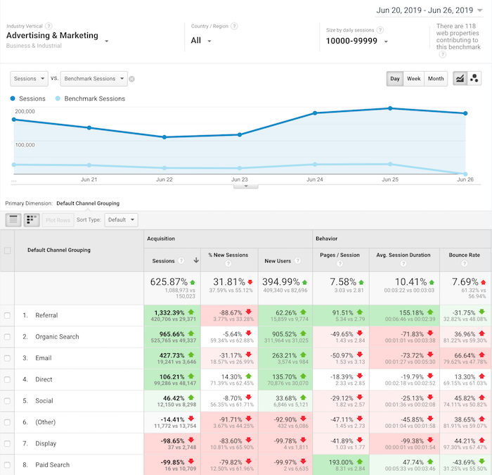
Within Google Analytics navigation, click on “Audiences” then “Benchmarking” then “Channels”.
Once you do that, you’ll see a report that looks like the one above.
Although you won’t have specific data on a competing URL, Google Analytics will show you how you stack up to everyone else within your industry.
I love this report because it shows you where to focus your time.
If all of your competitors get way more social traffic or email traffic, it means that’s probably the lowest hanging fruit for you to go after.
On the flipside, if you have 10 times more search traffic than your competition, you’ll want to focus your efforts on where you are losing as that is what’ll probably drive your biggest gains.
The other reason you’ll want to look at the Benchmarking Report is that marketers tend to focus their efforts on channels that drive the most financial gain.
So, if all of your competition is generating the majority of their traffic from a specific channel, you can bet that channel is probably responsible for a good portion of their revenue, which means you should focus on it too.
Report #3: Location, location, location
Have you noticed that my blog is available in a handful of languages?
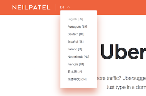
Well, there is a reason for that.
I continually look at the location report. To get to it, click on “Audience” then “Geo” and then “Location”.
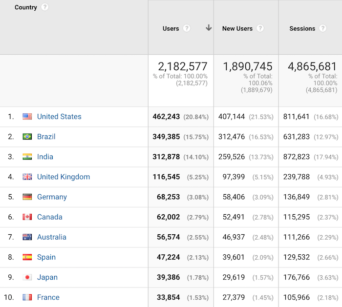
This report will tell you where the biggest growth opportunities are for your blog.
Now with your blog, you’ll naturally see the most popular countries being the ones where their primary language is the one you use on your blog.
For example, if you write in English, then countries like the United Kingdom and the United States will be some of your top countries.
What I want you to do with this report is look at the countries that are growing in popularity but the majority of their population speak a different language than what you are blogging on.
For me, Brazil was one of those countries. Eventually, I translated my content into Portuguese and now Brazil is the second most popular region where I get traffic from.
This strategy has helped me get from 1 million visitors a month to over 4 million. If you want step-by-step instructions on how to expand your blog content internationally, follow this guide.
Report #4: Assisted conversions
Have you heard marketers talk about how blog readers don’t convert into customers?
It’s actually the opposite.
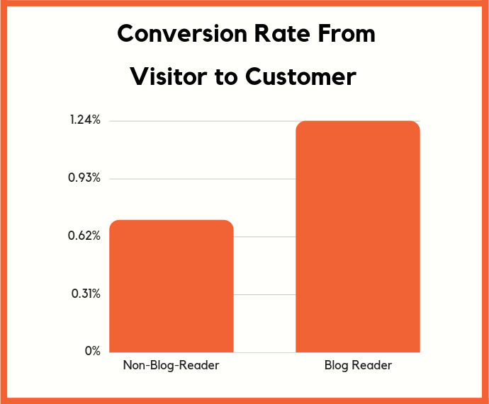
Those visitors may not directly convert into a customer, but over time they will.
But hey, if you have a boss or you are spending your own money on content marketing, you’re not going to trust some stats and charts that you can read around the web. Especially if they only talk about long-term returns when you are spending money today.
You want hard facts. In other words, if you can’t experience it yourself, you won’t believe it.
That’s why I love the Assisted Conversions Report in Google Analytics.
In the navigation bar click on “Conversions” then “Multi-Channel Funnels” and then “Assisted Conversions”.
It’ll load up a report that looks like this:
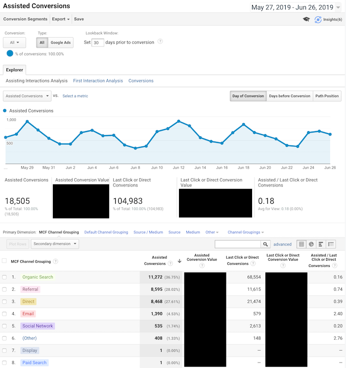
This report shows you all of the channels that help drive conversions. They weren’t the final channel in which someone came from but they did visit your blog from one of these channels.
In other words, if they didn’t visit or even find your blog from one of these sources, they may not have converted at all.
Now when your boss asks you if content marketing is worth it, you can show the Assisted Conversions Report to show how much revenue your blog helps drive.
The other beautiful part about this report is that it tells you where to focus your marketing efforts. You want to focus your efforts on all channels that drive conversions, both first and last touch.
Report #5: Users flow
What’s the number one action you want your blog readers to take?
I learned this concept from Facebook. One of the ways they grew so fast is they figured out the most important action that they want people to take and then they focused most of their efforts on that.
For you, it could be someone buying a product.
For me, it’s collecting a lead and that starts with a URL.
But I found that people interact with my blog differently based on the country they are coming from.
In other words, if I show the same page to a United States visitor and from someone in India or even the United Kingdom, they interact differently.
How did I figure that out?
I ran some heatmap tests, but, beyond that, I used the Users Flow Report in Google Analytics.
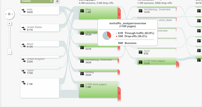
In your navigation click on “Audience” and then “Users Flow”.
Within the report, it will break down how people from each country interact with your blog and the flow they take.
I then used it to adjust certain pages on my blog. For example, here is the homepage that people in the United States see:

And here is the homepage that people from the United Kingdom see:

The United Kingdom homepage is much shorter and doesn’t contain as much content and that’s helped me improve my conversions there.
And of course, in the United States, my audience prefers something else, hence the homepages are different.
The Users Flow Report is a great way to see how you should adjust your site based on each geographical region.
Report #6: Device overlap
Blog content can be read anywhere and on any device. From desktop devices to tablets to even mobile phones.
The way you know you have a loyal audience isn’t just by seeing how many of your readers continually come back, but how often are they reading your blog from multiple devices.
For example, you ideally want people to read your blog from their iPhone and laptop.
The more ways you can get people to consume your content, the stronger brand loyalty you’ll build, which will increase conversion.
Within the navigation, click on “Audience” then “Cross Device” and then “Device Overlap”.
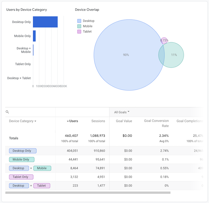
I’m in the B2B sector so my mobile traffic isn’t as high as most industries but it is climbing over time.
And what I’ve been doing is continually improving my mobile load times as well as my mobile experience to improve my adoption rates.
I’m also working on a mobile app.
By doing all of these things, people can consume content from NeilPatel.com anywhere, which builds stickiness, brand loyalty, and then causes more assisted conversions.
A good rule of thumb is if you can get the overlap to be over 6%, you’ll have a very sticky audience that is much easier to convert.
That’s at least what I can see with all of the Google Analytics accounts I have access to.
Report #7: User Explorer
To really understand what makes your blog readers ticket, you need to get inside their mind and figure out what their goals are and how you can help them achieve each of those goals.
A great way to do this is through the User Explorer Report.
Click on “Audience” and then “User Explorer”. You’ll see a screen that looks like this:
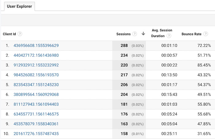
This shows you every user who visits your site and what they did. You can click on a client id to drill down and see what actions each user performed on your blog.
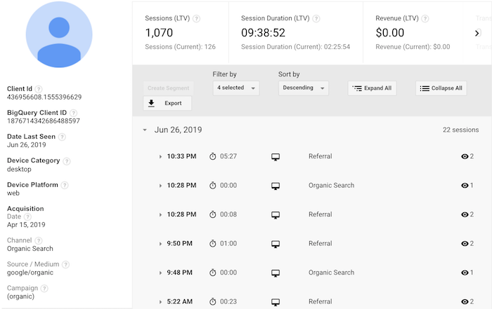
From there, you can click on a time to see exactly what they did each time they visited:
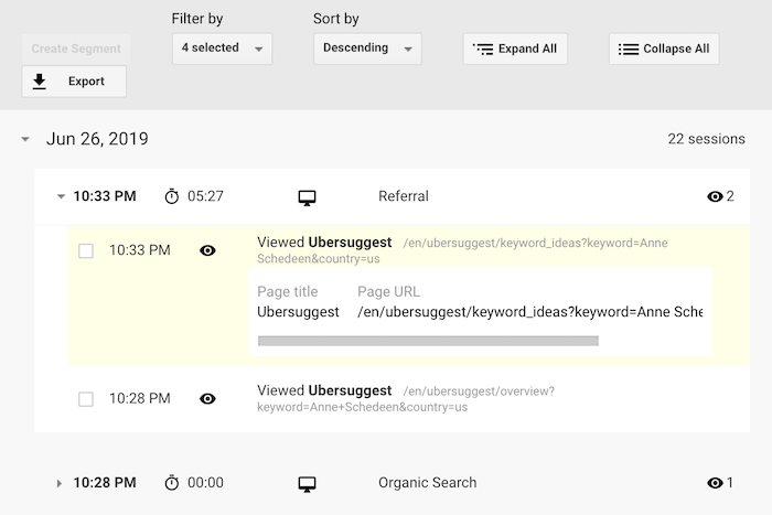
What I like to do with this report is to see how the most popular users engage with my blog. What are they reading? What pages are they spending the majority of their time on? What makes them continually come back? How did they first learn about my blog?
By comparing the most popular blog readers with the least popular, I am typically able to find patterns. For example, my most loyal blog readers typically find my site through organic traffic and then subscribe to my email list.
Then they keep coming back, but the key is to get them to opt into my email list.
That’s why I am so aggressive with my email captures. I know some people don’t like it, but I’ve found it to work well.
So I focus a lot of my efforts on building up my organic traffic over referral traffic and then collecting emails.
Look at the patterns that get your most popular users to keep coming back and then adjust your blog flow so that you can create that pattern more often.
Conclusion
Yes, you should look at your visitor count. But staring at that number doesn’t do much.
The 7 reports I describe above, on the other hand, will help you boost your brand loyalty, your repeat visits, and your revenue.
I know it can be overwhelming, so that’s why I tried to keep it to just 7 reports. And if you can continually improve your numbers in each of those reports, your blog will continually grow and eventually thrive.
So what Google Analytics reports do you look at on a regular basis?
The post 7 Google Analytics Reports That Show How Your Blog is Really Performing appeared first on Neil Patel.
from Blog – Neil Patel https://ift.tt/2Xiez3x
via IFTTT
