The following research was first published in the MECLABS Quarterly Research Digest, July 2014.
Product pages are a staple in nearly every business website in existence. Oftentimes, they represent the final hurdle before a prospect clicks “add to cart” or fills out your form. Therefore, if we can improve the performance of these key pages, we can see substantial increases in conversion and sales.
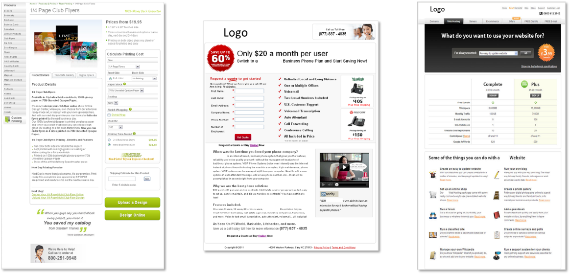
Figure 1.1
Look at the three pages in Figure 1.1. What do they have in common?
Granted, there could be multiple correct answers to this question. However, one similarity may have escaped your notice: anxiety. In every page, especially product pages, certain elements raise the anxiety level of the prospect. This should concern you for two very good reasons:
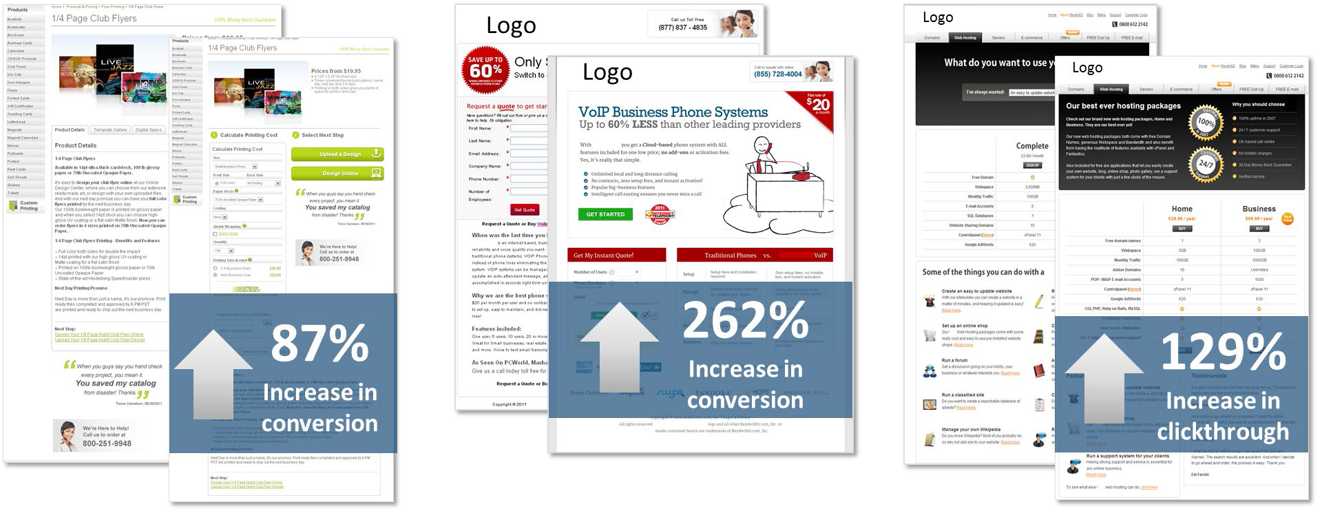
- In our experience, when we correct for anxiety, we see gains.
- The needed correction often involves only simple and small changes.
Figure 1.2
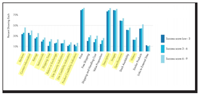
In the Marketingsherpa E-commerce Benchmark Study, we found ecommerce marketers are employing a variety of page elements that can be used to reduce anxiety (Figure 1.3).
Figure 1.3 – Page elements used by successful and unsuccessful ecommerce companies on product pages.
Anxiety-reducing elements highlighted.
We tested four of those minor elements to correct specific points of anxiety on the same page and to help us understand the interplay of anxiety and the corrections we make.
Experiment: Which anxiety correction had the biggest impact?
The experiment sought to improve the sales of e-books from a well-known retailer in the market. Our approach was to test four different variations of the product page against the control, with each treatment correcting for a different form of hypothesized anxiety:
- Version A: Adjusting for anxiety regarding site security (Figure 1)
- Version B: Adjusting for anxiety that the e-book would not be compatible with their reading device (Figure 2.2)
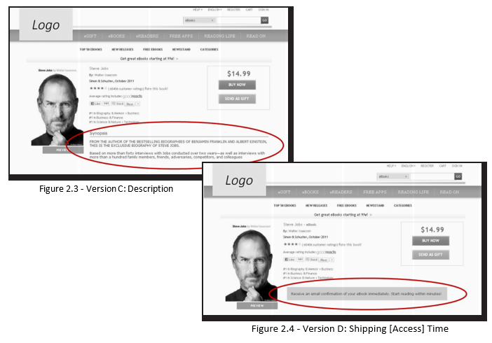
- Version C: Adjusting for anxiety that the e-book would not be of interest or value to them (Figure 2.3)
- Version D: Adjusting for anxiety regarding the shipping time frame of the e-book (Figure 4)
What does your instinct tell you? Which, if any, of the corrections would most improve conversion?
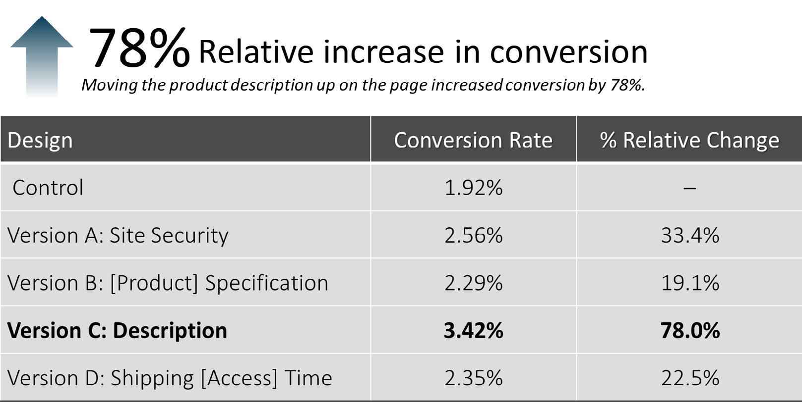
The result: Version C was the winner, increasing conversion by 78%
After our complete analysis, we discovered three key principles as to why Version C was victorious, as well as what we can learn from the success of the other treatments.
How to correct for anxiety on product pages
Key Principle #1. Every element we tested on the page overcorrected some type of customer anxiety, with various elements performing more effectively than others.
It is crucial to note that while Version C produced the largest increase, each treatment page outperformed the control. In other words, in every case where we took steps to alleviate customer anxiety, conversion went up. These results underscore the importance of this effort, as well as the relative ease with which gains can be achieved.
It is important to note the use of the term “overcorrect” here because anxiety is not always rational. You may know that flying in a plane is statistically safer than riding in your car, but, for many of us, our anxiety level is much higher in an airplane. Is it rational? No. Is it still very real? Yes. You may see no reason for concern about a given aspect of your page, but that does not mean anxiety is absent for customers.
Key Principle #2. The effectiveness of each corrective is directly related to how it matched the specific concern in the mind of the customer.
While all cases of anxiety correction produced lifts, one change impacted conversion significantly more than the others. Version C overcorrected for a concern that was most immediate to the prospect at the time. Therefore, it is crucial to discover the specific anxieties your customers are experiencing on your product pages. Among a plethora of options, we have found some standard minor corrections you can make for specific anxieties:
Source Correction
Product Quality Anxiety ———————————> Satisfaction Guarantee
Product Reliability Anxiety —————————–> Customer Testimonials
Website or Form Security Anxiety ——————-> Third-party Security Seals or Certificates
Price Anxiety ————————————————> Low-price Guarantee
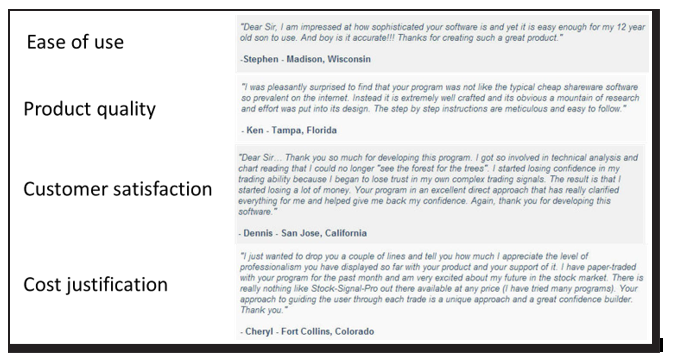
Additionally, customer testimonials can be used to alleviate several different concerns. You want to choose testimonials that specifically deal with the point of anxiety the customer is experiencing (Figure 3.1).
Figure 3.1 – Examples of testimonials addressing specific points of customer anxiety
Key Principle #3. Location plays an important role. You can more effectively correct anxiety by moving a corrective element within close proximity to where the concern is experienced.
As in real estate, location is of utmost importance when correcting for anxiety on product pages. If you are correcting for form security concerns, you want the correction element right where the customer must click to submit the form. In Version C, we simply added a plot synopsis above the fold rather than farther down the page, and it led to the biggest jump in conversion. It’s not always about creating new elements, but instead, placing existing ones in a location that better serves the thought sequence of customers.
Overcorrecting for product page anxiety
Anxiety is lethal to product page conversion. It is always present, and it is not always rational. By overcorrecting for predictable or discovered customer anxiety, you will empower more prospects to complete the sale.
The effectiveness of an anxiety corrective is dependent on two essential factors:
Specificity – How specific is the corrective to the source of anxiety?
Proximity – How close is the corrective to the moment of concern?
If you can identify the main cause of anxiety on the page and implement an overcorrection element in close proximity, you are on your way to higher conversion and more sales.
Related Resources
Landing Page Optimization: Addressing Customer Anxiety
MECLABS Research Catalog — Learn about other experiments performed in the MECLABS Laboratory
Conversion Rate Optimization — Read how anxiety plays a role in building the “Ultimate Yes” to conversion
Online Testing: 6 Test Ideas To Optimize The Value Of Testimonials On Your Site
To learn more about anxiety and the factors that affect it, enroll in the MECLABS Landing Page Optimization Online Certification Course
The post Product Pages Tested: How carefully pinpointing customer anxiety led to a 78% increase in conversion appeared first on MarketingExperiments.
from MarketingExperiments https://ift.tt/2v161SE
via IFTTT
