Blogging is arguably the best content creation strategy for promoting your website.
Publishing blogs on a regular basis boosts your site traffic, adds SEO value, generates leads, helps you build backlinks, and increases your internal linking opportunities. Blogging gives your website visitors a reason to keep coming back to your site and stay on your pages for longer periods of time.
Furthermore, blogs are highly shareable. It’s a great way to increase your exposure on other platforms.
The list goes on and on. I could sit here all day and talk about the benefits of blogging. That’s why I publish so many blogs on a regular basis and have done so for years.
So for those of you who already have an active blog, that’s great news. You’re already on the right track.
But now it’s time to take your blog to the next level. You can use this part of your website as a lead generation tool. The best way to do that is by building an email list.
It doesn’t matter what type of website you have; this strategy can be applied. Some of you might have an ecommerce site with a blog as a supplemental page. Others may have a website that’s strictly dedicated to blogging. The rest of you probably fall somewhere in between.
Regardless of your unique situation, you need to use your blog to get email subscribers. Here’s why.
Email marketing yields a massive ROI. Studies show that marketers average a $44 return for every $1 they spend on email campaigns. That’s a 4,400% return!
People on your email subscriber list will spend more money than your other customers.
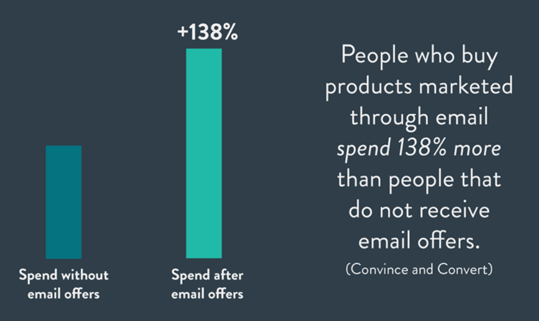
Plus, seemingly everyone on the planet uses email. Well, at least everyone who is landing on your blog pages.
According to Statista, there will be roughly 5.6 billion active email accounts worldwide by the end of 2019. In the United States, 91% of all Internet users have an email account.
Here’s something else to consider. 99% of people with email account check their messages on a daily basis. 73% of Millennials say that email is their preferred method of communication from businesses.
Simply put, email marketing works.
But before you can benefit from these campaigns, you need to build your list. That’s what inspired me to write this guide. I’ll show you how to turn your blog into an email opt-in machine.
Choose an email marketing service
Before you can collect emails, you need to be signed up for an email marketing service.
You won’t be sending out individual messages or bulk emails manually—that’s just crazy talk. Email software makes it easy for you to collect, manage, and contact your subscribers.
Plus, you’ll gain valuable insight on the success of your campaigns. Email marketing services will tell you things like:
- Open rates
- Bounce rates
- Spam rates
- CTR
- Unsubscribes
For those of you who already have email marketing software, you can skip over this part; unless of course, you want to switch providers. These are some of the top email marketing options on the market right now:
- Constant Contact
- MailChimp
- ActiveCampaign
- GetResponse
- AWeber
There are dozens of other legitimate email marketing services out there for you to consider, but they are all extremely similar.
Pricing is typically based on the number of subscribers that you have on your list. As the list grows, the price increases as well. Don’t worry; this is a good thing. You want to have a huge email list. Plus, as we said earlier, you can expect a high ROI from your email marketing campaigns.
Choosing your email software is based on personal preference. You might want to consider a free trial to test out the navigation, user experience, and features before you finalize your decision.
But for the most part, you really can’t go wrong if you choose one of the options that I listed above.
Create an opt-in form
Now that you’ve signed up for a service, you need to create an opt-in form to place on your website.
You should definitely have a dedicated landing page on your website for email sign-ups. But you’ll also want to have sign-up forms on other pages of your site as well, including your blog main page, and every blog that you publish.
You can create these forms through your email software. Again, the instructions and wording will vary slightly depending on which service you’re using. But it should be very straightforward and easy to find.
Then just generate a shortcode of the form to embed on your website. You’ll probably create several of these, which we’ll talk about in greater detail shortly.
Here’s a basic example from Search Engine Land of what the final version of these opt-in forms will look like on your blog.
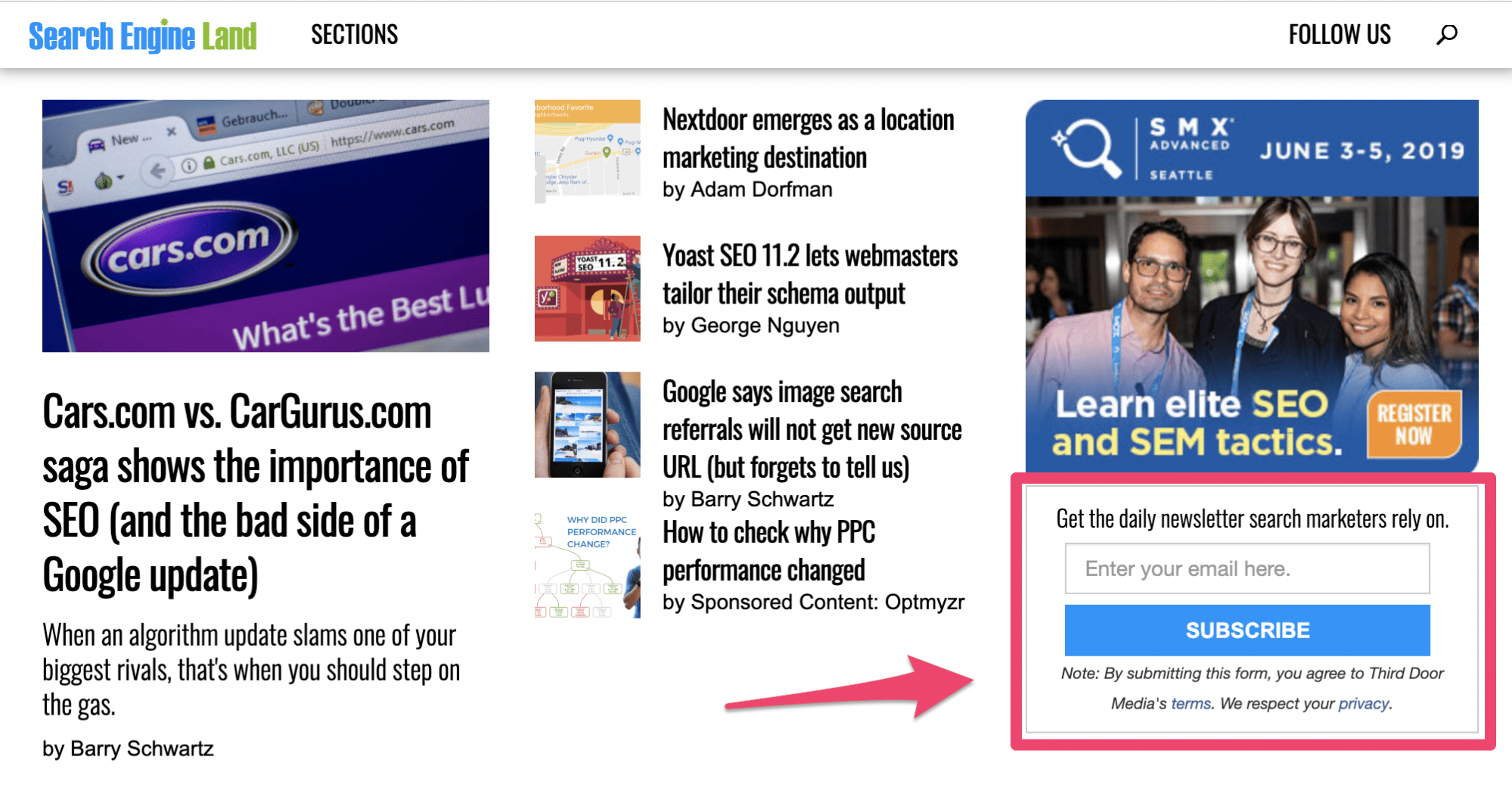
This screenshot is from the blog homepage.
It’s very simple. On the right side of the screen, there’s an option for visitors to sign up for their newsletter.
The only piece of information required to join this mailing list is an email address. Short opt-in forms increase the chances that more people will sign up.
If your forms require a first name, last name, email address, phone number, zip code, favorite color, and mother’s maiden name, it feels like you’re one step away from asking for the person’s social security number. That’s overkill.
Think about it. All you really need is their email address.
Other information makes it easier for you to personalize the customer experience, but you can worry about that down the road by asking them to create a user profile or account. For now, just focus on getting them to subscribe.
Search Engine Land continues to apply this strategy on all of their blogs.
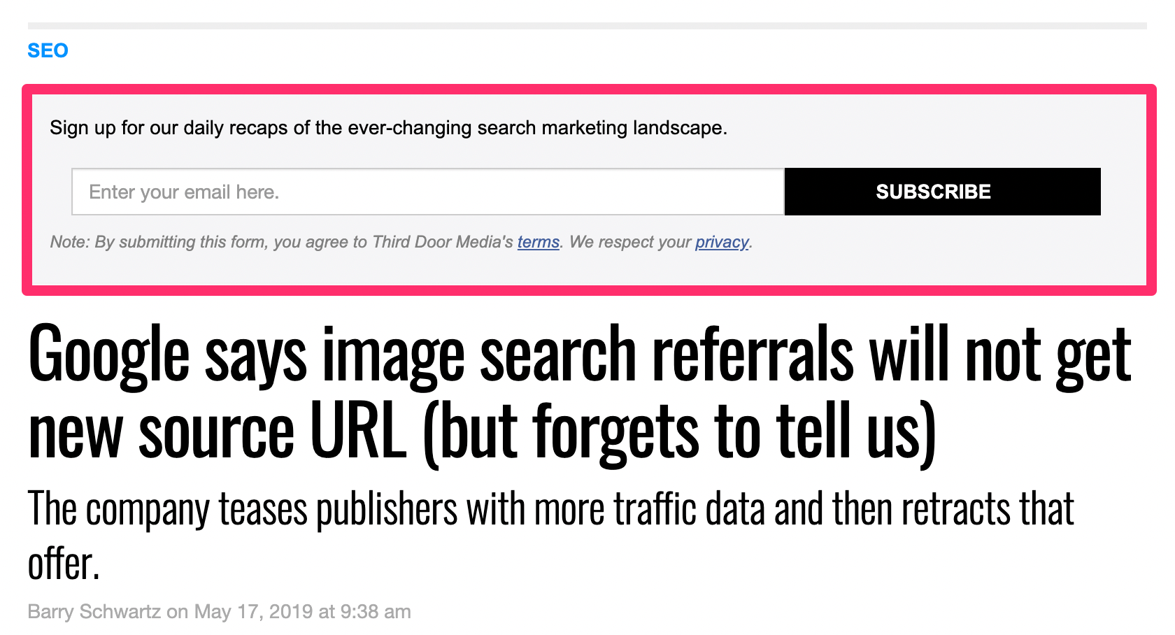
Here’s what it looks like when you click on an individual blog post.
Before the title, they give you another chance to opt-in through a simple form. As you can see, it’s not quite the same as the first form, but it’s very similar.
They don’t stop here either. There is another opt-in form at the bottom of each blog post as well.

By putting these opt-in forms all over the blog, it increases the chances that people will sign up.
Notice what all of these forms have in common. None of them are obtrusive.
Website visitors can still navigate and read without having to deal with any pop-up windows, sliders, or anything else that could ruin their experience.
As I said earlier, you’ll want to create multiple versions of your opt-in form so it’s easier for you to track. Eventually, you’ll run tests to see which ones are performing the best. But I’ll talk about those tests later on.
Add an incentive
Why should someone sign up to get emails from you?
It’s a fair question. Sure, you want their email address so you can monetize them, but what are they actually getting in return?
If you don’t give people a reason to sign up, they probably aren’t going to.
Think about how many emails you get on a daily basis. If it’s anything like me, you’re getting hundreds. In fact, the average office employee receives 121 emails each day!
Not everyone will be so willing to just subscribe to every opt-in form they see without thinking twice about it. But by adding an incentive, it can dramatically improve your chances.
Here’s a great example from the Conversion XL blog.
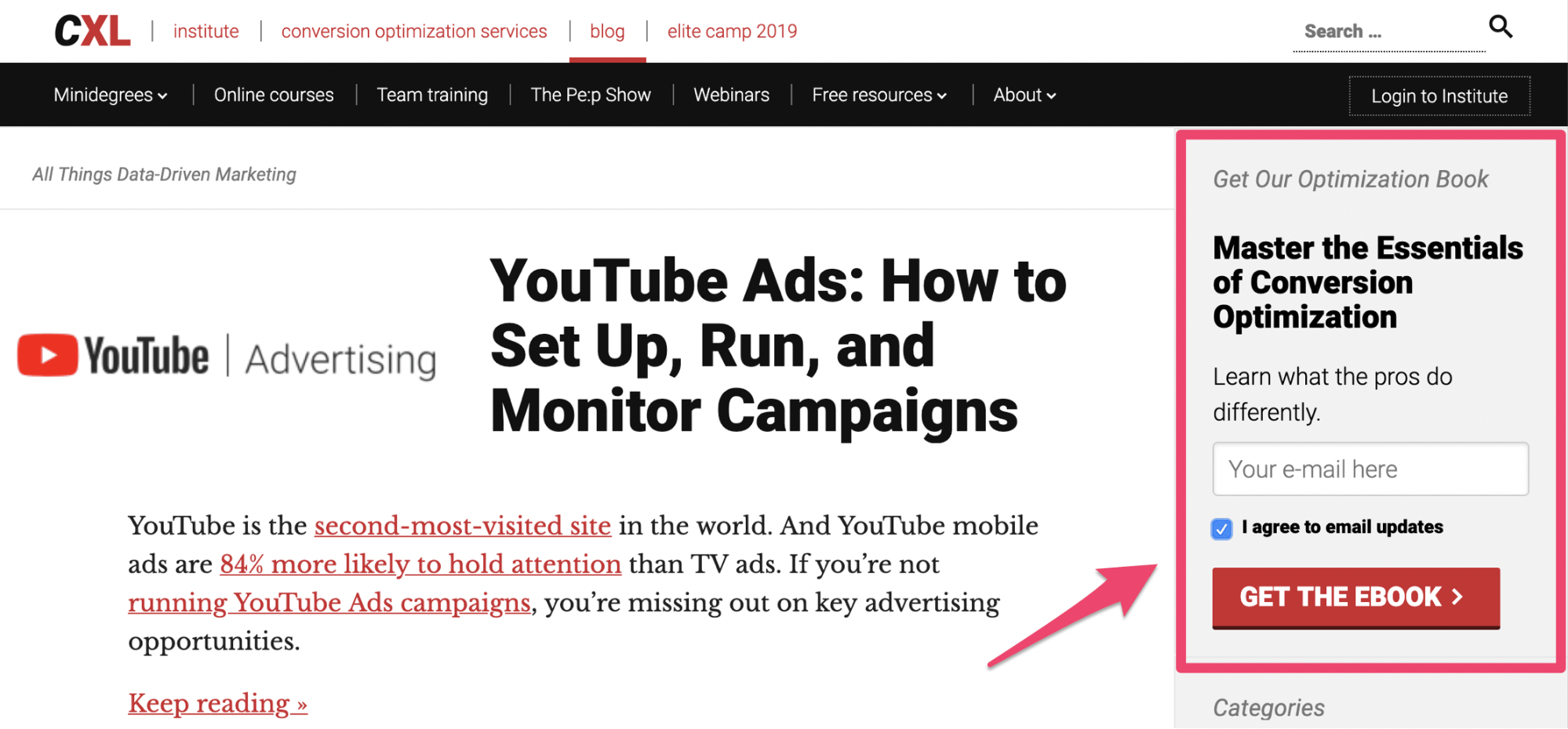
This simple sign-up form is similar to the examples we saw before.
However, this one is pitching the website visitor from a different angle. Rather than just saying “subscribe for weekly updates” or something along those lines, they are offering a free ebook.
As you can see, the book is about mastering conversion optimization. In order to get the free ebook, the person has to provide their email address. There is a box below that line saying the user will also be getting updates via email.
There are tons of ways for you to employ this strategy on your blog as well.
For example, let’s say you operate an ecommerce site. On your blog posts, you can pitch a discount code for joining an email list. Offer a dollar amount or percent discount off of the visitor’s next purchase.
Just think of something that goes beyond “sign up.” Learn how to craft the perfect value proposition and add it to your opt-in forms.
Use a sticky bar
If you don’t want an opt-in form in the sidebar or within the content itself, like the previous examples we looked at, you can always use a sticky bar as an alternative.
As the user scrolls through your blog, the sticky bar will remain in place at the top of the page.
This is another non-obtrusive way to collect email addresses with your blog. Here’s an example of how HubSpot uses this strategy.
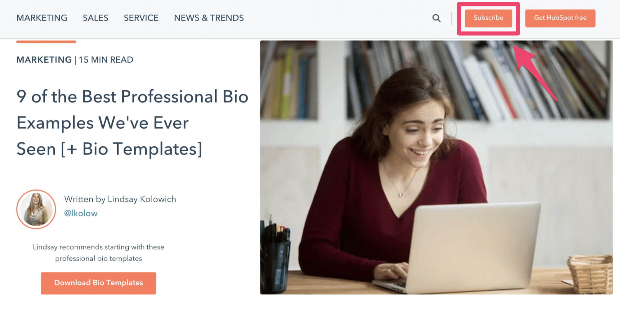
The “subscribe” button is at the top of every blog post.
So this will always be in view as people read through the blog. If you click on this button, you’ll see the following options:
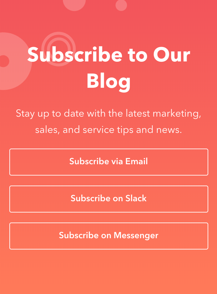
Subscribe via email is the top option.
Once someone clicks on this, they’ll be provided with an opt-in form similar to the ones we saw earlier.
Keep in mind, these added steps may not generate as many subscribers as other methods. But with that said, website visitors who go through this process will be more qualified leads. You know that they’re interested in getting emails if they complete the extra steps.
Check out my guide on creating a double opt-in landing page as a way to qualify your leads as well.
This type of sticky bar is just another approach for you to consider.
Create a visual CTA
Instead of a traditional opt-in form, you could try making something that’s a little bit more inviting to draw attention to your email list.
In this case, a custom visual image with a CTA should do the trick. You can put this at the top or bottom of your blog posts.
Here’s what this looks like on the IMPACT blog.
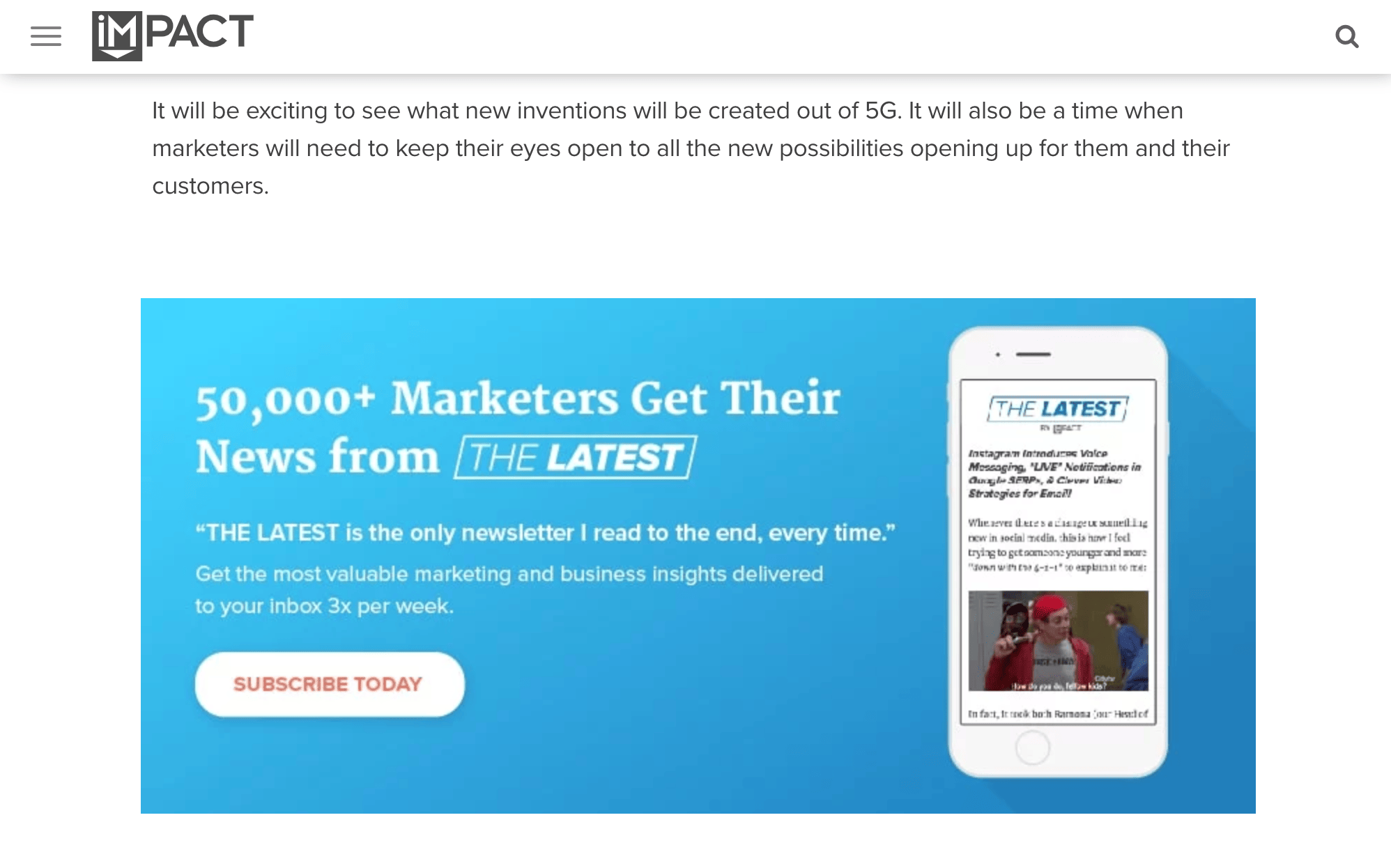
Notice how this looks different from the other examples we’ve looked at so far.
The entire visual is dedicated to getting subscribers. It includes a photo, value proposition, and CTA button. IMPACT is enticing readers to sign up by power in numbers.
Psychologically, if 50,000+ people are doing something it must be good, right? That’s the idea behind this strategy.
I also like how the image shows the newsletter on a mobile device. It’s very relatable to the audience. This tells the story of someone who can get updates to their phone, which is super convenient.
Since 61% of all emails are opened on mobile devices, this makes a ton of sense. Overall, this is a creative way to draw attention to an email list on a blog post.
Run A/B tests
Every element of the email opt-in forms on your blog should be tested.
- Size
- Color
- Position
- Wording
- Font
Start with one idea, then move on to the other. The idea behind A/B testing is that everything can always be improved. You might think you have the perfect opt-in strategy, but that’s not always the case.
Some of you will be surprised to learn that a subtle change can drastically increase your sign up conversion rates.
Let me take a moment to circle back to what we discussed earlier in terms of creating multiple opt-in forms. This makes it easier for you to test out different elements and variations.
For those of you who plan to take an approach like Search Engine Land and place forms in multiple areas throughout the blog, you can figure out which one is performing the highest. You may ultimately decide that one of them can be eliminated.
Then you can continue A/B testing the most popular forms to ensure that it converts at the highest possible rate.
Conclusion
You’re not getting the most out of your blog until you start using it as a tool for building an email list.
The first step to implementing this strategy is choosing an email marketing software. Then you’ll use that software to create opt-in forms to place on your blog.
From here, it’s just a matter of figuring out how you’re going to present that form to your website visitors. Adding an incentive, using a sticky bar, or creating a visual CTA are just three ways to drive conversions.
You’ll ultimately want to test out all of your strategies make sure that your blog is performing at the highest possible level.
from Quick Sprout http://bit.ly/2XfVr7k
via IFTTT
