You already know infographics work. The question is: how can you create one that will be popular? If you are like me, you probably don’t have a design bone in your body. But don’t worry; that shouldn’t stop you.
When I first started creating infographics, I used to hire firms like Column Five, who are great at creating them. The cost, however, was just a bit too high for a startup. So eventually, I had to learn the whole process from A to Z.
Here are the steps you need to follow to create a popular infographic:
Step #1: Find your data source
The most important element in creating an infographic is your data source. It doesn’t matter how pretty your graphic may be. If the data within the graphic sucks, it won’t do well.
So how do you find good data sources? The easiest way is to browse all the blogs within your space and look for the ones that have data within them. From there, sort the posts by the number of tweets and likes. The posts that contain the most data and are the most popular tend to be the ones that do well as an infographic.
If you can’t find popular posts that are data rich, you’ll have to come up with your own ideas and find your own data sources. Sure you can try to hire someone on oDesk to help you out, but they probably won’t do a great job.
You yourself are going to have to create data sets through research or hire a professional blogger for a few hundred bucks to create the data set for you. You can usually find these bloggers by posting a job listing on Problogger.
Step #2: Finding a designer
Everyone has their own opinion on what a great infographic looks like. So, how do you find a designer that can please everyone? Sadly, you can’t please everyone, but you can please the majority.
The thing with designers is that their biggest critics are other designers. So if you can find a designer that other designers love, you’ll be in good hands.
Through sites like Dribbble and Behance, you can search for the word “infographic” to find designers who know how to create infographics. You can then look to see which ones have the most likes, favorites and comments as those designers are most likely respected by other designers.
Once you have a list, hit them up and ask how much it would cost for them to create an infographic. Most of them won’t have a flat rate; instead, they will have an hourly rate of $50 to $85. It may seem like a lot of money, but they can typically create a graphic within 5 to 7 hours. So you should only be paying anywhere from $250 to $595 per graphic.
Step #3: Create a wireframe
Before you create an infographic, you need to lay out the data points into a story. Each data point should flow into the next one. And there should only be 6 main points/parts to the graphic, or else it will be too data rich.
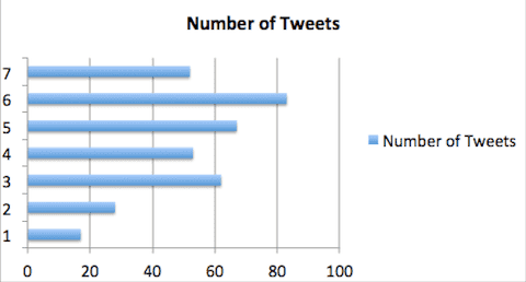
What I’ve found is that when a graphic has 6 main data points, it tends to get more tweets compared to infographics that have 5 or 7 main data points.

Once you’ve laid out the data, you now need to work with your designer to think of ways to represent the data in a visual format that is easy to understand. Whether it is through graphs, drawings or visual examples, the data points need to be really easy to understand. If they aren’t, it defeats the point of creating an infographic.
After you’ve laid it all out, you want to give this set of requirements to your designer:
- Infographics need to be vertical – by analyzing 100 horizontally designed infographics versus 100 vertically design graphics, I found that vertical graphics are tweeted 28.9% more and are 41.7% more likely to be embedded into other websites. If you think about it, it makes sense… most websites are designed vertically, not horizontally. That’s why most people prefer embedding vertical infographics.
- Use complementary colors – graphics that use complimentary colors versus a lot of random colors tend to get 14.1% more tweets and 10.6% more likes.
- Use large fonts – although this seems like common sense, a lot of designers try to cram a lot of information in a graphic by reducing font size. Graphics with large fonts tend to get 38.5% more tweets and 54% more likes.
- Use custom illustrations – when your designer uses illustrations to explain the data versus simple graphs and charts, the infographic tends to get 52.7% more tweets and 72.8% more likes.
- Go 3D – you don’t have to do this, but if you are able to create your illustrations in 3D, like this graphic and this one, they are more likely to be shared around the web. The only issue is that it costs around $4000 to produce a 3D infographic, which is a bit too expensive when you think about how many visitors and links an infographic usually generates. On the flip side, you could have your designer learn how to create 3D infographics versus outsourcing it.
- Include your logo – infographics can really help brand your company. Make sure you include your logo somewhere on the graphic. If you also got your data from a 3rd party source, make sure you cite the URLs at the bottom of the graphic.
Step #4: Come up with a headline
No matter how good your data or infographic is, if the title of your infographic sucks, no one will read it. It’s impossible for me to come up with a title for your infographic, but I can teach you what works best.
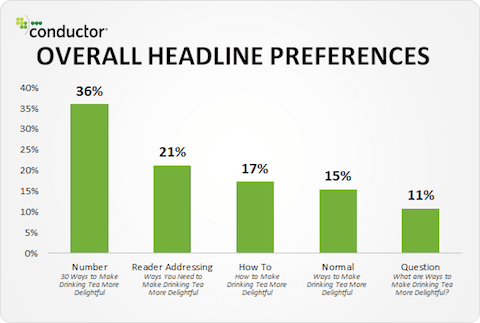
Nathan Safran recently wrote a blog that broke down what headlines people click on the most.

As you can see from the image above, 36% of the people prefer number-based headlines. A good example of this is “15 ways to boost your search engine traffic”. 21% of the people prefer reader-addressing headlines like “Why you ought to boost your search engine traffic”. And 17% prefer how-to headlines such as “How to increase your search engine traffic”.
Based on this data, you should ideally create number-based or reader-addressing headlines for your infographics.
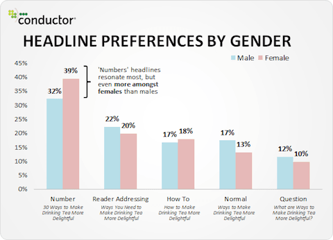
Even when you break down the results by gender, it’s still clear that people prefer number-based headlines:

Hopefully that helps you come up with a headline, but if you are still struggling, follow tip number 1 in this blog post.
Step #5: Promotion
Before you start promoting your infographic, make sure you create an embed code so that people can easily share the infographic on their websites. If you are using WordPress, you can use the embed code generator plugin.
Once you have an embed code, you should create a list of all the blogs that write about topics related to your infographic. Once you have a list, you should email each of them using this simple template:
Subject: [insert the name of your infographic] infographic
Hey [insert their first name],
I hope your [insert the day] is going well. I noticed your blog and thought you might want to check out this infographic we just rolled out about [insert the topic of your infographic]. Check it out when you have a minute and let me know what you think.
[insert url]
The Embed code is located under the infographic for an easy copy and paste (just in case you wan to share it with your readers)
Thanks for taking a look! Hope it was of interest to you,
[insert your name]
The template above may seem boring, but roughly 8% of the people you email should be embedding your infographic. If you can’t get at least 8%, it either means your infographic isn’t that great or that you are emailing sites that are too big like Huffington Post. You should ideally be targeting blogs that have a PageRank of 6 or lower as those blogs are more likely run by 1 individual versus a company that moves really slow.
In addition to that template, you can also submit your infographic to the following directories:
- http://www.infographicsarchive.com/submit-infographics/
- http://submitinfographics.com/
- https://ift.tt/1c9bivh
- http://visual.ly
- http://reddit.com/r/infographics/
- http://www.nerdgraph.com/submit-infographic/
- http://www.infographiclove.com
Lastly, you should use the search feature on Twitter to find users who tweet about topics related to your infographic and direct-message them asking if they could tweet your infographic to their audience. Most of these users will ignore your direct message, but around 5% of them will tweet it to their audience. If you are unable to get 5% to tweet it, it means that your infographic isn’t great or that you are direct-messaging users with over 10,000 followers. As long as you direct-message people with under 10,000 followers, you’ll be fine.
Conclusion
By following the steps above you should be able to create an infographic that does well. And if you create a few infographics that don’t go viral, don’t worry about it. It usually takes a few tries to get it right even if you know what you are doing.
Learn from your audience as they may prefer infographics on certain topics over others. As long as you do this, you should be able to generate traffic and backlinks to each of your infographics.
from Quick Sprout https://ift.tt/2HLchXC
via IFTTT
