
Rarely do people read content from beginning to end.
Maybe it’s because of our “microwave,” instant gratification culture. Maybe it’s because millions of other articles are vying for people’s attention.
Or maybe it’s because reading from screens takes about 25% longer than reading from paper. Research has even indicated that readers experience an unpleasant feeling when reading online text.
Whatever the case may be, it’s crucial to take the right approach when writing for online readers—a new approach.
There’s a certain art to digital writing that differs significantly from writing traditional paper text.
If you expect to convert more of your audience into actual customers, you need to crack the code.
You need to switch up your game plan.
In my early days of writing, I didn’t realize this. I had an eye for visual appeal, but I was unsure of how this applied to blogging. There I was, blogging away every day without realizing how people were viewing my articles.
Now, I have a better idea of how people interact with written content online.
What you’re viewing right now is a result of my research and testing.
It’s about scannable content.
What you’re up against
First, let me set the stage for the idea of scannable content.
Did you know that 55% of people spend fewer than 15 seconds actively on a page?
That’s not ideal when your goal is to keep visitors exploring and to get them interested in your product/service/brand.
You’ve got only a small window to grab their attention and motivate them to read your content. And it’s not realistic to expect visitors to read it in its entirety. Hardly anyone does that anymore.
In fact, research on the way people read websites found that only 16% of their subjects read a webpage word by word. Most participants—79% of the test subjects—scanned new pages they came across.
The takeaway is that less than two out of 10 people will actually read an entire blog post. The vast majority will be highly selective about what they read and will merely scan through it.
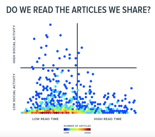
Another interesting thing is that just because content gets shared doesn’t mean reading engagement increases.
Chartbeat analyzed 10,000 articles shared on social media and found “that there was no relationship whatsoever between the amount a piece of content is shared and the amount of attention an average reader will give that content.”
This graph illustrates this phenomenon:
What’s the solution?
It’s simple. You need to become adept at writing scannable content. This is what the modern digital reader is looking for (whether they consciously know it or not).
What exactly is scannable content?
“scannable content is short, sweet and to the point. Sentences and paragraphs are brief. Bold text and bullet points highlight key points. Links to other content are used to provide your readers with supplemental information.”
This writing format is geared toward 21st century readers, who primarily read content on a screen as opposed to a book or any other print publication.
It’s specifically tailored to streamline the way readers absorb information to keep them interested.
And it works.
Dr. Jakob Nielsen even found that scannable online content boosted readability by 57%. If you’re used to conventional writing (e.g., large blocks of text), you need to throw that approach out the window.
You need to embrace scannability. Fortunately, there’s a step-by-step process you can follow.
1. Write short paragraphs
You might have noticed that I prefer to use short paragraphs in my content.
Really short. In fact, a lot of my paragraphs are only a single sentence in length.
That’s not by accident.
I would say that this technique is perhaps the most important when it comes to creating scannable content.
Allow me to provide you with an example. Here’s a large, ugly block of text:
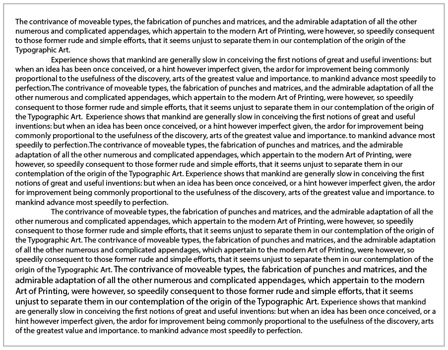
You probably find yourself straining your eyes to read through it.
And here’s some text broken down into much smaller, more digestible chunks:
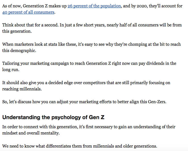
Which do you find more aesthetically pleasing and easier to read?
I would bet you’d say the second one.
It’s broken up in a way that allows you to move seamlessly from one point to the next without it taxing your brain in the process.
The key is to include only one idea per paragraph and make it a maximum of four sentences. However, I try to stick with just one to three.
Remember that white space is your friend, so use plenty of it to break up text into smaller chunks.
2. Keep your sentences short
There’s no reason to drag your content out by writing long-winded sentences and using PhD-level vocabulary words that only the academic elite will understand.
You need to remember that your audience will consist of a lot of different readers with varying levels of education (and vocabulary).
If readers have to continually check the dictionary just to understand what you’re trying to say, it defeats the whole purpose.
That’s why you’re better off keeping your sentences fairly brief and not getting overly wordy just for the sake of sounding smart.
As a rule of thumb, any more than 16 words per sentence is too long.
Be practical, and try to simplify complex information as much as possible so that everyone can understand it. “Dumb it down” if you have to, but keep the value high.
3. Follow the four-syllable rule
A simple strategy to ensure your writing isn’t wordy is to avoid using any words with more than four syllables.
For instance, you would want to stay away from:
- Unintelligibly
- Appropriation
- Lackadaisical
You get the idea.
Your readers should be able to maneuver their way through your content without becoming exhausted during the process.
4. Use subheaders
Most readers won’t be interested in every single point of your article.
Instead, most readers would prefer to bounce around to seek out the few pieces of key information that interest them the most.
You can accommodate this desire by including several subheaders throughout the body of your content.
This breaks it down in a logical way that makes your content “flow.”
If you read posts from any of my blogs including Quick Sprout, Crazy Egg, and Neil Patel, you’ll notice that I take full advantage of subheaders.
They serve as a quick and easy way to locate main points and accelerate the scanning process. Just make sure that each subheader encapsulates what the following paragraphs cover.
Also, try not to get too clever or cute about it. Instead, keep your subheadings simple and practical.
5. Use bullet points
Who doesn’t love bullet points? I know I do.
They seamlessly break down information so readers can extract key data without having to think too much about it.
Here’s a good example of bullet points used to perfection:

Rather than writing out your list in a sentence, separating your points by commas, create a bullet list, and your readers will love you for it.
6. Sprinkle in images
Images serve two distinct purposes.
First, they serve as an eye candy and fulfill your reader’s subconscious desire for visual stimuli.
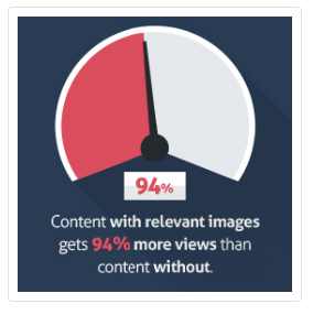
Second, they provide periodic breaks between blocks of text.
Both help keep readers on your site for longer and encourage them to engage with your content.
I try to throw in an image at least every few paragraphs or so because I know the images I use enrich my content with information and add validity to my points.
I recommend using data-driven pictures (like graphs) or images to serve as examples, rather than merely using “placeholders,” because these will really add to the overall depth of your content.
7. Add links to external sources
To add authority and credibility to your writing, it’s a good idea to include quotes, data points, graphs, etc. from reliable sources.
I do this with pretty much every piece of content I write. It backs up my argument and proves that I’m not just pulling statistics out of thin air.
But since it’s not practical to include every gory detail, you’ll want to simply include a key sentence or two and insert a link to the original source.
If your readers wish to learn more about a certain topic you cover, they can simply visit the link. As a result, this won’t bog down your content with extraneous information.
8. Create lists
I love lists.
There’s something about breaking down content in a logical, sequential order I find satisfying. It keeps things neat and tidy.
Apparently, I’m not alone.
A study performed by Buzzsumo and Okdork analyzed over 100 million articles to determine which received the most shares. According to their findings, lists were the second most shareable format (only infographics were shared more).
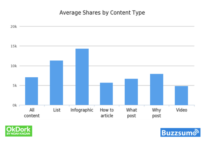
If you really want to maximize the scannability of your content, use plenty of lists.
I’m not saying do this for every single piece of content you create because it will become redundant, but 50% or so should be a good number to shoot for.
Lists are a great weapon to have in your arsenal because they lend themselves to being scanned naturally.
Conclusion
Creating scannable content has arguably never been more important than it is today.
By accommodating the modern online reader and presenting information in a streamlined, visually appealing way, you can improve the reader’s experience.
This technique is also effective for preventing “cognitive overload,” which can drain a reader’s mental energy.
The end result is happier readers who spend more time on your site and who are more likely to convert.
from Quick Sprout https://ift.tt/2FCTnyj
via IFTTT
