
Google Analytics (GA) is a digital marketer’s best friend. I use it all the time to check metrics, spot trends, and see what type of content my audience appreciates the most.
Of course, there are other tools you could use to analyze your metrics, but they’re not as valuable as GA for two reasons.
First, Google Analytics is free. The price can’t be beat.
Second, Google Analytics is a tool designed by the company that also gave us the most popular search engine in the world. That means it can (and does) provide you with information about the browsing and search history of the people who visit your site.
Beyond that, Google Analytics offers a wealth of information you can use to improve your reach. GA makes it easy to check conversion rates, view your visitors’ demographics, discover the way people follow the links within your site, and analyze your e-commerce funnel.
Basically, Google Analytics is awesome.
Obviously, I use several tools to track my data and analyze it. But I strongly recommend Google Analytics.
If you’re a digital marketer, you need to know a thing or two about Google Analytics.
That’s why I wrote this article.
I want to give you three simple, straightforward, and actionable tips that will allow you to create better content.
Here’s the thing about analytics: all those numbers and metrics serve a purpose. They tell a story. They give you instructions.
They tell you how to become a better marketer.
The purpose of analytics is to show you what’s going on with your marketing and what needs to change.
Marketing isn’t a guessing game. You shouldn’t have to wonder: Is this working? You should know. And you should know because of data.
So, do you want to know what’s working and what’s not working with your content marketing?
The three numbers I’m about to show you do just that. They give you an accurate read of user behavior and tell you what you should do next.
1. Average time on page
It’s this simple: if you’ve got great content, people will read it.
And reading takes time.
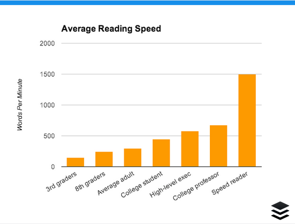
Speed readers can buzz through an article like this in about two minutes.
That’s insanely fast.
For most—mere mortals—this article will take 10-15 minutes to read.
If you want to find out how fast you read, take a test at myReadSpeed.com.

Google Analytics gives you some insight into how your audience is reading. No, it’s not going to test their reading speed.
However, it is going to give you information regarding their time and behavior on the page.
This information comes from Average Time on Page in GA. It provides an insight into your audience’s interest level, reading speed, and overall engagement with a page.
As the name implies, it tells you how long the average user hangs around on a specific page.
If you’re producing content that’s 2,000 words in length and you find that people are leaving after just 30 seconds, then either you’ve got an audience consisting entirely of people who’ve participated in the Evelyn Woods Reading Dynamics course or they’re just not taking the time to read all your content.
Spoiler alert: it’s probably the latter.
It’s time to look at the Average Time on Page metric.
You can find it on the Behavior Overview report of GA.
- Click on Behavior in the left-hand sidebar.
- Select Overview from the menu that appears below.
You’ll see the metric among the stats that appear below the graph:
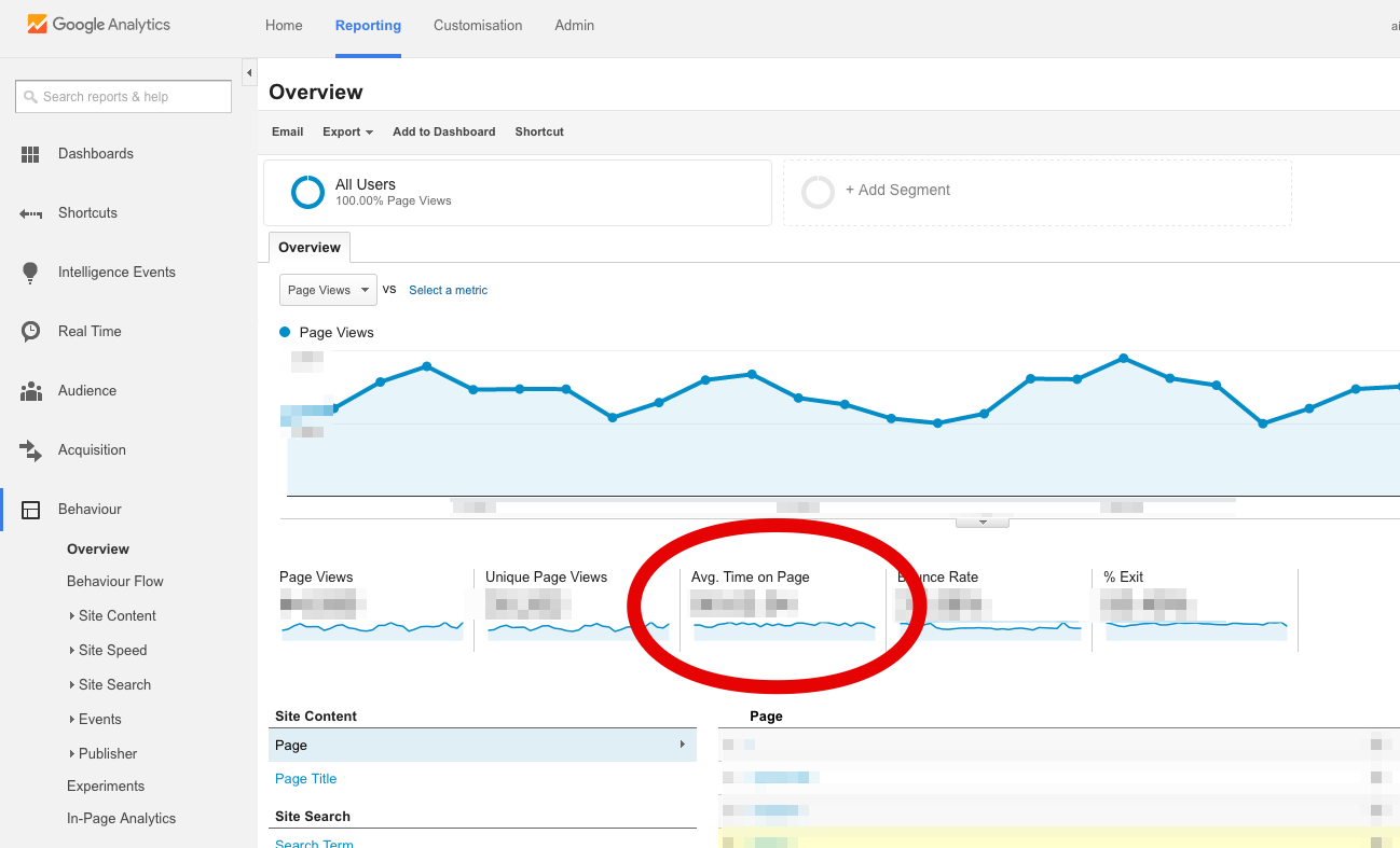
Unfortunately, though, that number gives you an across-the-board average of all your pages. You need a report that shows you how much time your visitors are spending on individual pages.
You can create a custom report to show you that information.
There’s an easier option, though. Just import Avinash Kaushik’s Content Efficiency Analysis Report.
It will show how much time your visitors are spending on each page.
You can use this report to determine which type of content is “sticky”—that is, which blog posts tend to keep people hanging around the longest.
Once you know that, you can produce more of that type of content.
Here is the big idea behind the Average Time on Page metric.
Knowing how long users spend on a given page tells you how interested they are in the page.
Remember, it’s just an average. A reader who spends 20 minutes on the page will be balanced out by the reader who spends only two seconds on the page.
Taken as an average, however, time on page shows you how interesting and engaging your content is.
If your average time on page is really low, it may suggest that your content isn’t all that great.
Find the pages or articles that have the longest average time on page, determine what’s different about those pages, and use these principles when you create more content.
2. Referrals
One of the best ways to tell whether your content is resonating with people is to see whether other webmasters are linking to it from their sites.
That’s why you need to pay attention to the Referrals metric.
To view referrals:
- Click on Acquisition on the left-hand sidebar of Google Analytics.
- Select All Traffic.
- Click Channels.
In the table that appears on the main screen, you’ll see that the first column is labeled “Default Channel Grouping.” It lists the various channels that include Social, Direct, Organic Search, and Referral.
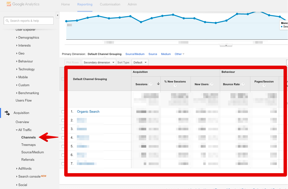
It’s that Referral metric that’s important here. Click on that link to view your referrals.
The table that appears shows you exactly where your inbound traffic is coming from. That’s great information to have, but it’s still not a complete story.
Why? Because it’s an aggregate number. In other words, it shows you how much all of your traffic comes from specific sites and doesn’t show which specific pages they’re linking to.
Fortunately, you can fix that by adding a new column to the table.
As I said, I love Google Analytics.
At the top of the table, you’ll see a dropdown menu labeled “Secondary Dimension.” Click on that:
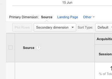
On the menu that appears, click on “Behavior.” Then, select “Destination Page” from the list of options that appear:
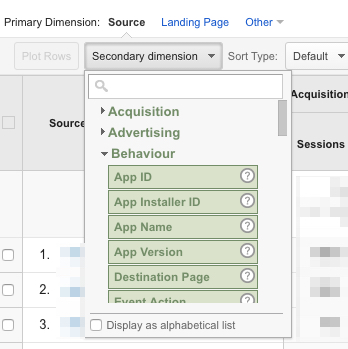
Boom. Now you have a referral report that not only shows which sites are linking to your site but also which specific pages they’re linking to.
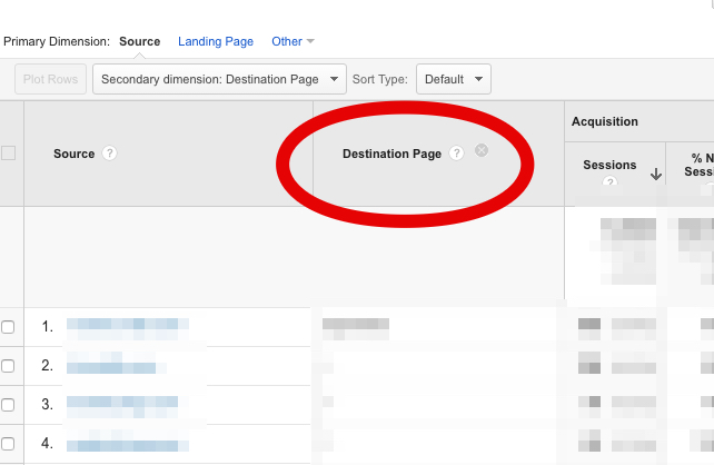
Even better: the default sorting is by the number of sessions in descending order. So you can immediately see which type of content gets the most backlinks.
What do you do with that information?
Easy: create more content like the articles that have the most referrals. If your content is good, people link to it. It’s that simple.
Ultra-linkable content is good content. The more links you’re earning, the better you’re doing.
3. Interests
Marketing is all about reaching people.
This is especially true with content marketing.
If you want to connect effectively with your visitors, you have to communicate with them on their level. That’s why it’s a great idea to find out what their interests are.
Fortunately, Google Analytics has a report for that.
- Click on “Audience” on the left-hand sidebar of GA.
- Select “Interests” from the dropdown menu that appears below.
- Click on “Overview.”
Now, you’re looking at a few bar graphs that show you the interests of your audience. The graph below is from a tech website.
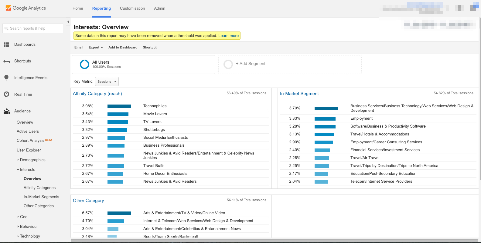
The first graph shows the “Affinity Category.” That tells you about the general hobbies and interests of people who’ve been visiting your site. Here’s how Google defines Affinity Categories:
Affinity Categories identifies users in terms of lifestyle; for example, Technophiles, Sports Fans, and Cooking Enthusiasts. These categories are defined to be similar to TV audiences.
The “In-Market Segment” graph shows you what your visitors are interested in purchasing. Here’s a definition of an in-market audience from Search Engine Watch:
An In-Market Audience is composed of folks who are actively searching and comparing your product/service. Individuals in this audience have indicated that they are actively in-market for a specific category such as “Autos & Vehicles” or “Real Estate” or “Travel” or any of the other audiences currently available from Google.
The “Other” graph gives you broad categories of your visitors’ interests. Google explains it this way:
Other Categories provides the most specific, focused view of your users. For example, while Affinity Categories includes the category Foodies, Other Categories includes the category Recipes/Cuisines/East Asian.
How does any of that help you produce better content? It gives you the ability to tailor-fit your blog posts to your readers’ interests while simultaneously boosting your brand.
For example, let’s say you run a men’s fashion e-commerce site. This week, you’re at a loss about what type of article you should write for your blog.
So, you fire up Google Analytics and view the interests of your visitors.
And then you have an “Aha!” moment.
You see on the “In-Market Segment” graph that 10% of your visitors are interested in “Employment.” They’re looking for a job.
You close GA, log in to your WordPress CMS, and type up an article titled “Here’s How to Dress for Success at Your Next Job Interview.”
Boom. The article gets shared more than most others on your site; it gets backlinks from various “life hacker” sites; and you even receive an honorable mention in GQ.
That wouldn’t have happened had you not checked the interests of your visitors.
You can dive deeper into each of these interest categories. For example, click “In-Market Segments” in the sidebar menu underneath “Interests.”
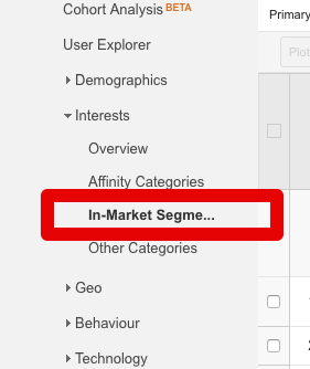
This will display a breakdown of the traffic trends associated with the in-market segment.
You can see how each category of visitor is interacting with the site—their sessions, bounce rate, session duration, and goal completion (if you have Goals activated).
What’s next?
The impact of your content marketing efforts shouldn’t be a mystery.
Check Google Analytics regularly to see which types of articles your visitors appreciate the most. Then, produce that type of content on a regular basis.
You can replicate this model for any and every number in Google Analytics.
Simply ask yourself these questions:
- What does this number/metric say about my audience?
- How should my content change as a result?
Bounce rate, session duration, percentage of new sessions, number of returning visitors, service providers, operating system, screen resolution, browser, language settings, mobile traffic, acquisition date, user retention, pages per session—all of this information has to do with your users, your readers, your audience.
All you have to do is understand what the numbers mean and then make relevant changes to your website.
Conclusion
Now, hold on a second.
I just told you to “make relevant changes to your website,” but I need to offer a final disclaimer. That’s what this conclusion is for.
It’s tempting to go crazy and start changing your website left and right. “Ooh! A number! Change the strategy! Revamp the content! Switch up the headline!”
Let me caution you against doing that. Why? Because if you start changing everything, you’ll defeat the entire purpose of analytics, which is to understand exactly what’s working and what’s not.
To truly understand what’s effective, what’s not so effective, and how to make the right kind of changes, you need to do one more thing.
Split testing.
This article isn’t the place to explain split testing—I’ve explained some of those principles elsewhere.
Instead, this is the place to encourage you not to change things willy-nilly but to make strategic changes in a split-testing environment.
The advantage of A/B-testing individual changes is this: Your analytics—all those numbers I talked about up there—will become far more reliable, effective, and actionable.
Google Analytics paired with accurate split testing is a surefire way to make better content.
The better you get at reading and acting upon your analytics, the better content you’ll create.
from Quick Sprout https://ift.tt/2FCyaor
via IFTTT
