A landing page, simply put, is any page that gets traffic from anywhere other than the same pages on your site — hence the name landing.
It’s most commonly associated with pay-per-click ads like Google Adwords, where you can drive traffic to a specific URL that has been designed to receive those visitors.
The problem with most landing pages is that they’re created around broad categories like “jeans” instead of being more specifically focused like “women’s skinny jeans” or “juniors boot-cut jeans”.
These days, people intuitively understand that when searching the web, the site whose description most closely matches their search is likely to be the winner.
And when you’re paying for clicks — you’re losing money every time a customer goes elsewhere.
Does Keyword Relevancy Matter?
You may think that once you’ve caught the user’s attention (and their click) with a highly targeted ad — that your job is done.
Retailer California Closets wanted to test this theory out for themselves.
Would an ad-specific landing page outperform a more generic one?

Although it’s unclear what the original ad text was, one could theorize that it was “get organized” — which then leads people directly into the site with organization tips and products.
The ad-specific landing page outperformed the generic page by increasing lead form submissions by 115%
With this in mind, a landing page is generally your first and only opportunity to make a first impression with your customer. It’s your chance to start a conversation, ask a question, invite discussion and welcome clicks on into your site. For many sites, particularly those in high-competition areas, it may be your only chance to reel in a visitor and convince them that your offer is worth their time and attention.
That means you simply can’t afford to get it wrong.
Fortunately, setting up and using landing pages in your overall marketing plan is relatively easy. It’s just a matter of creating a web page that combines all the components needed to make a page successful for your specific customer.
Of course, entire books have been written on the subject, and it’s still very much an evolving science. But this guide will work hard to dispel the myths, lift up your conversion rates, and get you on the right track.
Is My Home Page a Landing Page?
It is if your visitors type in your URL directly. But this is likely because they’re familiar with your brand and site already — not that they just happened upon your site mysteriously. Typically, your home page is a more broad, generic introduction to what you have to offer, rather than being narrowly focused to one particular topic.
Many marketers mistakenly direct pay-per-click traffic to their home page, thinking that their visitors will “figure out” where they want to go. Bad news — they won’t. There’s just too much competition, too many opportunities to comparison shop, and limited time to do so. And all these reasons are why we create landing pages — to simplify and streamline the entire process.
Why Should I Use Landing Pages?
Landing pages let you narrow your focus and remove the clutter from your pages that could distract your visitor from taking the action you want them to take. It allows you greater control to direct them and help them find what they’re looking for much faster — and this, in turn can ripple out to affect your search engine rankings too.
Even if people have landed on your page and know exactly what they’re looking for — they want to take the quickest action possible to get results. This was exactly what Time Doctor, a productivity software tool wanted to test in their own landing page. They created a long, detailed page which covered all the major features of their program (see screenshot) and tested it against a much shorter, single “screen-width” page:

The shorter version converted 36% more customers than the longer version. However, it’s worth noting that not all short copy pages will outperform their longer counterparts. Depending on the item being sold — a higher price-point product would likely have required a more in depth showcase of features and benefits.
So What Does This Mean for My Search Engine Ranking?
Since search engines like Google are all about relevancy, they want people to find what they’re looking for. If your site does a good job of that in a straightforward way, then chances are, you’ll steadily outrank your competitors for being the answer to the searcher’s needs — it’s a win-win!
Good landing pages, in turn, can improve your conversion rate — which is the percentage of visitors that ultimately took the action you wanted. These people have been converted from visitors to interested shoppers to potential buyers and hopefully, lifelong customers.
Landing pages are like signposts that direct buyers at each stage to take that next all-important step.
When is the Best Time to Use a Landing Page?
Not all pages are cut out to be landing pages. That’s why, ideally you’ll want to use them:
- As destinations in your pay-per-click ads – Create a different landing page for each keyword and group so that you can test, track and see how each one performs.
- To create anticipation about a product launch- Landing pages are a great way to promote a “coming soon” teaser — even if the product isn’t finished yet.
- To segment your offers – No single offer will appeal to everyone. Some people prefer printable coupons, while others would rather redeem promo codes online. Landing pages can help you steer visitors exactly where you want.
- To segment your audience – Just like your offers, not every visitor should be directed to a generic “one-size-fits-all” landing page. Attract different groups with pages tailored specifically to them and their needs.
How Do Landing Pages Fit In with Other Online Marketing Strategies?
Landing pages aren’t meant to replace any other forms of marketing, but rather add to them.
Unlike most other marketing strategies, however, landing pages follow a keep-it-simple approach. When it comes to design, content and other aspects of a page — less is more. This means that it’s not uncommon to see landing pages with the entire site navigation stripped away so that few elements remain on the page.
It’s important to understand the role that landing pages play in your overall marketing plan:
- Landing Pages and Search Engine Optimization (SEO) – Landing pages are designed to go hand-in-hand with search engine optimization. Any optimization strategies that you employ across your site should also be used on your landing pages as they can only benefit from it.
- Landing Pages and Pay-Per-Click (PPC) Advertising – Landing pages and Pay-Per-Click advertising go together perfectly, and landing pages being used as destinations for PPC ads are one of their most common and most popular uses. But you should also know that landing pages can be used just as successfully with organic search engine rankings — they’re not reserved solely for paid ads.
- Landing Pages and Conversion Rate Optimization (CRO) – It’s a very common misconception that conversion optimization (the act of getting your customers to take the action you want them to take on your site) is done solely by landing pages. Conversion optimization involves many more aspects — but landing pages are a strategic part, and just one of the ways you can convince customers to come further into your site and interact with it.
- Landing Pages and Social Media Marketing -Landing pages also work well with social media, and many businesses have one or more pages for their fans on Facebook, Twitter and other social sites they frequent.As you’ll see, landing pages give you an easy way to create a customized destination for every customer segment, marketing campaign, special offer or pay-per-click add. As such, they’re immensely powerful.But, as with all great marketing strategies, there are some things that they can and cannot do. Let’s take a closer look:
Landing Pages are NOT:
- Long sales letters – This is not your chance to go into great detail about how great your product is, but rather to provide the user with exactly what they’re looking for — immediately. Remember, relevancy is key here. If they want to know more, they’ll come back.
- “Name Squeeze” pages – These are part of an old internet marketing tactic that presented users with a choice: enter your name and email to get a freebie, or go elsewhere. Landing pages are more evolved than this.
- An opportunity to push a hard sell – This is also not the time to pressure your buyers. For many people, this is the first impression and likely the only one. You want them to take the next step into your funnel — you don’t want to shove them into it!
- A once-and-done strategy – Landing pages need to evolve and change as the market and demands change. You should always be testing and refining your message so that it is more relevant, more helpful and more on target with what your customer wants. This is a long but thoroughly rewarding process as it gets you closer to achieving your overall marketing goals.
The Problem with Most Websites
The issue that most websites have is that they are built from either a design or development perspective.
With a design perspective, there’s an emphasis on the aesthetic. A great deal of attention is paid to typography, color, consistent branding, the tone and “voice” of the content and other creative areas.
With a development perspective, there emphasis is on the platform. How is content published and managed? What kinds of content are accepted? How will the platform evolve as needs change?
While there’s nothing inherently wrong with either of these points of view, they’re missing the marketing element which should be at the foundation of any site designed to sell. Because we’re so caught up in design/development changes and their various stages, we often forget to put the customer first and ask — what are they looking for? And more importantly, how can we deliver that experience and make it flawless at every step of the way? This is where the design and development points come in.
Case Study: How Much Should You Include on a Page?
The question then becomes — what’s the right amount of content and design on a page? Confidis, a French credit loan service, tested two variations of its landing pages — one which removed images, navigation and even customer support links, and the other which included all of these elements:
Here was the original page: (Source: WhichTestWon)

The updated Confidis landing page without navigation, images or support links
The results were astonishing — a full 48% more people signed up as a result of viewing the shorter, “stripped out” landing page. It was shorter, more compact and all of the information the user needed loaded “above the fold” — within the first 1/3rd of screen space.
These are just a few of the ways that a reworking of existing screen space, and prioritizing different elements can have a dramatic effect on increasing conversion rates and bringing in more customers with less effort, time and money spent.
But how do these changes affect search engine optimization? You might be surprised to learn that landing pages aren’t designed to replace SEO at all.
SEO vs. Landing Pages
Search engine optimization is a component of landing pages — but it isn’t designed to compete with them. Now that Google is hiding keyword data — marketers can no longer put as much of an emphasis on keyword research as they once did. Now, the strategy shifts from pure optimization to pure intent.
“What did the customer have in mind when they found our page?”
The first step, therefore is to bridge the gap between what the user’s intent is, versus your landing page. As an example, someone searching for “cheap flights to Paris” may only be in the starting phases of planning their vacation, whereas someone searching for “cheap flights to Paris from Denver in May” may have their calendar all planned out and might optionally be looking for car rentals, hotels and activities to do during that time.
That’s the difference — and power — of intent.
Once the user determines that your page most closely matches their question or issue — they’ll give you a click. But your job isn’t finished yet.
Web users are, by nature, “scanners” rather than readers. They don’t have time to read all that content you worked so hard on writing. They want to know — at—a—glance, whether or not your page is going to meet their expectations. They’re also secretly judging you, asking themselves, “Can I trust this advice? Is it safe? What else should I know about this?”
Matching Headlines with Search Queries
One of the most important steps that you can take to improve both your landing page conversion rate and your search engine optimization is to match headlines with your user’s search query.
In this example from Search Engine Watch, the search phrase was best health insurance plans for single men. The resulting first ranked entry was the Ask Men website, with the title “best health insurance plans”.
This communicates two points — that the site is a recognized authority and it likely has the answer the user is searching for. It’s also easy to visually scan and understand within seconds — all things that searchers want:

The AskMen homepage explores the best insurance plans for single men — its headline is right on target with the searcher’s query
The page above could do with a lot less clutter — but considering that their galleries and advertising are the biggest money-makers for the site, rather than the articles, it still does a good job balancing out the user’s inquiry with what it needs to keep earning profit.
Now that you understand how landing pages are different from other marketing methods — the question you should be asking is “what do my users want from my landing page?” They won’t readily tell you, but enough marketing tests and psychological profiles have been done to tell us which types of pages typically perform best no matter what the user is looking for:
Headlines with Direction
Users want to be told where to go, what to do, and how to do it. That’s why the best performing landing pages have a clear, concise headline that immediately speaks to the reader’s wants, fears or needs. Here’s just such a headline from Carelogger, a diabetes tracking system that instantly addresses the user’s concerns:

Anyone struggling with diabetes wants to keep themselves in better shape and keep their blood sugar on target— and by highlighting what it tracks, as well as the words “Optimal Health”, Carelogger was able to increase their conversion rate by 31% because they matched their headline to what their audience wanted.
Clear, Concise Language
The Encyclopedia Britannica was able to boost their conversion rates by an astonishing 103% just by adapting their copy to include everyday language which included bullet points that highlighted the best reasons to buy now:

Apple’s marketing team are masters at “less is more” when it comes to selling some of their most powerful benefits. How would you describe something as complex as Siri in just a few words?

One sentence. Unlimited possibilities.
Focus on the Customer
People visiting your landing pages want to know that they’re important and valued. Using self-centered language like “I” and “we” gives the impression that you only care about yourself or your business/solutions rather than the customer.
Email management service AwayFind once used the headline “Let us find urgent messages” — but in a test, they replaced it with “Let urgent emails cut through the clutter and find YOU”. Not only does this sound much less “stalker-ish” and give less of an impression that the company decides what’s urgent or not — but it puts the user in a position of control and convenience.

As a result, AwayFind increased signups by 91% — a remarkable achievement by any measurement.
Be Trustworthy
Adding security seals, such as what Mint.com employs on their page, ensures that your personal and financial data is safe with them — and that they have the third-party credentials to back up their promise:

Now let’s move on to some specific examples of different types of landing pages that convert.
6 High Converting Types of Landing Pages
There are actually many different types of landing pages—each is ideal for a different situation in a different business.
If you understand what each type of landing page consists of, why it’s effective in specific situations, and how to make them, you’ll be able to use the right landing page for the right job.
And that’s exactly what I’m going to show you with the following 6 types of landing pages.
1. Product not quite ready? Use a “Coming soon” landing page
One big mistake that you can make is to not promote a product ahead of time.
Just because a product isn’t fully developed doesn’t mean that people wouldn’t want to hear about it and get notified when it’s ready.
If your product presents a unique solution, your target audience is going to do whatever they can to get their hands on it, whether it’s now or in the near future.
Now, if you promote a product before it’s ready, you can’t send people to a sales page that doesn’t exist.
Instead, you should send them to a “coming soon” landing page.
These are becoming increasingly popular as companies recognize how effective they can be.
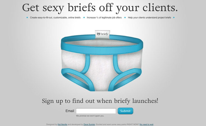
Essentially, you want to create a simple landing page that makes it clear that the product is coming soon and that allows the visitor to opt in to get updates on the product.
This way, the marketing team isn’t just twiddling their thumbs while the product guys are at work.
Additionally, this type of landing page gives you really good validation.
If you’re getting terrible conversion rates from targeted traffic, then no one is interested in the product. You can save yourself a lot of time and money by either scrapping the product or taking it in a different direction.
The other benefit is a bit more obvious: you have a list of qualified leads.
When you do launch your product, it won’t be to an empty room. You can get your first wave of orders almost immediately, which will give you the feedback you need to refine the product.
Keys to an effective “coming soon” page: This type of landing page isn’t terribly difficult to create, but you still need to make sure you include all the most important elements.
I’m about to go over all the elements with you. They should all be included when possible, although not in any specific order.
First is the product itself. Visitors need to know what the page is about. In the example above, the product is mentioned “briefly” in the second largest line. It doesn’t need to be huge, but visitors should understand that you’re developing an actual product.
Next, make it clear that the product isn’t ready. This should be one of the largest parts of the page.
On top of that, you need to specify when the product will be ready.
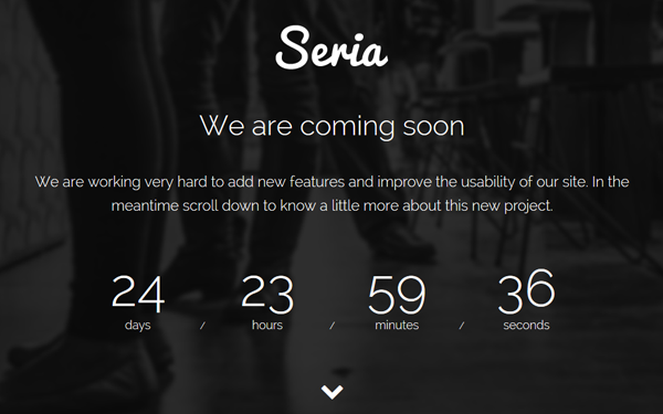
If you’re not sure, you can be a bit vague and say something like “coming Winter 2016.” However, it’s better to get specific when possible. If you can, add a countdown to the page:
Finally, it’s absolutely crucial that you clearly sum up what your product has to offer.
In one or two sentences, describe what your product is and how it can help your target audience. This should be one of the main focal points on the page.
For example, on the coming soon page you see below, it’s clear that “shopidex” is a community specifically created for small business owners looking for growth.
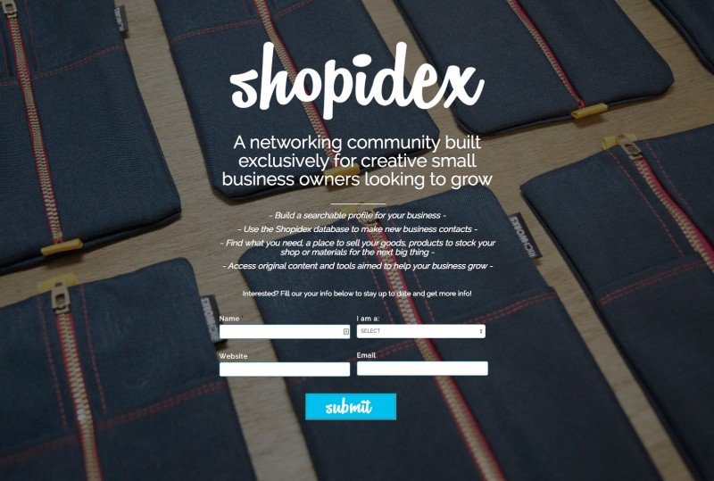
Visitors know whether they are in that target market and can easily decide whether they’re interested in that type of product.
You can expand past those few sentences if you like, but you don’t have to unless you have a rather complex product.
Finally, you need an opt-in, and you should also make it clear what your visitors are opting in for, e.g., “enter your email to be notified when the product is ready.”
Tools to help you make a “coming soon” page easily: While “coming soon” pages are simple enough that they could be built from scratch, you really don’t need to.
There are many tools that have these types of templates. You simply click on the “coming soon” template, then click on each piece of text, and edit it however you like.
One option is Kickoff Labs, which has 20 different themes for “coming soon” pages. It isn’t free, however:
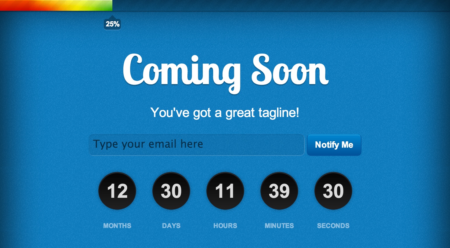
Perhaps the most popular landing page creator is Unbounce, and they have a decent selection of attractive “coming soon” page templates:
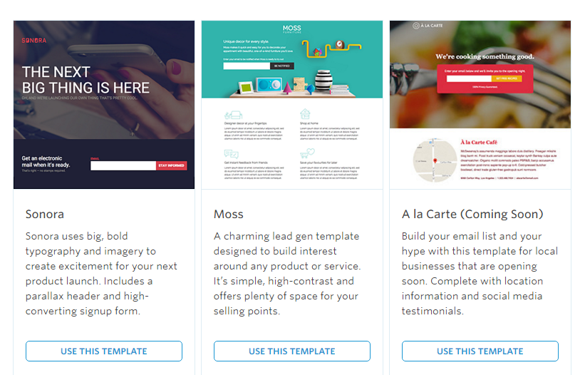
Again, it’s not a free tool, but it’s easily worth the money if you regularly create landing pages.
Another solid option is Lander, which has a good collection of “coming soon” templates.
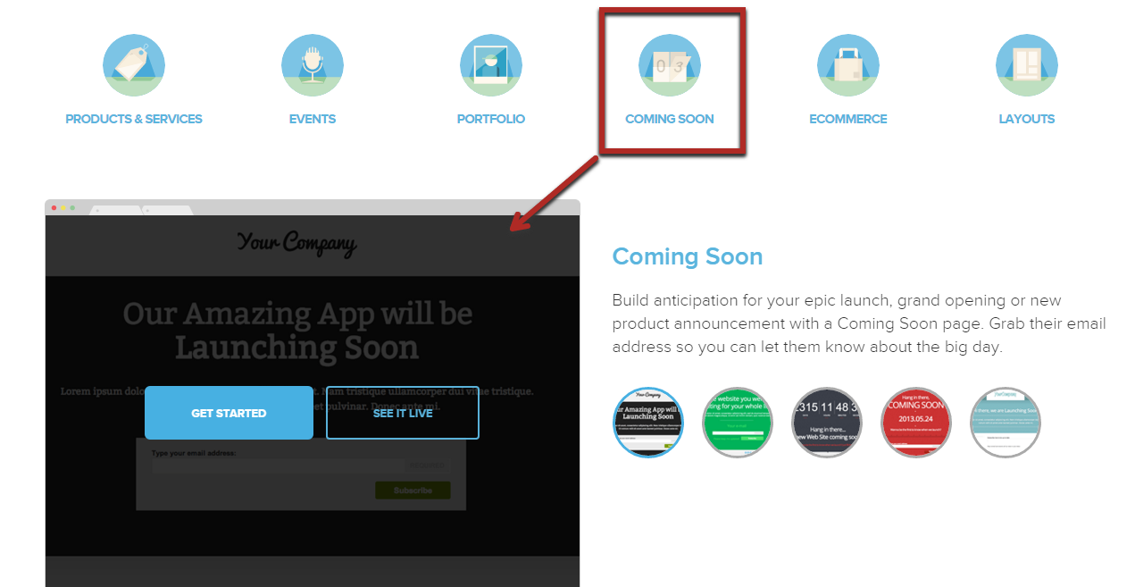
The tool you use doesn’t really matter as long as you understand the principles we went over in this section.
2. How to incorporate video into an effective landing page
If you have a unique and potentially complex product, it can be hard to convey everything within a short page.
One great option is to include a video on the landing page and make it the primary element. You can still have text explaining the product and its benefits, but that’s included afterwards.
Here’s an example of this type of landing page on Crazy Egg:
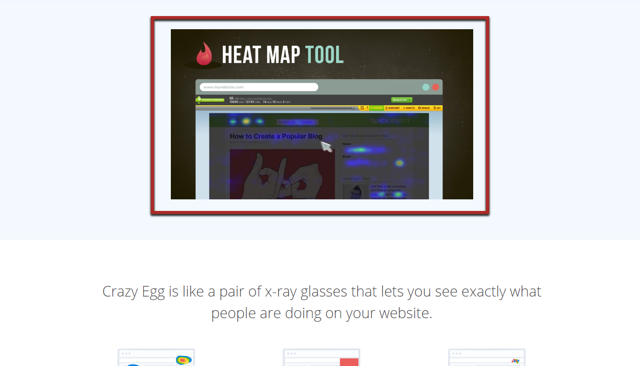
The video is the sole focus of the page. You could have text beside it as well, and even a button, but the video should stand out so that visitors understand that they should watch it.
Components of an effective explainer video: Videos can be a great tool on landing pages because very few people will scroll down a long page of text. However, a large percentage of them will watch a 1-2 minute video.
It also makes it difficult for them to skip past an important point by accident as you usually have their full attention as they watch.
But putting up just any video obviously isn’t enough.
A bad video will result in a bad conversion rate, just as a great video will result in a great conversion rate.
There are two main aspects of an effective video that you need to try to achieve.
The first is quality.
Videos have come a long way in recent years, and viewers expect professionally made videos.
This means:
- no blurriness
- good lighting
- no background noises or echoes
- no stuttering or unclear speech
on top of other things.
Unless you happen to have the knowledge and experience to produce a video like that, you’re going to need professional help (more on that in a minute).
The second main aspect is a compelling story.
People associate videos with entertainment. You have 1 or 2 minutes to tell a short, compelling story about why your product is important and why it’s awesome.
It doesn’t need to be complex, but you want to introduce your product, highlight the most important features, and show all the ways the viewer could benefit from them.
If you feel like you struggle with this aspect of videos, read these articles I’ve written in the past:
- How to Leverage Storytelling to Increase Your Conversions
- How to Engage and Persuade People Through Storytelling
- Tell Your Brand’s Story
4 steps to create an explainer video: If you’re still with me, you probably have a good idea in mind for using a video on a landing page.
All that remains is to know exactly what to do to actually make one.
Step 1 is to decide on a budget. Quality videos often cost more than $1,000 per minute of video.
Remember that quality always comes first, so if you have a limited budget, make your video shorter instead of cutting corners on the creation.
Step 2 then, of course, is to hire a freelance explainer video creator. You can find these on any major freelance site (like Upwork or Freelancer) just by searching for keywords such as “explainer video” or “product video”:
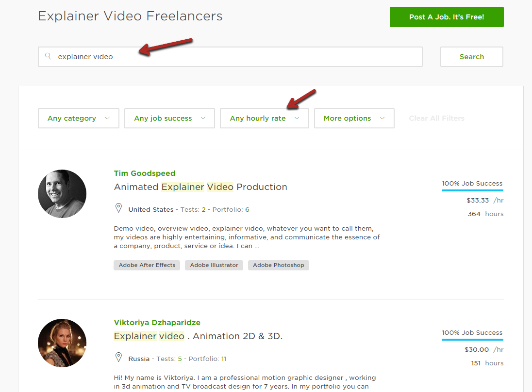
Again, you typically get what you pay for. Don’t cheap out unless you have no other options.
Alternatively, you can use a specialized marketplace for video creators like Animation Explainer Videos.
Step 3 is to work with your freelancer to develop a video outline and script. You could do this yourself to save a bit of money if needed.
Step 4 is to simply wait for your freelancer to create the video, give them feedback for edits, and then publish the video.
If you’ve never created a video, this might seem overwhelming. Just break it down into small steps, and you’ll see that it’s fairly easy.
3. Selling a complex product? Highlight its features
If you have a complex product, creating a video is one way to convey all its features.
However, there are drawbacks of videos. For one, they are much harder to edit than text and images.
Second, not everyone likes video. Those people would rather read, so it almost always makes sense to have text on the page anyway.
Finally, Google can’t index videos well, so if you want your landing page to rank for any terms in the search engine, you’d better have a decent amount of text.
If you have a product with complex features, you’re not just solving one problem—you are solving many with your product.
There’s no way to concisely explain all those benefits in a few sentences.
If you try to, you might end up confusing visitors who are looking for one specific solution that your product provides, but not the others.
So, what’s the solution?
It’s to create sections on your landing page, one for each main feature.
The order is important. You want to order them from most commonly sought after to least sought after.
Here’s what I’m talking about: Aweber landing page has clear sections (with differently colored backgrounds) for different purposes.
The top section focuses on the 3 main components of Aweber’s software (they jump out in blue bolded text):
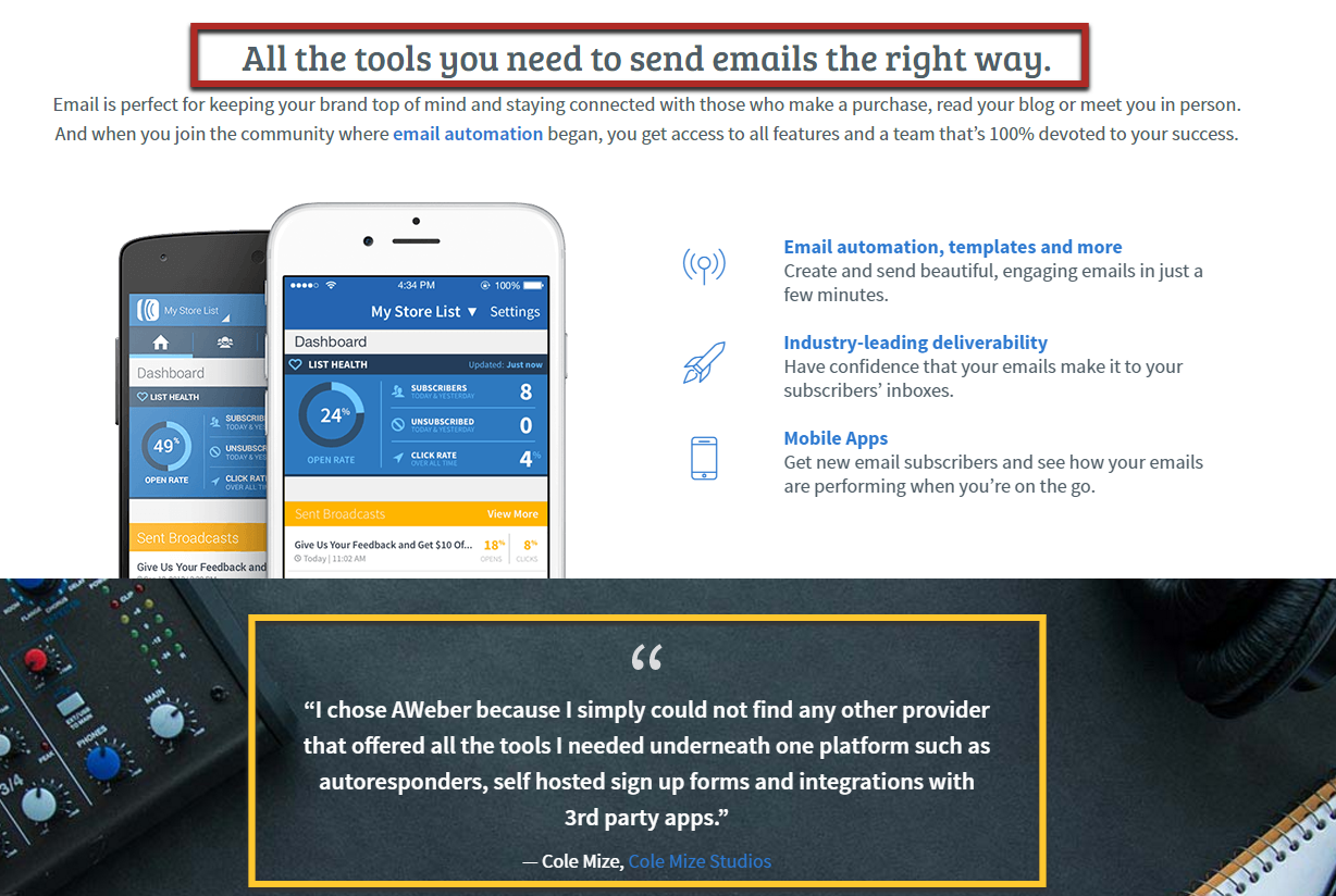
The next section has a testimonial.
The page continues on, and you go through a few more sections that highlight different features and benefits of the product.
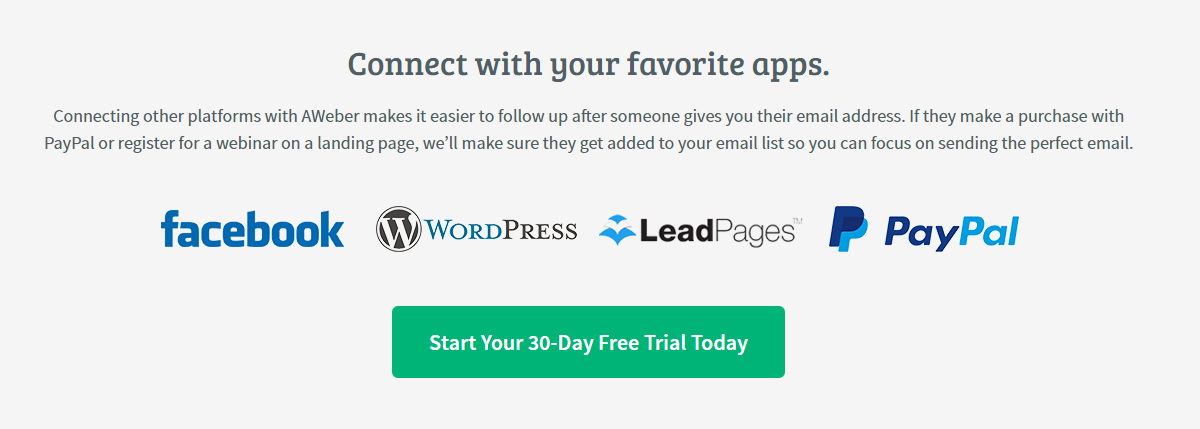
For example, further down is a section that highlights how easy it is to integrate the product with other popular applications:
You don’t necessarily have to have differently colored backgrounds, but there should be clear divides for each section.
Explain each feature in plain language: One important aspect of creating a section for all the features of your product that is often ignored is the language you use.
It’s not enough to simply list the feature; you need to describe it in simple terms—those that your customers would use themselves.
Despite having a huge customer base and complex products, Hubspot still does a fantastic job of this.
Look at this example from one of their landing pages for their Sidekick tool:
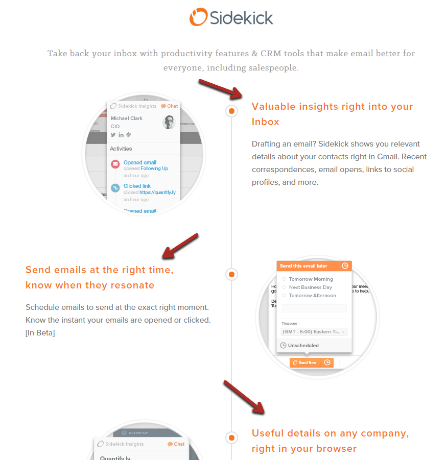
In particular, notice how clear each section is.
From the text color and size to the images and center dots, it’s clear where each section begins and ends.
Then, look at the language they use.
For example:
Sidekick shows you relevant details about your contacts…email opens, links to social profiles, and more.
Many companies would have written something like this instead:
Sidekick shows you insights into your customers’ web presence. Improve your demographic information collection and message targeting easily.
I would bet quite a bit of money that you’ve read something like that on a landing page before.
It leaves you scratching your head, saying “huh?”
While making your product sound complicated might seem like a good way to justify its cost, using vague, high-level language actually has the opposite effect.
Use simple and concise language, similar to your audience’s.
4. Stop selling to cold traffic, and use a lead generating landing page instead
Remember that landing pages can be used in almost every step of your sales funnel.
They are optimized for conversions…of any kind.
But in order for them to work effectively, your landing page visitors need to be in the right place in the buying process.
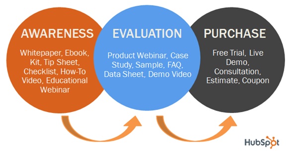
Even the best landing page is going to struggle to sell a product if the visitor has never heard of it or your brand.
However, that very same landing page could have an amazing conversion rate when the visitors already know and like your brand. It could be even better if they’re really struggling with the problem your product solves.
Those people who’ve never heard of you, your product, or your website are called “cold traffic.”
The others, with whom you’ve touched base before are considered “warm traffic” and are much more likely to convert.
Is this really a landing page problem?
While at first it might seem like a traffic problem, it is a problem that can be solved with landing pages.
Instead of sending cold traffic directly to one of your landing pages that sells a product, you send them to an earlier in your sales funnel landing page.
Forget about asking them to do something big like pull out their wallets to buy something. Let’s get them on an email list first.
Once you get them to subscribe, you can start sending them emails and building a relationship. And eventually, you send them to that product landing page.
Starting your sales funnel with a landing page: A large percentage of highly successful businesses use this strategy. I urge you to consider it.
For example, Unbounce is arguably the biggest provider of landing page creation tools there is. They’ve done extensive testing to ensure that their landing pages have the lowest bounce rate possible (and highest conversion rate).
That applies to their templates for sale as well as to their own landing pages. Here’s an example of one:
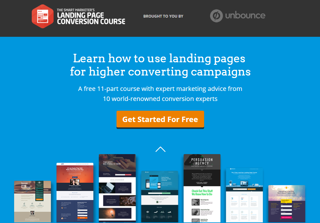
Notice how they focus you on the page to get you to give them your email address in exchange for their email course.
They make it difficult to even find the pricing page on this landing page because they don’t want their cold traffic to do anything else but to join an email list.
Unlike on a blog, where the value you provide through free content might be enough to get someone to sign up for an email list, cold traffic to a landing page needs an incentive.
As you might know, the incentive is called a lead magnet.
The more enticing the lead magnet is, the higher your opt-in rate will be.
If you have a great offer and send the right type of traffic to a landing page with a lead magnet, it’s possible to achieve conversion rates of over 50%.
The 3 keys to an effective lead magnet: Creating an appealing lead magnet isn’t easy, but it’s not difficult either.
It requires understanding of the three key factors that affect your conversion rate.
The first factor is relevance.
There are two components of relevance. The obvious one is that your offer has to be relevant to your traffic’s interests.
So, if your target audience consists of dog lovers, your lead magnet should be something like a book about dogs, not cats.
But your lead magnet should also be relevant to your audience’s problems.
If many of your visitors are struggling to find good ways to play with their dogs, you might offer an e-book like “5 Ways to Play With Your Dog More Efficiently.”
Compare that to an e-book along the lines of “25 Awesome Dog Names.” While it’s about dogs, which is relevant, it’s not relevant to any of that audience’s problems.
The second factor is related to relevance, and it’s value.
It’s very simple:
The more someone values your lead magnet, the more likely they are to opt in to your email list.
A 10% off coupon is more appealing than a 5% off coupon.
An e-book with 10 ways to play more efficiently with your dog is more valuable than one with only 5 ways.
Additionally, if your lead magnet solves a pressing problem of a visitor, they will put a lot more value on it, which is why relevance is also important.
Finally, the third factor is feasibility.
Remember that we can’t directly ask cold traffic to buy something because it’s asking too much too soon.
For the same reason, you don’t want to overwhelm those visitors with a huge lead magnet.
Imagine you offered this email course: “A 52-Week Course to Dog Training Master”.
While that would have more value than a 10-week course, it also doesn’t seem feasible to most visitors—it’s too much.
So, while you want to provide as much value as you can, there’s a certain point where the extra value becomes too much work for your visitors.
Find the balance between too much and too little value.
If you understand those three factors, you’re ready for my step-by-step guide to creating amazing lead magnets.
5. Focus on the problem you solve before introducing the product
I know you love your product, but sometimes, your customers don’t.
So far, we’ve looked at landing pages that focused on communicating the features and benefits of products.
Sometimes, however, they aren’t the most important thing.
For simple problems, customers already know exactly what they’re trying to find.
If you sell a product to such customers, you need to take a different approach.
On your landing page, you should have very clear, simple text as the focal point:
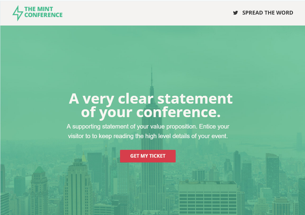
That main text should describe the product the visitor is looking for.
Let’s say that a visitor knows they need an affordable shag carpet.
Instead of focusing immediately on the quality of your carpets such as the perfect softness, size, and all other sorts of things, you state the obvious:
Affordable shag carpets for any home.
Below that, you can add another sentence of your product’s best feature(s). Maybe the carpets are made with a special material that your customers might appreciate, etc.
The key here is that they care about finding the exact product they have in their mind first, before even considering the features.
The 2 most important parts of this type of landing page: If you have a simple product that is suitable for this type of landing page, there are two keys to maximizing your conversion rate.
The first is your main statement, which is typically made as a headline across the middle.
The worst thing you can do is get clever.
State what your product does and offers in one concise sentence so that visitors know that they’re in the right place. Just like we did above.
The second key is having a good call to action.
The call to action is usually placed in some sort of button that you want the visitor to click. It then takes them to a sales page or some other landing page to learn more about your product.
Your button can potentially say a lot of different things:
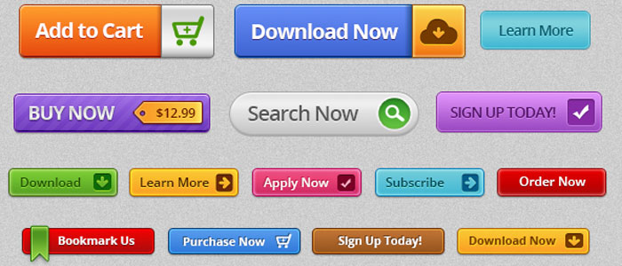
You can improve the effectiveness of your calls to action by using language that describes an action.
Instead of the common calls to action, like:
- Learn more
- Download
- Buy this
create more specific calls to action for your product. If your product is a dog training manual, you could try:
- I want my dog to listen!
- I’m sick of disobedience
- Download my dog training solution
To make it even more effective, apply urgency by adding a word like “today” or “now.”
Here is my complete guide to making your button calls to action more effective.
6. Let your visitor choose their own adventure
There’s one type of product that you might be selling that we haven’t talked about yet.
If you have a complex product, the other options we’ve looked at so far might not suit it.
Certain products have many different features, all of which could be their own products. Different customers might be interested in a specific feature and not care about the others.
If you use the other options we’ve looked at so far, you’ll be emphasizing certain features near the top of your landing page.
This is good for your potential customers who want that specific feature, but it will cause potential customers interested in other main features to lose interest and not convert well.
The solution is to give them a choice.
Instead of jumping right into a feature, you let your visitors choose what they’re interested in. Then, depending on the button or link they choose, you take them to a certain section of the page (or even to a different landing page).
Hubspot is a great example of this. They have a complex product that serves both marketers and salespeople. Each group is interested in different things.
On a Hubspot landing page, there’s a link to get more information on their marketing platform as well as their sales software:
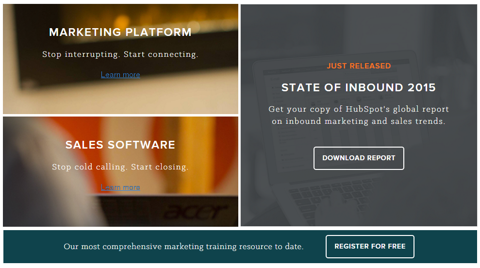
On top of that, they also offer a lead magnet, just in case any cold traffic finds their page.
When to use a “choose your own adventure” landing page: The main factor that will determine whether you should use this type of landing page is whether your traffic is comprised of different types of people.
Some products appeal to many different audiences, and those audiences need to be approached differently because they care about using your product in different ways.
Ideally, you’d send them to a landing page designed just for them, but that’s not always possible. That is when a “choose your own adventure” page is the next best option.
How to make your own adventure landing page: The great thing about this type of page is that it’s fairly easy to make. All you need are links to different landing pages or to content further down on your landing page.
If you need to implement the second option, it’s pretty simple.
There are two parts. The first is your anchor point, where the page will jump to when you click the link.
Put the anchor point on the heading of the section that you want someone to jump down to.
For example: Hubspot for marketers
Then, go back up to where you’d like to place the link, but instead of putting an entire address in the link tag, type the “id” name that you specified after a hashtag when you created the anchor point.
Like this: Learn how Hubspot helps marketers
Put that link in a button or panel near the top of the page, and the segment of visitors interested in those features can go right to them without getting confused.
Conclusion
Landing pages are an important tool that should be in every marketer’s arsenal.
But if you want to take full advantage of landing pages in your work, you need to use the right type for the situation.
Let’s quickly go over what we’ve learned…
- Landing pages are designed as a springboard for users to step further into your site. They do this by being relevant and focused on a single point — such as the user’s search inquiry. They are most commonly associated with pay-per-click pages such as Google Adwords but are certainly not limited to that platform.
- Using landing pages is all about maximizing your return on investment for each customer. The more specific, simple and streamlined a page is, the more likely the user will take the desired action.
- Ideally, landing pages should be used to segment your offers, your users, as destination pages for your pay per click ads, and/or as a way to create anticipation about a product event (and encourage users to sign up as the event comes closer).
- There are certain things that landing pages are not built to do — mainly act as long-form sales letter or simple name-squeeze pages. Your landing page is essentially the “welcome mat” that draws visitors into the rest of your site. Provided that you have a captivating offer that resonates well with them, you’re digitally encouraging them to walk through the front door.
- Some of the best converting landing pages embody the philosophy of “less is more”. It’s common to remove superfluous graphics, navigation, testimonials and even customer support options to help the user focus on a single action you want them to take.
- Search engine optimization isn’t meant to replace landing pages or vice versa. SEO adds to landing pages, and when done right, landing pages can in turn increase relevancy in the eyes of the search engine and potentially increase your rankings.
- Users have certain expectations you must fulfill if you want them to take the next step, mainly: a headline that matches their inquiry, clear, easily-understandable language, a focus on their needs and the elements of trust and credibility in choosing to do business with you.
- I’ve also shown you 6 of the highest converting types of landing pages, and you should now understand when to use them and why they work.
These are the main ingredients customers are looking for when they land on your pages. And, they want all of these things in a fast-loading, easy-to-browse, and user-friendly environment.
from Quick Sprout https://ift.tt/3yFao5c
via IFTTT
