Email is one of the most effective marketing campaigns out there — in fact, the average ROI of an email campaign is 122%.
For those who aren’t afraid to take a few extra steps, email images will spice up your campaign and help your email campaign stand out.
I’m going to show you how to leverage images in email the right way.
Email Images: Yes or No?
You can use email images, but should you?
I want to start by asking a few questions, because these will help you determine if using email images helps or hurts you. Read these and answer yes or no:
- Do my images support my brand?
- Have I optimized the image size?
- Am I using the right number of images?
- Am I properly using image alt tags?
- Are my emails easily accessible?
Chances are you may not even know the answer to all these questions.
If that’s the case, then you’re not getting all you can from your email images, and this guide will help you.
But it’s not quite that simple. Having email images can boost your email’s aesthetics, but how do you increase email click-through rates with images?
What Is a Good Email Click-Through Rate?
Your click-through rate is the percentage of people who click on an image, link, or video in your email to continue through to your content. The average click-through rate is around 2.5% across all industries.
This number might sound a little low, but keep in mind, we’re talking about click-through and not open rates, which is the number of people who read your email.
Including images in your campaigns is a great way to increase engagement and improve your chances of driving traffic or even sales.
Images in Email Marketing: The Magic Ratio
Many marketers will tell you there’s a specific magic ratio of image to text, but it’s not always true. What is true is image-only emails will almost always cost you a trip to the spam folder.
Do that too much, and you’ll find your whole domain blacklisted.
That’s no good.
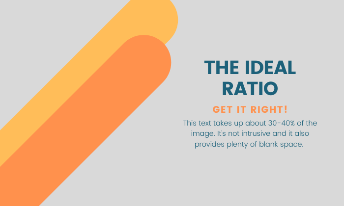
The ideal ratio is around 30-40% image to text. Any higher, you run the risk of triggering spam filters. Any less will make your email difficult to read.
The only way to find out what works for your audience is to test it! Use A/B testing to figure out what works and what doesn’t.
Keep Your Email Images Consistent
How many times have you searched for something on Google, found what you wanted, and clicked through to the website only to realize the link didn’t lead where you expected — at all?
It’s frustrating.
The truth is, you might be doing this to people right now without even realizing it.
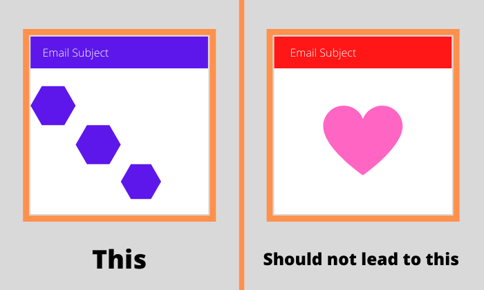
Your email image needs to align with your brand and remain consistent throughout your marketing campaign.
Make sure when someone decides to open your email, it remains true to your company message, and all the emails look relatively similar.
If you’re using blue headers with a specific font in your campaign, it should match the landing page your visitor ends on.
Personalization and Targeting Are Key
Email personalization is more important than ever.
Why?
Because there’s more impersonal spammy communication out there than ever before. Personalization changes the way your email appears based on the person you’re targeting.
Just think about it. How often have you received an email that seems like it was made for you?
Not often, right?
This is where you can get ahead of your competition by doing the things no one else is willing to do.
No product or service has “universal appeal,” so you need to narrow down your email images to a targeted audience.
According to Invesp, 59% of online shoppers find products more interesting when you personalize your marketing approach.
So, how do you personalize your email images?
Cater to Repeat Buyers
Find products people need to purchase regularly and appeal to people who bought in the past. Amazon uses this strategy, resulting in 60% conversions from their on-site recommendations.
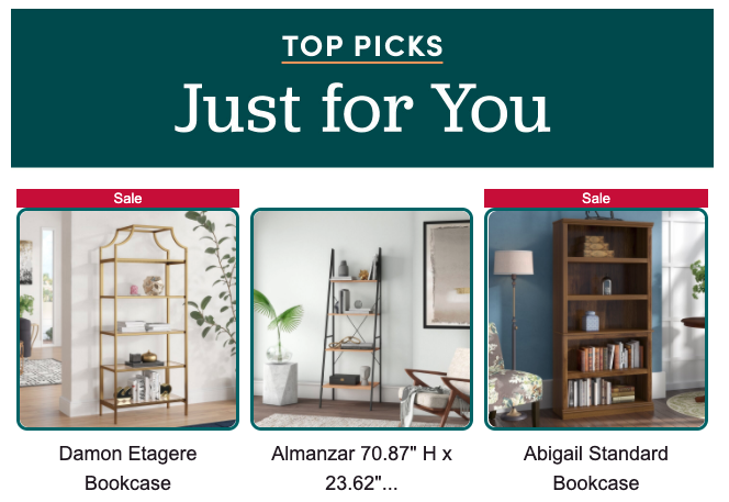
Here’s an example from Wayfair that was based on browsing history:
Recommend New Products
Recommend products to customers based on their previous buying history. Go the extra mile and even call it “Selections for [insert name].” That strategy helps create an “in-store experience” for your subscribers.
It’s as if you went to the clothing rack and specifically picked out items you thought would look great on them!
Ask Questions
If you’re selling a service or a digital subscription, you can ask your subscribers why they haven’t made a purchase yet. Give them a chance to sound off on what’s holding them back.
Doing this not only helps the email feel more personal and intimate, but it allows you to get feedback on what you could do better.
The ALT Tag Is More Important than You Think
We all know the importance of ALT tags for website images, but what about images in email marketing?
Are you currently using ALT tags properly in your email campaigns?
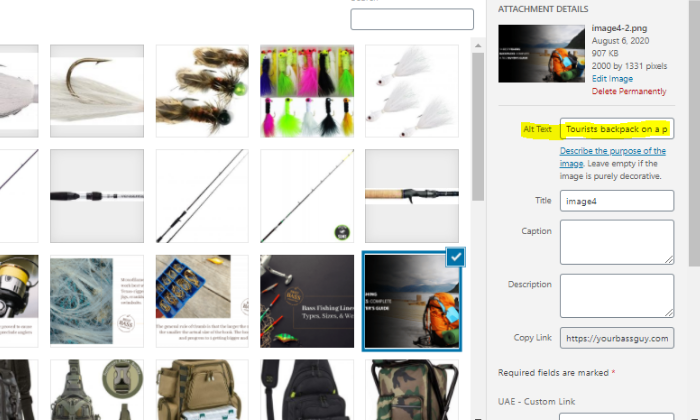
When the email client doesn’t download images correctly, your ALT tag becomes your lifeline for a few big reasons:
- When the email client doesn’t download the image, the ALT text displays to the email recipient.
- ALT text provides context if images aren’t loading.
- ALT tags make it easier for those who use screen readers and other accessible technology to understand the image.
When all else fails, the ALT tag might be the thing getting the email recipient to open.
How to Create ALT Tags for Emails?
On the back end, an ALT tag looks like this:
<img src=”youremailimage.jpg” border=”0″ alt=”How to Use Email Images in Email Marketing” width=”482px” height=”205″ />
Where it says “alt=” is where your ALT text goes. So, if an email image doesn’t load properly, that’s what will display across the email text area instead of the image.
The process of adding it might vary based on what email client you use. Here’s how to add ALT tags on MailChimp, for example.
Use the Best Format for Email Images
You have three primary formatting options for your email image. PNGs, JPEGs, and GIFs are the most common choices. Let’s look at the pros and cons of each.
PNG
Portable Network Graphics offer a large color palette, which means compressing the file size doesn’t impact the image’s resolution.
Another benefit is that you can add transparent layers, making it easy to embed the image on top of other content. This lets you blend the background image into an email with live text.
The only downside to PNGs is the file size is much larger compared to JPEGs and GIFs because of the image quality.
JPEG
JPEGs offer large image compression, but doing so impacts the quality of your image. When you reduce a JPEG image, it groups each section into larger blocks, which causes the image to become blurry — which isn’t a good look.
While these are the most common image types, I wouldn’t recommend using them for email images.
GIF
You get less color vibrance with GIFs because they use an 8-bit color palette compared to a 24-bit palette with PNGs and JPEGs.
The obvious difference is the animation effect. Using GIFs in your emails increases interactivity and can allow you to show more than one product with the same image.
How to Find the Best Email Images
Finding the right images to get your email message across is crucial. There’s a variety of different types of images you can use, and each has its own purpose. Let’s look at a few.
Charts and Graphs
Providing statistics and data is almost useless without a graphic to back it up. When you provide charts in your email to prove a point, it makes it much easier for the recipient to grasp your message.
Inside’s business newsletter has a Series A funding tracker where you can see what startups recently got funding above $5m:
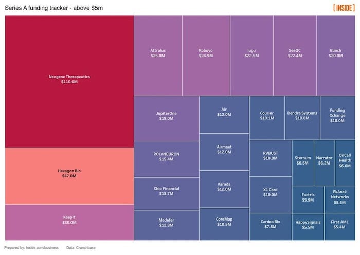
This easily shows at a glance who got the largest amount of funding, by size and color.
Piktochart is an infographic tool that makes it easy to create free charts (with a watermark). Just enter the data and select the type of chart you want.
Stock Photos
Stock images are the easiest way to add images to your email marketing campaign. There’s a large assortment of sites to choose from like Shutterstock, Depositphotos, and Pixabay.
When sourcing the best image, choose something relatable to your audience. If you’re targeting middle-age moms of toddlers, find images that appeal to your demographic.
Don’t just add images to add images — make sure they have a purpose.
Screenshots
Instead of using a numbered list to explain how something works, turn the process into beautiful imagery with screenshots.
Awesome Screenshot is a browser extension on Chrome, Safari, and Firefox that makes it easy to capture screenshots directly from the browser. You can capture a whole page or a part and download it to your computer.
Personal Photos
Keeping it real and making things personal is never a bad choice. Email marketing is all about pulling back the curtain and showing people what you’re all about.
You don’t need professional photos to make sales, and the realistic and pure nature of personal photos can be what you need.
Illustrated Content
Illustrations are a nice way to expand your possibilities. While you might be able to do a certain amount of things with a product, an illustration can display limitless options while staying true to your brand.
Here’s an example from comedian Nate Bargatze announcing a drive-in tour. After this image, his email contained a text call-to-action with more information.

Consider hiring an illustrator on Fiverr or Upwork to get affordable illustrations.
User-Generated Content
User-generated content is huge. In fact, 76% of customers trust content coming from “average” people versus the brand itself.
UGC helps create trust, and it offers authority from a relatable audience. For example, imagine how an image of someone using your product in their home would outperform a stock photo or a cartoon using it.
Offer rewards to happy customers by having them upload images to social media using specific hashtags and use those images in your email marketing campaigns.
Never Send Image-Only Emails
While images are important – you should never send an image-only email.
Here’s why:
Image Blocking Is Real
If you work in the corporate world, you understand this point. Many companies block images by default, and in fact, 43% of email users have their images turned off.
So, if you don’t have your ALT text game up to par, your campaign won’t load properly.
Email Image File Size
Email image sizes can cause subscribers with slow connections to lag and become unresponsive. If your email takes too long to load, your subscribers are going to click out or even unsubscribe because they can’t get your emails to open correctly.
Email Accessibility Is Changing
More people are using voice assistants to read emails, and these do not recognize ALT text or HTML yet. So, if the user is trying to read your image-only email, you’re out of luck.
So, what’s the ideal email image format?
Background Images with Live Text
Remember earlier, when we talked about the pros of using PNG files for your email images? Here’s where this all comes together.
Background images applied as an element to the email allow you to put live text over it, providing the most accessibility. Even if the subscriber has images disabled, they’ll see the text, which ensures all your subscribers will get something from the email.
Bulletproof Buttons
Including your CTA in your image is a fatal error. If the image is blocked or doesn’t load properly, the button or CTA you have is hidden and completely missed by the recipient.
Using bulletproof buttons allows you to build the button with code, rather than images. So if everything fails and your image doesn’t load, the subscriber will still receive your text and CTA.
Conclusion
Email images are an effective strategy to increase your email campaigns’ success, but you can’t take shortcuts.
Using the right image size, format, and design is critical to ensuring your emails get delivered and get results.
Follow all of the best and worst practices outlined in this guide, and you’ll be well on your way to a higher click-through rate and a repeatable email process that will drive traffic for years to come.
Need some help perfecting your email image strategy? Drop a comment below.
The post How to Use Email Images to Boost CTR appeared first on Neil Patel.
from Blog – Neil Patel https://ift.tt/2FVNwbM
via IFTTT
