There’s a lot to take into consideration when you’re designing a website. You have to create the layout, set up the site architecture, place calls to action (CTAs), and pick your domain name, just to name a few things.
But all too often a website’s color scheme is an afterthought.
So many site owners put little to no thought into picking their website color palette, let alone a trending color scheme. They think, “How important could my website’s colors really be?”
Well, the color choices on your website have a bigger impact on visitors than you might realize. They invoke specific feelings and can be a powerful way to motivate the choices your visitors make.
In fact, research shows that people judge products within 90 seconds of exposure — and 90% of that judgment is based on color alone. Choosing the right colors impacts how your readers perceive your website and brand.
Do it well and it can enhance your content’s readability, increase comprehension, and improve learning.
Colors are one of the most important elements that add credibility to your website. According to HubSpot, nearly half of people rank the design of a website as the number one factor in determining the credibility of a company.
Do You Need Help With Website Design?
Get help with designing your website or blog today.
Get Started
The University of Toronto conducted an interesting study on colors and how they are perceived by individuals. They determined that most people prefer combinations of simple colors.
In most cases, just two or three colors were perceived as appealing. That’s why sticking to a color palette is so important to the success of your site, and ultimately your business.
But there are more than 10 million colors to choose from. That’s overwhelming, to say the least. How can you determine which website colors are the best for your brand?
Whether you have a new site that you’re designing from scratch or an old website that needs a facelift, you’ve come to the right place.
This guide will show you which color palettes are trending so you can find the colors that best fit your website’s brand and those that match how you want your customers to feel. We’ll look at examples of real sites and list some of the exact color codes for your reference.
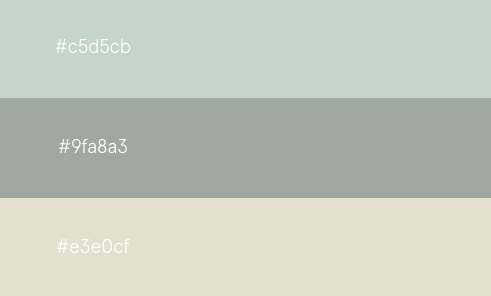
1. Soft Tones
Soft tones are definitely trending in 2020. Creations Namale is a jewelry brand based in Canada. Here’s a screenshot from the 2020 look book on the homepage of their website:
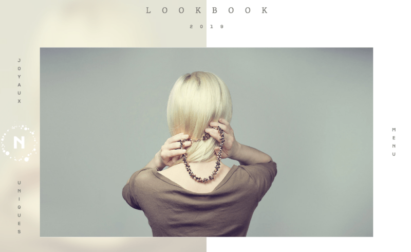
The colors are muted, classy, and very appealing. It’s a perfect choice for a brand in the fashion industry selling jewelry. The simple tones work well with each other and help the images of jewelry stand out.
In addition to the simple color scheme used on this site, the layout takes the same approach. The white space lets the page breathe. Throughout this guide, you’ll see that the use of negative space is just as important as the colors you use.
As you can see, there is minimal text. They’re a jewelry brand after all. They don’t need to rely on a bunch of text to get their message across—and their audience doesn’t want that anyway.
The muted colors give off a sense of class and refinement. It’s not in your face.
Rather than trying to cram as many products as possible onto one page, this site takes the approach of just one at a time. That gives visitors a chance to experience each product one at a time. The colors help that by supporting the images and highlighting them, rather than distracting from them.
Creations Namale is using desaturated versions of green and brown (two earthtones). Desaturation just means taking common colors and mute them. This helps this brand send the right message and not distract from their products.
If you’re interested in using these colors on your website, the color codes are below.
2. Simple Gray, Off-White, and a Pop of Red
You don’t always have to choose a bunch of different colors either. Website color palettes that use shades of gray with the occasional primary color to highlight something are less distracting and allow your audience to focus on what’s important to them.
Check out this page from Tareq Ismail’s Portfolio. Tareq is an experienced designer, so it’s only natural that he chose a powerful yet simple design and color scheme for his own website.

There is more text on the page, but it’s still simple and easy to read.
Rather than using a pure white tone, Tareq chose a slightly off-white color to blend with his gray and red color palette. This off-white works particularly well since he’s wearing a white shirt in the image on this page.
The subtle hints of red in the text really complete the look, taking a page that would be otherwise boring and making it pop.
These are the color codes used on Tareq’s site.

This is a great option to consider if you’re looking for a color palette that’s professional, simple, and works well with pages that have a bit more text.
3. Blue and Green Gradients with White Text
Stripe is a popular payment processing software option for ecommerce companies. As a technology brand, Stripe needs to stay up to date with all of the latest tech trends. But they also have a website color scheme that’s trendy as well.
Before we look at what their website looks like today, take a look at what their site looked like six years ago, back in 2013:
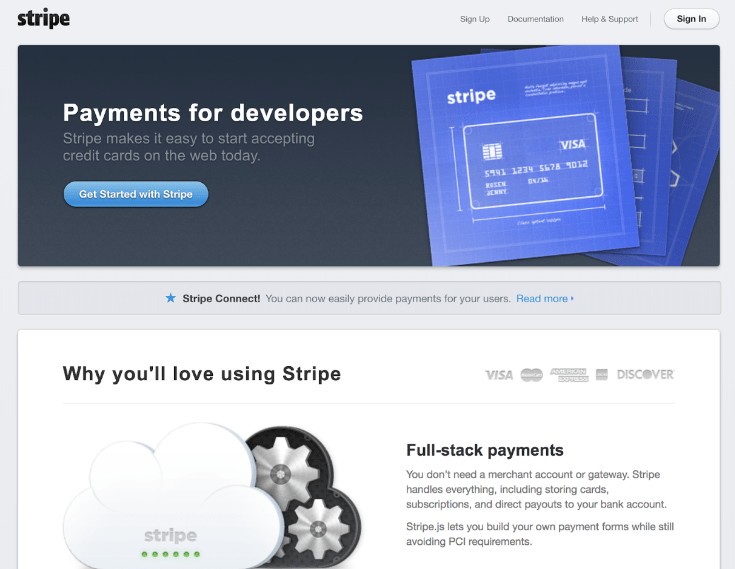
Is there anything wrong with this design? On the surface, it just looks a little bit boring and dull. There’s nothing about it that’s really visually appealing.
But Stripe made adjustments. Its current color palette uses a technique that’s been growing in popularity—gradients. Take a look for yourself:
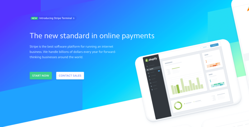
This page blends vibrant blues that fade into a nice bright cyan with a hint of seafoam green to provide a dynamic background for the white text to jump off of.
By using a gradient scale, Stripe takes a very simple blue color and blends it with different tones to create more texture in the background.
The difference between the 2013 site and the 2020 site is like night and day. Even if you’d seen the two homepages without knowing the years they were live, you’d have been able to identify the newer one.
If your website is currently outdated and looks more like the Stripe site from 2013, try adding color gradients to give your palette a more modern look.
4. Throwback Orange and Red tones
Retro color schemes are making a big comeback in 2020. Lots of top brands are using popular colors from the 1970s, ‘80s, and ‘90s on their websites. But they are putting a modern twist on them.
By incorporating retro elements with modern tastes, they’re able to give new life to old trends. They’re also able to evoke specific and familiar feelings in their audience no matter when they grew up.
It’s a bit of an oxymoron. How can something be retro and modern at the same time?
Let’s look at the Spotify homepage.
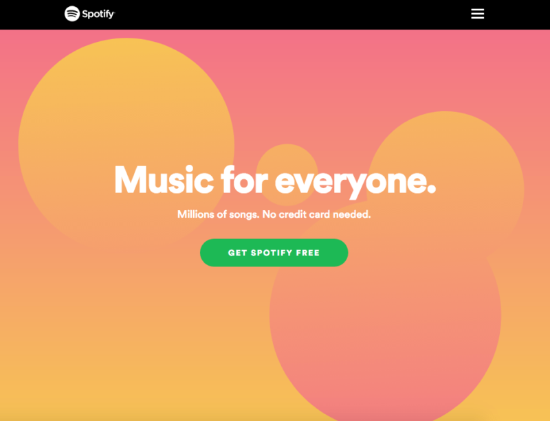
These warm orange and red tones have a throwback vibe to them, but the design itself is very trendy and uses gradient scales to blend the colors.
You can use generational marketing to segment your target audience. It’s important to make sure you understand who you’re trying to target with your website color schemes. This goes far beyond just picking pink designs for women and blue designs for men.
Spotify chose these colors because they knew some of their audience included those who grew up in the ‘70s and ‘80s. They also know there’s a trendiness to these colors that younger generations love.
5. Soft Pink, Bright Pink, and Jet Black
Cowboy differentiates its brand by selling electric bikes on a modern—and slightly pink—website. Typically, the words “cowboy” and “pink” don’t normally go hand in hand, but the sleek and trendy design of this website is perfect for what they’re selling.
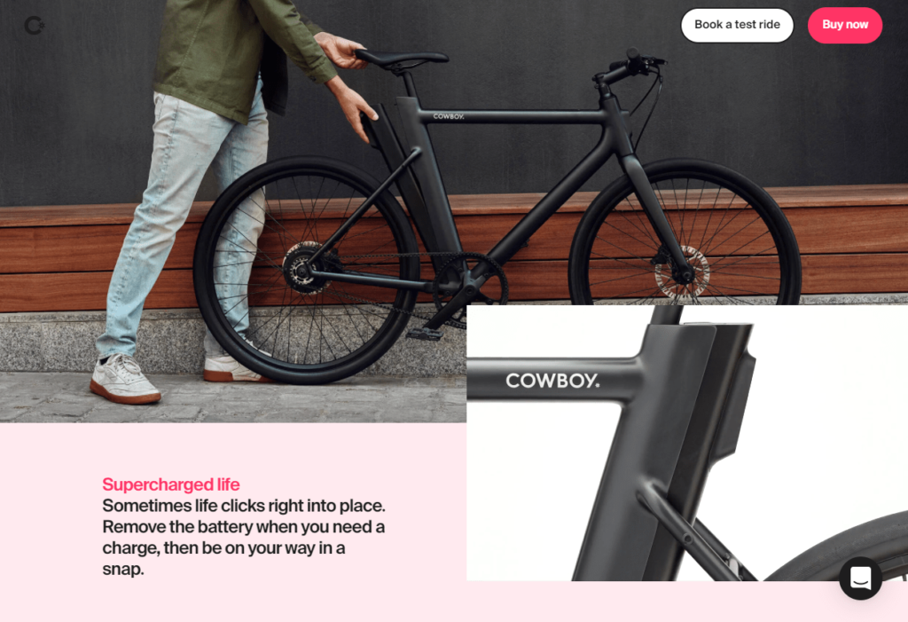
The soft pink tones in the background makes the jet black bike stand out and become the center of attention. By adding the brighter pink accents in subtle locations around the page, Cowboy Bike nails the trendy and modern color palette.
Despite a feminine connotation with pink, Cowboy targets users of any gender. Instead, they evoke feelings of enjoyment, trendiness, and social buzz when used with black.
If you like this design and think that the modern feel would work well for your website, you can use these color codes as a reference when you’re choosing your color scheme:

6. Gray, Soft Yellow, and Deep Blue
The QED Group is an organizational development firm based in the Czech Republic that is keen to apply concepts in psychology and behavioral economics.
QED Group knows company culture and empowerment, so it makes sense that they have a sleek website that uses unique color combinations in a smart way.
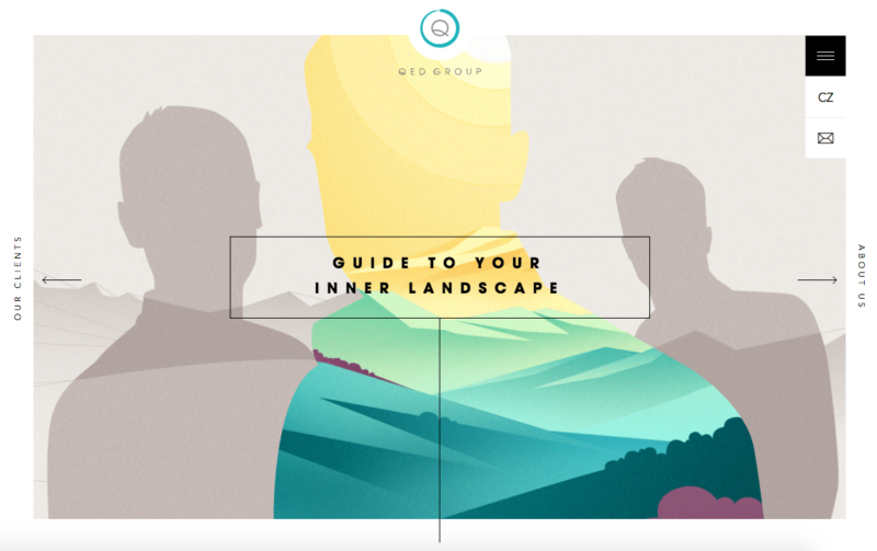
At first glance, the color palette of their home page is a bit busier than some of the other examples that we’ve looked at so far. But they still pull it off well with this trendy design.
Normally you would think that yellow, blue, and purple tones would be difficult to read and hard on the eyes. By using lighter and dull gray tones in the background, they are able to add brighter contrasting colors to the middle silhouette.
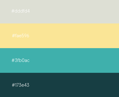
If you like the modern look of these soft yellow tones paired with gray and deep blue, check out these color codes:
7. A Very Light Touch of Earth Tones
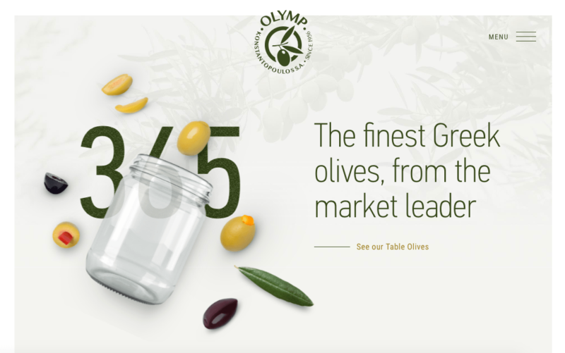
Konstantopoulos S.A.’s “Olymp” label sells Greek olives. Hence, earth tones—especially shades of green that hew close to the color of olives—make sense for its website.
The layout and design of this homepage are very simple. The main color choice here is olive green, of course. But as you can see, it’s used very sparingly.
It’s a fresh take on a classic, but effective color scheme. Rather than going overboard with wall to wall saturation of dark greens, the soft gray background helps the images, text, and colors pop.
Look closely and you’ll see muted green leaves in the background. This helps highlight the green text and logo, and draw your eye to them.
For businesses that deal in healthy foods, plants, and agriculture, the earth tones color palette is a great choice. Refer to these green, gray, and light brown color codes to get a similar look on your website.

You can do something similar if your product has an identifiable color. Start with the light gray background and darker gray copy color and add your accent color in sparingly. This is a good launching point for simple, not-too-busy color schemes that provide a quick facelift with just an identifying main color and a complimentary accent color.
8. Lots of Red, Balanced with Muted Tones
If you look back at all of the trending website color schemes we’ve covered so far, you’ll notice a popular color that’s rarely used—red.
That’s because red is one of the most powerful but challenging colors to use on a website. It can be overwhelming since red easily draws a reader’s attention. But when used right, it can be a great way to add excitement to your website.
One way to effectively use red is to use a light touch to give a pop of color to something as small as a few key words in the text (remember Tareq Ismail’s portfolio in #2?).
Another way is to pair more muted colors with red. This is a more advanced color scheme tactic than what we saw on Tareq’s website.

A while back, the creative branding agency five/four swung for the fences by using a bright red color on a huge portion of their website, paired with tan and a muted bluish-green.
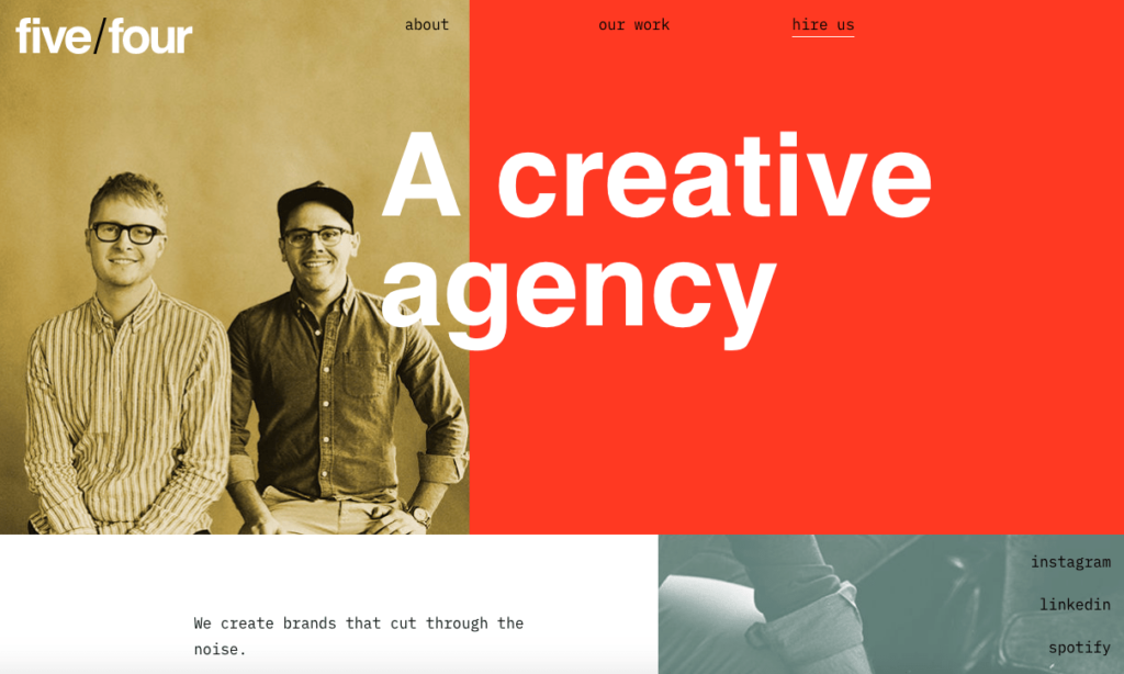
The red here is doing a lot of the heavy lifting, with the muted blue-green supporting it as an accent color. If they had decided to go with bright yellow, light blue, and bright orange in addition to this red color, it would have been way too much.
But these soft colors pair perfectly with red. This red works really well for the brand, too. It’s bright, bold, and draws lots of attention to the theme of creativity.
So, for those of you who want to go modern and bold with your color scheme, consider using these color codes with red on your website.
Just make sure you don’t go too big with the red. You want to be certain that you have enough of the softer tones to let your page breathe, while still capturing a trendy appearance.
9. Futuristic Pastels and Primaries
This list wouldn’t be complete without an example of Anton & Irene. These are professional designers based in New York. They specialize in all aspects of design, including digital products.
And they put on an absolute masterclass on pastels and primaries.

One of the best parts about this website color scheme is the futuristic feel about it. The outfit choices of Anton and Irene are pretty far out. It’s a bold choice–but sometimes, the boldest choices pay off the most. Here they use flashy combinations without it ever descending into gaudiness.
While this site uses more colors than some of the other examples we’ve seen so far, they are used sparingly, so the page isn’t messy or unappealing. This is reflected in the image they use too: Anton wears contrasting purple and orange while Irene wears blue and yellow. They’re imperfect opposites (blue’s opposite is orange, and purple’s opposite is yellow), but they work together well as a whole.
If you’re looking for an artistic spin for your website color scheme, try using different combinations of these exact colors.
10. Black on Black on Black
We’ve seen some black on nearly every website that we’ve looked at so far, but always used pretty sparingly. It’s usually reserved for text, as opposed to being one of the main colors or background.
However, that doesn’t mean you can’t use heavy blacks in more abundance for your website color scheme. Doing so helps showcase feelings of class, luxury, and professionalism— especially if you use different black tones like these:

Check out the JY BH homepage. By combining different shades of black, you’ll get the gradient effect, which you saw earlier with some of our other examples. The heavy black gradient gives the site a mysterious, bold look.

This company is a French clothing manufacturer that sells luxury garments and accessories for both men and women. Just like in fashion, black is a timeless color for web design. It’s been popular for years, and will continue to be popular in 2020 and beyond.
But if you’re going to go black on your website, use different shades to add depth and texture, like the example above. Just one black will look flat and basic.
More Resources on Website Design
Of course, your brand is much more than the color scheme you choose. The way those colors interact with your overall website ultimately impacts your conversions, credibility, and the success of your brand.
To help you create the best website you can, here are a few of our very best resources to serve as guides on your design journey:
- 13 Website Design Best Practices. This is our checklist of everything you need to know about designing a winning (and converting) website.
- How to Create a Website (Step by Step Guide). Don’t know where to start? Read this article on how to create a great website from scratch. No coding knowledge required.
- Website Planning in 4 steps and 20 minutes. You wouldn’t want to go on a road trip without building a route first. And you wouldn’t want to create your company’s website without planning it out. This guide will show you how to choose the right content types—and how to structure them for your site.
- How to Design a Homepage That Converts. Homepages are where the majority of your visitors will first encounter your brand–so you want to leave a good first impression. Here’s how to do so while converting them into lifelong customers.
- The Best Web Design Services. You don’t have to do this on your own. In fact, if you have a good budget, we highly recommend you turn to a proven design service company to help you build your website. Trust us. It’s well worth the money.
- How to Choose the Right Color Schemes for Your Ecommerce Shop. Want a great way to influence your visitors into paying customers? Color psychology is a subtle, but powerful way to do so. Here’s how you can get started.
- How Colors Affect Conversion Rate. Here’s our full infographic on how colors impact your bottom line.
Conclusion
It’s 2020. That means it’s time for you to ditch the color scheme you were using years ago. It’s important to switch it up because color schemes can impact sales on your website.
Using these color palettes as a launching point, you can create a modern, trendy, and unique website. You can even use some of the exact color codes that we showcased.
You’ll likely find that choosing the right website color palette doesn’t have to be hard. And when you do it, you give your brand the shot in the arm it needs to draw in new visitors and excite old ones too.
Do You Need Help With Website Design?
Get help with designing your website or blog today.
Get Started


from Quick Sprout https://ift.tt/3mZcO8c
via IFTTT