We all want our websites to be great. Not only will a high-quality website draw new visitors to your brand, but it can also keep those visitors coming back, turning your website into an income-generating engine.
Too often, site managers make subtle mistakes that end up hamstringing their efforts. When this happens, your visitors won’t think your site (and your brand) are high-quality—and they’ll turn their attention to a brand that is.
With so many other options available on the market, it’s too easy for people to find what they’re looking for somewhere else.
This goes for ecommerce stores, blogs, or any business that has a website. If a visitor sees a red flag on your website, they will leave. It’s that simple.
Some of you may not even realize you have components on your site that drive people away. Even if you think you have some of these basics down, you can always add more components to improve your credibility.
And that’s just the tip of it. Creating a high-quality website isn’t a “set-it-and-forget-it” thing. It’s an ongoing process of tweaking, polishing, and testing to create something great.
The 22 Elements of a High-Quality Website
With that in mind, here are the 22 elements you need to keep in mind when creating a fantastic site.
- Relevance and context
- Content length
- Expertise
- Grammar and spelling
- Readability
- Formatting
- Images
- Social media integration
- Internal and external links
- Quality of comments
- Limit advertisements
- Ease of navigation
- Make customer service easily accessible
- Contact information
- Reviews and testimonials
- Validation from other media sources
- Awards and achievements
- Page loading speed
- Security
- Clearly state all policies
- Be upfront about your prices
- Secure the checkout process
Let’s jump in and take a look at each in detail.
1. Relevance and context
What keeps you coming back to the websites you visit more once or more a day? Most likely it’s because of engaging, relevant content.
Developing well-written and informative content for visitors is one of the biggest key factors in creating a high quality website.
Quality content is original, purposeful, and correctly optimized information that people and search engines are driven to read, view, and share. Google’s algorithm recognizes high quality, relevant content, and rewards it with higher rankings.
Focus on creating only the best high-quality content that you can. That means content that is personalized for your target audience.
Only then will it be relevant to them and demand their interest. It will both help you rank better and delight your customers.
Go deeper: Want to learn more about creating things your audience will love? Check out our 9 tips to create highly engaging content.
2. Content length
There’s a lot of conflicting information out there about the ideal blog post length. Some sources will tell you 500 words is the sweet spot. Others will tell you to unleash your inner Tolstoy and crank out thousands of words.
Our suggestion is to focus on developing longer, high-quality content between 1,400 and 3,000 words.
One study by Backlinko found that the average word count of articles on the first page of Google is 1,447 words (see below). That said, we’ve also discovered that longform blog posts tend to perform better in both backlinks and rankings.
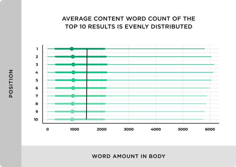
Notice I said high-quality content above. That’s because word count doesn’t matter much if the overall quality of your content and website is bad. People won’t want to stick around and read it and Google will ding you for it as a result.
Takeaway: Sites with more words in the copy occupy higher ranking positions but it is important to find a balance between SEO and user readability.
The perfect blend will vary depending on your niche, competition, and audience.
3. Expertise
High-quality pages and websites need content that demonstrates authority and trustworthiness on their topic.
The expertise of the author is a critical factor for any content to be considered high quality.
People want to read posts from experts that can dig into a topic and explain it. Focus on writing detailed, well-researched posts and give examples to support your points. Remember: longer form, high-quality content tends to perform better on search engines anyway.
4. Grammar and spelling
Have you noticed a theme yet regarding your website’s content?
That’s right, I’ve said “high-quality” several times and I’ll say it again. This point is simple, though—obviously, spelling errors and poor grammar will come across as amateurish and lacking in quality.
Reread your content before it goes live and run a spell check before you publish. Or, better yet, hire an editor (Editor’s note: I may or may not have demanded that this line be added).
5. Readability
Readability is the ease in which text can be read and understood.
Use shorter sentences, paragraphs, and active verb forms. Remove all clutter and unnecessary words, and limit the use of adverbs and adjectives when possible.
That’s because, sometimes, less is more.
For example, Ernest Hemingway styled his writing to be concise and simple. Each sentence is trimmed of fat. As a result, he was able to write some of the greatest stories in American literature.
Be like Hemingway (but, of course, without the excessive drinking and cheating on your significant other).
Use the Flesch reading ease formula to determine the readability of your text before publishing. This not only improves your content’s readability but it also optimizes it for mobile readers too.
6. Formatting
Roughly four out of every five users always scan web pages, according to a Nielsen study.
Not only that but visitors are less likely to read a post with poor formatting. High quality content is easier to read, and suitable for scanning and skimming.
Use HTML headings such as H1, H2, H3, plus tags, number lists, and bullet points to break your content down into easy-to-scan sections. Also, add a linked index at the beginning of your article if it is long.
The headings, tags, numbered lists, and bullet points will help make your content scannable and readable. Use bold and italics to highlight important parts so that they are highly visible as people scan.
7. Images
Include images in every piece of content that you publish. Be careful not to go too crazy with these! Too many images and videos bog down your site’s loading speed.
But images are great for a number of reasons. For one, they help break up long blocks of text. For example, which of the two pictures below is more difficult to read?
This one?

Or this one?

The first one, of course. The second one benefits from the images of adorable cats breaking up the huge blocks of text (and also taking advantage of everyone’s love for adorable cats).
Also a good text or video helps add depth to your blog post. This is a place where the old writing adage of “show, don’t tell” applies.
Plus, your image helps with SEO rankings. For example, if you use WordPress and click on ‘edit image’…

…you can fill out the alternative text for it. If your image doesn’t load for any reason, your browser will load the alt image text instead.
Not only is this good for your visitor, but Google uses the alt text while crawling the Internet images. If your alt text is “dog sitter”, there’s a chance your image might show up when people search for “dog sitter.”
Overall, images are a great addition to your blog posts because they can help make your articles more readable and increase SEO.
8. Social media integration
Integrating social media to your website gives your users more ways to share and engage with your content.
For example, add social sharing links to your blog posts to give your visitors a way to share your content. This increases your brand awareness and introduces you to folks who might not have otherwise heard of you.
You can also create a social login option. These are websites that allow you to login using Google, Twitter, Facebook, LinkedIn, and more.
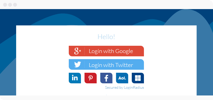
Your readers will thank you for it. 73% of people prefer to login using their social media accounts anyway.
So place your social media sharing icons visibly on the page and include call-to-action for people to share.
9. Internal and external links
Linking to valuable internal and external resources not only helps your readers but will also help you rank better.
This isn’t just hearsay. Google Search Quality Senior Strategist Andrey Lipattsev said it himself in a Q&A.
Relevant bit starts at 30:26.
Lipattsev says that the two most crucial factors are “content and links pointing to your site.”
Not only is it important to have links pointing to your site, but you also need to link to articles in your own website as well. 9 out of 10 sites at position 1 in search engine result pages have at least one internal self-referencing link.
Focus on building a nice internal link architecture. The URL that you link to and the anchor text need to be relevant to your content.
Go deeper: Learn more about how to build an effective link architecture for your website here.
10. Quality of comments
Content with a high number of comments is perceived as high-quality.
On the other hand, spammy unrelated comments might hurt your rankings and make you look bad in the eyes of your visitors.
Of course, this depends on a number of factors:
- Do you want comments on your articles? Some websites don’t include comments on their articles at all—and that can be fine! However, if you want to build a community of readers, as well as a relationship with them, having comments is a great way to do it.
- Do you have the resources to manage comments? If your site is popular (which it will be if you follow our advice), you could see dozens or even hundreds of comments with each article. Moderating them can become a full-time job. Do you want to have someone on your staff spend time moderating? Is that worth it to you?
If you do decide to have comments on your website, you’ll also have to choose the platform on which visitors can comment. Typically this comes in the form of either the default commenting tool (like WordPress has for most of their blog themes) or an integrated commenting platform like Disqus.
Make sure you moderate your comments and leave thoughtful responses to engage your users to do the same.
Quality comments help you rank better and encourage readers to engage with the content.
11. Limit advertisements
While advertisements may be a nice form of income for you, they aren’t going to be popular with your visitors.
How much do you rely on ads to make a profit? If it’s just a small percentage, I recommend getting rid of them altogether.
If you’re an ecommerce site or have a website that makes money from other revenue streams, ads aren’t always necessary.
But say you run a blog and ads are your primary income. In that case, you’ll need to keep them as limited as possible.
Take a look at the types of ads people dislike the most:
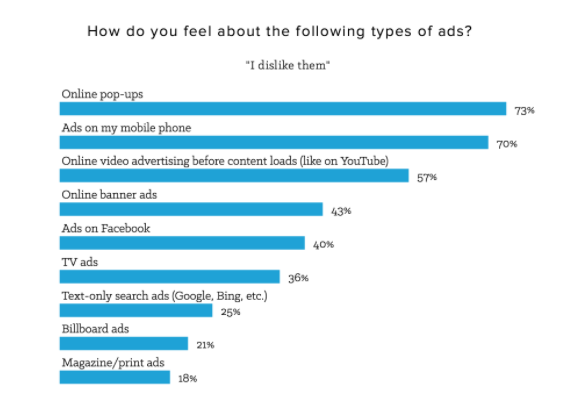
Take these numbers into consideration. Avoid popup ads and use minimal banner ads.
Remember: Ads might be a big income stream for you. Just make sure you find creative ways to keep them without derailing your visitor’s experience.
12. Ease of navigation
Customers shouldn’t struggle to find what they’re looking for on your website.
A few rules of thumb to help you nail navigation:
- The menu options should be limited so it’s not too overwhelming.
- Add a search bar so your readers can look for something specific is a great way to improve your navigation as well.
- Include your logo, contact information, and navigation buttons in a horizontal nav menu at the top of the screen.

Check out this heat map of where most visitors look when visiting QuickSprout to see how effective our navigation elements are.
All of this helps enhance the user experience, which helps with your credibility score.
13. Make Customer service easily accessible
If someone visiting your site has a question or problem, they shouldn’t have to hunt for customer service options.
This should be readily available. When customer service is unreachable, it makes the visitor feel uneasy.
Note how Apple Support gives customers a variety of ways to reach customer service:
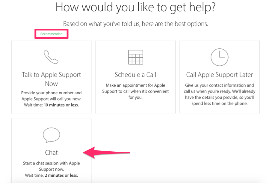
Apple offers these options for customer support because they know their users love to have choices. They even recommend one for those who aren’t sure about what they should pick.
Think about what your target customer would appreciate? Would they be more amenable to live chat? Or would they appreciate a phone call more?
Giving your customers different options to contact you is a great way to build trust and a lasting relationship with them.
14. Contact information
This should go without saying, but you’d be surprised how often I can’t find contact information on websites.
When I see that, I think it’s sketchy. What are they trying to hide by withholding their phone number? Not including contact information is a good way to lose credibility and leave your visitors frustrated.
Make sure your site has:
- Physical address if you have a brick and mortar location or accept mail.
- Email address so they can contact you if they have any questions or concerns.
- Phone number if they need to contact specific people at your business or if you have customer support set up.
- Links to social pages (Facebook, YouTube, LinkedIn) so visitors can follow you and share your brand.
Failure to do so will make your page appear untrustworthy.
15. Reviews and testimonials
Showcasing customer testimonials on your website helps generate social proof. This is the concept that people tend to imitate the actions of other people. This is especially true if you can get a testimonial from an expert in your industry.
Imagine two sets of dumbbells. Both sets are similar in size, weight, and quality. However, one set has the full endorsement of Arnold Schwarzenegger.
Which set would you be more likely to buy? The one with the Governator’s approval of course! Heck, you might even be willing to pay a little more for it. That’s the power of social proof.
You should also have a place on your site where customers can leave reviews. While good reviews are obviously what you’re looking for, some unfavorable comments may actually boost your credibility as well. After all, if all customer feedback on your website is positive, it may appear fake.
Even if some people didn’t have the best experience with your business, allowing them to leave a review for others to read will establish trust. It also helps prove you’re an actual business and not a scam.
Bottom line: Reviews and testimonials are all about building trust and credibility. Use them to your advantage.
16. Validation from other media sources
Have you been featured in a magazine, newspaper, or on a website? Any positive press about your company should be proudly displayed on your site.
If established media sources have verified your business, it will increase your legitimacy in the eyes of anyone who visits your website.
Find a good spot on your page to add any videos, screenshots, or links to all those stories. Some good places I suggest would be your about page, your home page, your social media feeds, or a dedicated press page for your business.
17. Awards and achievements
Your website is a great place to show off any awards or achievements whether it’s local, regional, or national.
Showcasing awards from the past shows you’ve been credible for a while. That can help establish credibility.
If you’ve been operating since 1950, don’t be afraid to plaster that fact on your website.
18. Page loading speed
The faster your page loads, the higher your conversion rates will be. That’s because users expect a speedy load time. If they don’t get it, they’re liable to turn elsewhere.
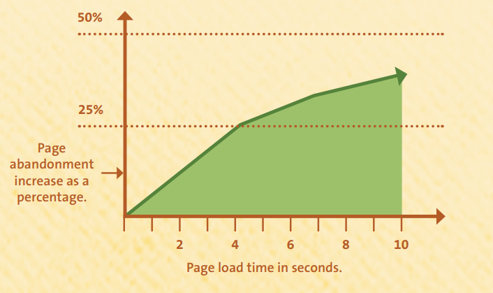
Page abandonment rates increase with longer load times. It’s that simple.
One key factor is your web hosting service. As your website grows and you garner more visitors, you’ll want to upgrade your web host in order to meet those demands. You get what you pay for. Check out our guide on the best web hosting providers for more information.
It’s worth it to pay a little extra to avoid technical glitches and always have fast loading times.
19. Security
What kind of security measures are you taking to protect users who visit your website? If you don’t know or if your answer is “Not a lot” then you need to change that.
More than 50,000 websites get hacked each day. If you don’t put up a few basic security measures, your website could be one of them.
While there are a lot of different ways you can keep your website safe, here are a few I recommend at a minimum:
- Use HTTPS protocol. This is an HTTP protocol (the rules used to transfer information from your server to a user’s browser) that helps secure users communication over the Internet. It is what ensures the security of users’ sensitive information such as credit card numbers and banking information online (see below).
- Choose a safe hosting plan. When it comes to security, not all web hosts are made equal. For example, shared hosting plans are affordable and can be good for small websites. However, they’re vulnerable to attack if other websites on the server get hacked. Check out our lists of best web hosts for the ones we trust.
- Backup your website. Sometimes crap happens. When it does, you’ll want to make sure that your website is backed up. Otherwise, you could lose all of your content if it gets hacked or attacked.

Doing these things not only can help the security of your website, but it also builds your credibility and trustworthiness with your audience.
If your website leverages a SaaS tool to help secure it, be sure to showcase those badges on each page.
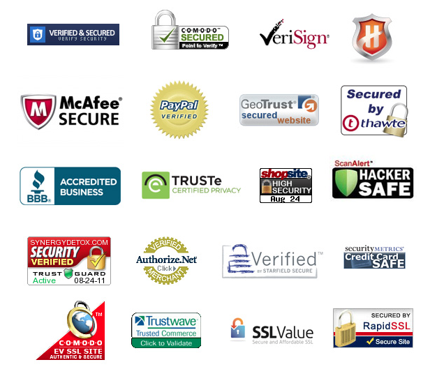
Studies show that people trust the Norton AntiVirus seal the most compared to other badges. If you use Norton, proudly display that badge on your site.
20. Clearly state all policies
Don’t assume website visitors know your company policies. That’s why all of these should be clearly stated on your website.
Make sure things such as your return policy or money back guarantee are outlined in detail as well. If you’re an ecommerce business, consumers may be hesitant to shop if they don’t think you stand behind your product.
This will help you from a legal perspective as well in case there is a dispute.
21. Be upfront about your prices
Don’t try to sneak hidden fees past your customers, it’s shady.
Let’s look at the top reasons for shopping cart abandonment:
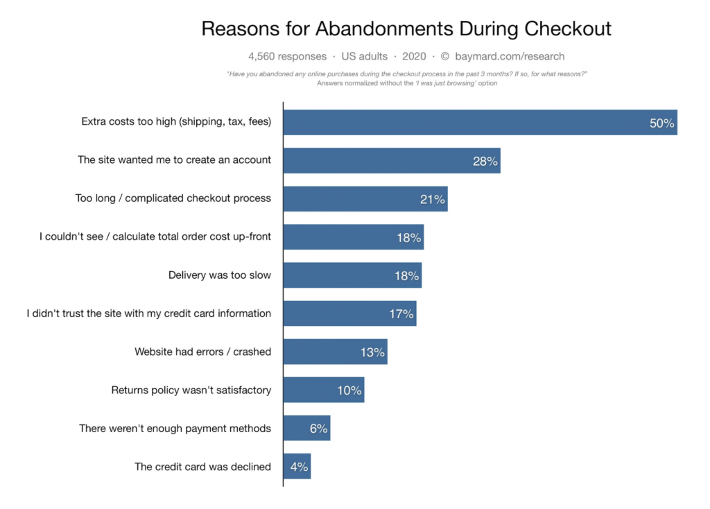
Tell your customers early that you’re charging them tax, shipping, or other fees.
You should have all your prices clearly listed on the website. Adding extra costs in the shopping cart could make the customer think you’re trying to sneak one by them.
It’s just not good business practice.
Why wouldn’t you just list your prices? What are you trying to hide? Those are questions that will go through the customer’s mind if you do that.
22. Secure the checkout process
In addition to adding security badges to your page, you have to make sure your checkout procedure is secure. If it isn’t, it could cost you untold thousands of dollars if there’s a security breach. Perhaps more importantly, it’ll cost you the trust of your customers.
Look at this example from Dick’s Sporting Goods:
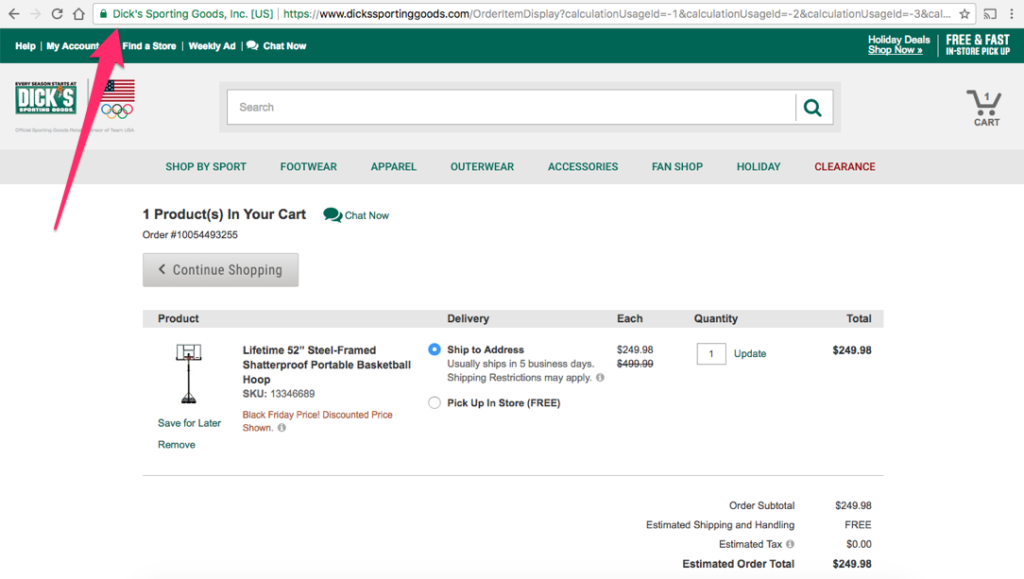
The secure link will make customers feel comfortable about entering their personal information, including a credit card number.
Conclusion
I wish I could tell you that if you just picked a few of the key elements above, you’d have a great website. But the reality is, you won’t.
It’s a total package type of thing, and you need to work on all of the elements listed above.
Sure, implementing a few of them is better than implementing none, but the goal is to make your website so great that people would want to come back and buy from you.
If your site looks incomplete or untrustworthy, it can drastically impact your traffic and conversions.
Most importantly, though, this is an ongoing process. You need to iterate and reiterate this system to get it working for you. As you constantly update and tweak your website, you’ll find that there’s always new ways to improve.
Make sure you do your best to create a high quality website by using as many of the 22 key elements that I described above.
from Quick Sprout https://ift.tt/2Uyukmu
via IFTTT
