Color is one of the most sneakily influential parts of your business—even if it doesn’t seem like it.
Not only does it impact the way people perceive your brand, but it also impacts your bottom line. Your customers make certain decisions about purchasing (or not purchasing) your products based on your color schemes. It’s the reason restaurants are so intentional about the colors they use.
This isn’t just hearsay either. Color psychology is a very real academic study. Not only does it impact your day to day life, but it will have an outsized impact on your business too.
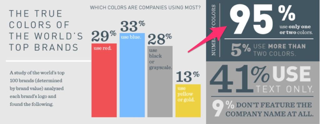
In fact, research has even shown that color accounts for 85% of an individual’s purchasing decision:
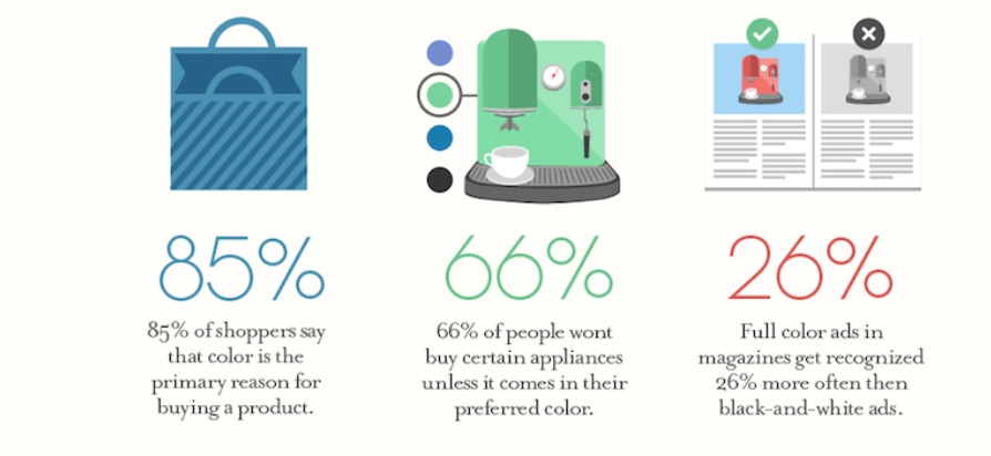
Yes, these numbers are pretty eye-opening—but there’s more to it than that. Simply changing your website from red to blue won’t increase sales by 200%. Conversion optimization is a bit more complex than that.
However, this does show that you should put more thought into color schemes than what looks good. When you use the right color schemes, you can have a massive impact on the way customers interact with your website.
These interactions can ultimately lead to more sales and more revenue.
In this post, I’ll get into a few of these elements and ways you can use them to make the best creative decision for your ecommerce shop. Later, I will show you the very best resources to help you learn more about designing a great ecommerce website.
7 Tips to Choose the Right Color Schemes for Your Business
- Choose colors for your brand-not just your ecommerce store
- Apply color psychology
- Consider your industry and products
- Consider your target demographic
- Use the right color usage pattern
- Consider user experience
- Color psychology won’t always fit with your business
As with anything business related, what works best for you and your business is going to be unique. Just because other ecommerce stores are using a specific color scheme doesn’t mean you should too.
For example, UPS and FedEx offer the same services. However, they have entirely different color schemes (UPS is brown and gold, whereas FedEx is blue, orange, and white).
Also, it should be noted that color theory and psychology isn’t a hard rule. Instead, think of them as launching points for your ecommerce website’s ultimate design.
With that out of the way, let’s jump into it.
Tip #1: Choose colors for your brand—not just your ecommerce store
Too many entrepreneurs forget that choosing colors is a branding choice. If you have no brand, it’s impossible for you to make the right decision when it comes to visual elements.
Your ecommerce store is no exception. The color scheme has to be consistent across all your business assets. I’m talking about social media, business cards, blog graphics, etc.
Professional sports teams do this very well. For example, the Los Angeles Lakers have their classic purple-and-gold uniforms that are instantly recognizable. They use those colors across merchandise, social media posts, advertisements, uniforms, and more.
It’s not enough to just choose a few colors you think look nice and going with it. You first need to get crystal clear about your brand. When you have that, it will be much easier to relate it to the world visually.
Use the following prompts to help you gain clarity into how your brand identity could be represented by color:
- In one sentence, express who you are, what you do, and whom you do it for.
- Think about one word that describes your ideal customer.
- How about one word that describes your brand?
- How do you want people to feel about your business?
- What problem do you solve for customers and how do they feel after it’s been solved?
Take a note of your answers. You’ll need them in the second tip.
Tip #2: Apply color psychology
In the exercises above, I place a lot of emphasis on feelings.
That’s because the way a potential customer is feeling influences their purchase decision-making. For example, if a person coming into a store is in a bad mood, the salesperson has to do more to get the sale. However, if the person is in a good mood, they’re more likely to purchase a product.
That’s where color psychology comes in. The right color can help improve a customer’s mindset and prime their feelings before any sales conversation happens.
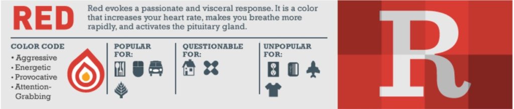
Think about it. It’s why you’d wear a red outfit if you want to be a showstopper. That’s what red does.
If you entered a room and the dominant color was black, you’d feel a sense of sophistication and luxury. That’s the response that black evokes.
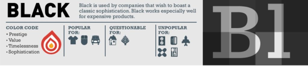
Why do we associate emotions with colors? It’s part of our conditioning. And it’s not just emotions. Concepts, actions, and qualities are all evoked from visual cues such as color.
Bottom line: You can (and should) use these connotations for your ecommerce website’s benefit.
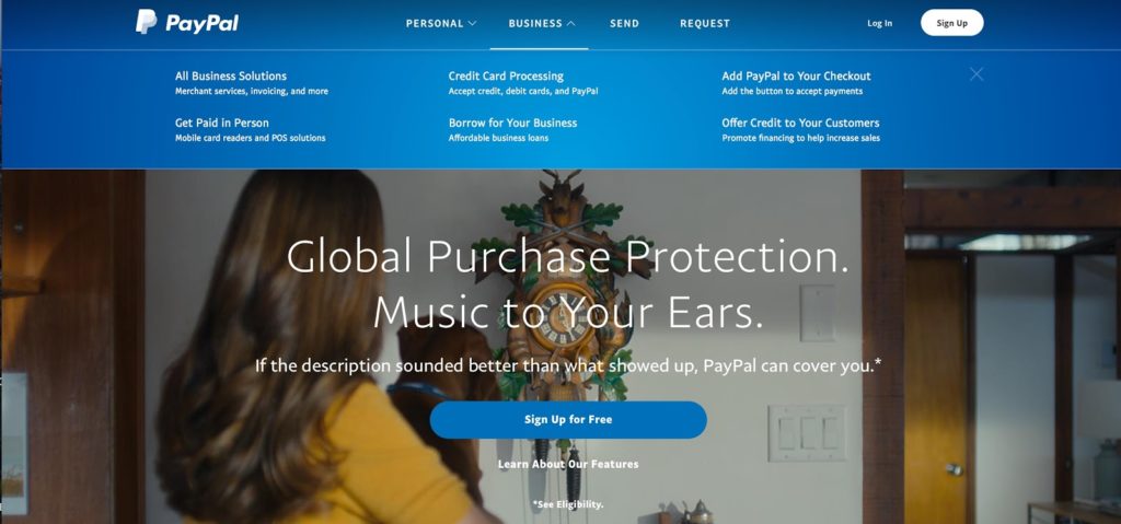
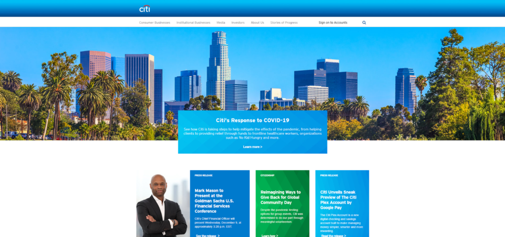
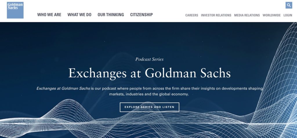
Want to come across as trustworthy and dependable? Consider blue. The financial industry uses this to great effect. It’s the color of security and trustworthiness, which is what you want people to feel when you’re handling their money.
That’s why it makes sense that companies like PayPal use it.
So does Citigroup.
And many others like Goldman Sachs.
While blue can evoke positive emotions like calm and security, it can also bring up negative feelings. In fact, all colors evoke both positive and negative feelings:
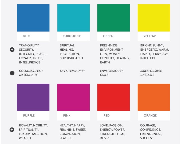
And some more …
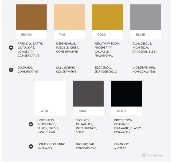
Note: Color psychology is even more nuanced than what these images say. This is just a simplified look at the topic.
Other variables need to be considered. It’s not just about your logo and what colors you use in the header. It also involves what kind of brand you create—and what you offer your customers.
Tip #3: Consider your industry and your products
There are a set of color schemes that are innate to most industries.
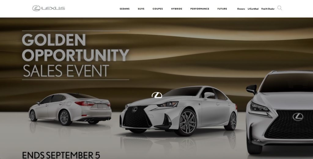
For example, black, gold, and silver are prominently used in the luxury automobile industry. That’s because they conjure feelings of refinement, wealth, and status.
Take Lexus for instance.
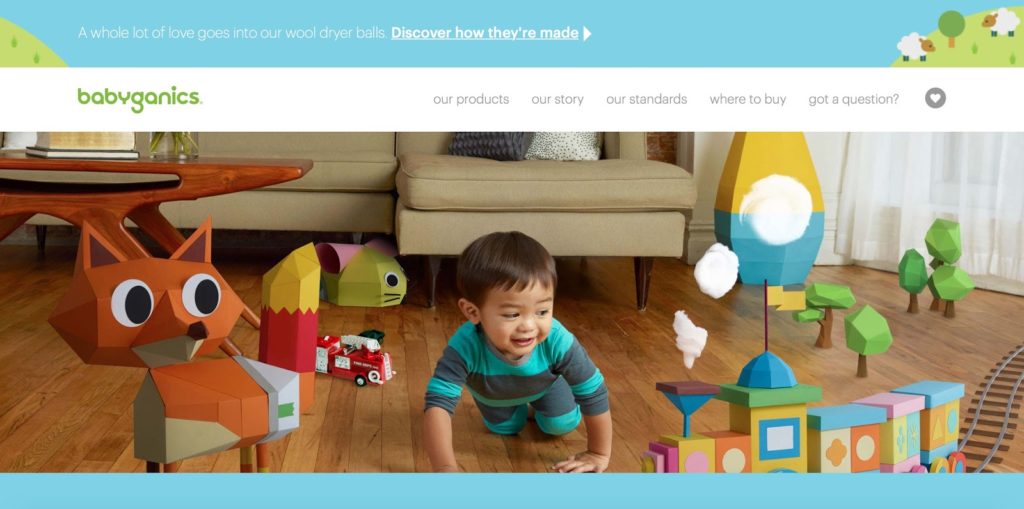
Brands with a health and eco-conscious focus, like Babyganics, gravitate towards greens, blues, and yellows. This evokes the natural and vibrant feelings of childhood.
To get a full understanding of your colors, visit the ecommerce stores in your industry. Grab a notebook or pull up a Google Doc and take notes. Examine their color schemes and other visual elements.
What works and what doesn’t?
What are some patterns that show up across the board?
This research is important even if you don’t use the colors you find. By getting a sense of what’s happening in your industry, you will end up getting a better idea of the direction your brand should (and shouldn’t) go.
You may even decide that a particular color is represented too much in your industry. To differentiate your brand, you can take an alternate path.
One good example of this comes from Uber and Lyft. Uber goes with black, evoking feelings of sophistication, luxury, and reliability. They even offer services specifically targeting riders who value a luxury experience.

Whereas Lyft uses magenta. It’s a more fun, light-hearted color to evoke a more playful feeling. They’re going after younger clientele who would more than likely use a Lyft to head to a fun night out (socially distanced, of course) than to head to work or to meet a client.
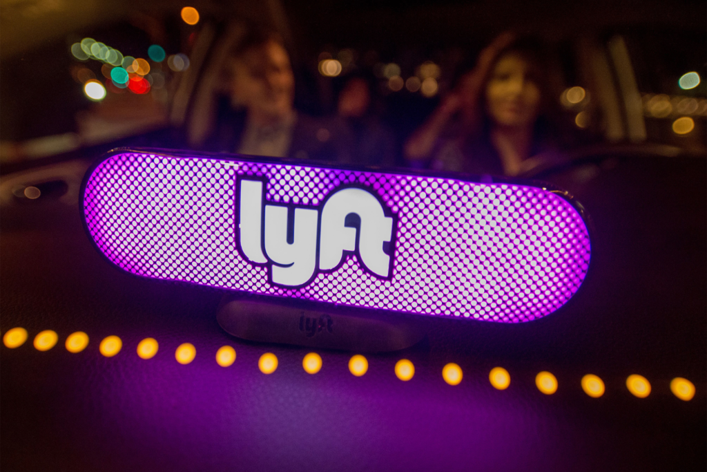
Go deeper: Uber has an entire page dedicated to their color branding choices. Even if your industry isn’t in ride-sharing, it’s worth the read to see the intention and reasoning behind a successful company’s color choice.
Tip #4: Consider your target demographic
This is one of the most crucial considerations.
Knowing your audience is one of the most important things you can do for your entire business. From knowing what products to create, to what services you should offer, to what social media sites you should use, you need to start with your audience.
And your color scheme is no expedition.
All good businesses know their niche and cater to a well-defined group of people.
Whether you have a narrow or wide focus, factors such as gender, culture, and age do have an impact on color preference.
Consider culture. While white represents purity and life in the West, it is a color of mourning worn at funerals in some Asian cultures.
Age has a similar effect. In many parts of South America and the Carribean, purple is the color of death and is considered unlucky when worn outside of a funeral.
You have to consider the people you serve and want to attract to your business.
Define all the demographic factors representing them like age, location, gender (if applicable), culture, and more. These can help guide your decisions on what colors to use.
For example, imagine someone in your target audience is marketing VP. She’s short on time and wants to get results for that campaign in her inbox yesterday. She’s built a team of folks she knows are experts at what they do.
A color that blends blue and purple would be great if this fits someone in your target audience, since they trust intelligence.
Tip #5: Use the right color usage pattern
Everything—from your industry to the specifics of the people you serve—has a part to play in color decisions.
That’s why there’s no one-size-fits-all solution to the color question. While it can be overwhelming to consider all the color options, there’s a simple solution: Use a color pattern that’s visually appealing.
It’s surprisingly simple, but it’s true. There’s no monolithic color solution for every industry, emotion, and demographic. It’s about finding a combination of complementary colors and shades that’ll give you a unique color scheme.
Doing so makes sure you don’t isolate any part of your customer base by being inconsiderate to their social conditioning. But the dominant deciding factor should be what has the most visual appeal.
I’ve made this super easy with a three-step formula to help:
Step #1: Choose a core color.
This will serve as your base.
It will be the color you use the most. I recommend one that reflects the feeling you want to evoke in your customers.
For instance, Quick Sprout’s core color is green. It evokes growth, fecundity (fancy word for abundance), and money. It’s a good color for our brand, industry, and target market.
That’s because we’re in the business of helping your business grow. That means finding the right customers, creating the right products, and making money.
(Also, choosing the right color schemes of course).

Step #2: Choose a color complementary to your core color.
Your secondary color should be something that contrasts well with your base but also complements your base color.
A good rule of thumb: Use the color wheel (see below image). The color wheel can help tell you what colors complement each other. Typically this is the color that actually contrasts the most visually with it. Select a color opposite of your dominant color on a color wheel and you have a good contrasting color.
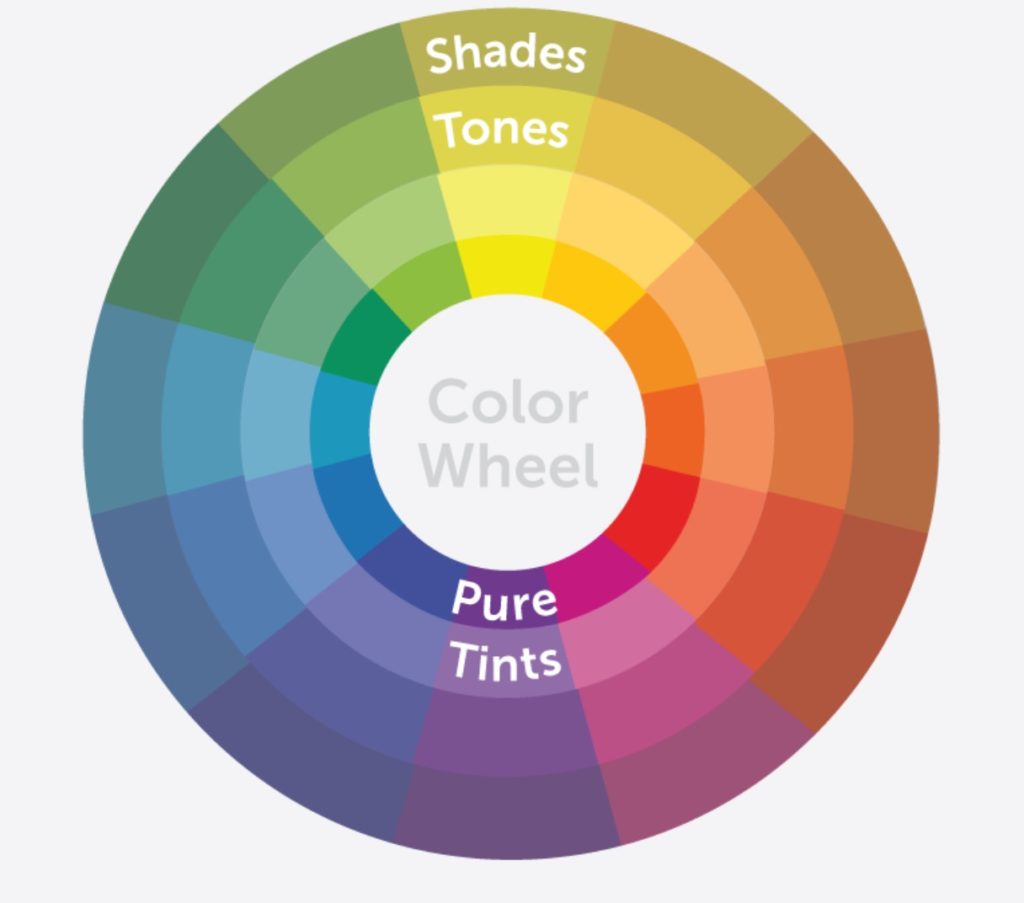
Go deeper: The color wheel is a perfect representation of the relationship between primary, secondary, and tertiary colors. Learn more about how to use it here.
When you use it, you’re relying on the proven principles of color theory to determine the right contrast. But remember: color combinations sometimes have very specific meanings behind them already. For example, red and green are complementary colors but you probably wouldn’t want to choose if your business isn’t some sort of seasonal operation revolving around Christmas.
You also don’t have to choose two opposite colors. This is just a solid rule-of-thumb when it comes to picking colors that generally work well.
Step #3: Choose a color that pops against the other two.
Finally, you need an accent color. This is the color that you’ll use to call attention to important elements on a web page or email (e.g. calls to action). If you want your reader to click on a certain button or text, the accent color is what you should use for it.
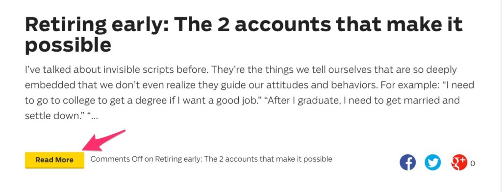
Let’s look at Ramit Sethi’s blog as an example. Yellow is his accent color.

Throughout his website, every call to action is yellow. It pops because the rest of his site is white or black.
Here’s a call to read more of his content:
He asks users to enroll in one of his courses:

If you have a problem or questions, he clues you in to speak to live support:
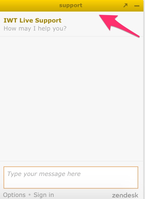
The combination of consistency and pop is a subtle visual cue to encourage people to act.
How do you choose your accent color?
Let’s go back to the wheel. Since you’re using three colors in your scheme, you want to form a triad within the color wheel.
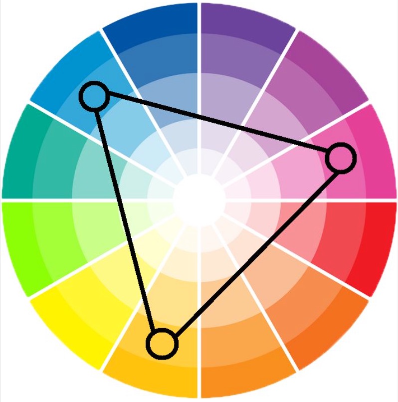
Using three color schemes now, you’re going to want to get close to the opposite complementary color without using it.
Confused? I don’t blame you.
Let’s use blue as your base color for example. Its complementary color would be orange, since that’s what is opposite it on the wheel. However, since you’re using three colors now, you’ll want your complementary color to be something close to it but not exactly it. In this case, you might use purple. Your accent color then might be yellow since it’s the last connect point on the triangle.
What if you want to use more than three colors?
It’s the same principle. Don’t use unrelated colors, BUT be sure to use colors that contrast with each other while appropriate for what your business is.
Tip #6: Consider user experience when selecting a color scheme
Above all, user experience should come first.
The aspect of user experience most affected by color is readability.
Nothing will make a web visitor hit the back button faster than yellow text on a white background (or some other equally distasteful color scheme).

To avoid that, you want to choose colors high in contrast.
White background and black text do the trick (no use messing with the classics unless you have to).
You can experiment more with graphics. Just be sure to check the contrast value on the colors to see if they complement each other.
Tip #7: Color psychology won’t always fit with your business
By now, you may have noticed a ton of factors influence color choices.
Color psychology has had a lot of rigorous academic study behind it. However, the lessons don’t always apply when it comes to business and marketing. After all, strong brand identity should guide your choices more.
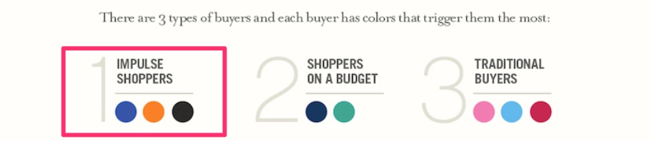
For instance, many studies have shown that both men and women hate orange:
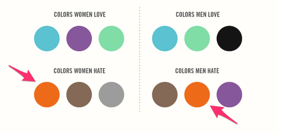
And many other brands have used this color to great success.
Amazon is a prime example. Early in the business’s life, its base color was orange (that’s since changed to a sort of teal with orange as an accent). Orange has also been proven to encourage impulse shopping.
No one color scheme will have people knocking down your door to buy what you’re selling.
However, it’s very helpful as a launching point when considering colors for your ecommerce website. So read up on color psychology. See how it impacts businesses and marketing. But do so with a grain of salt.
Use the colors you love and find appealing.
Then, test them to see what your customers respond to the best. Conduct split tests and make color the only variable. You can’t go wrong there.
Resources for Designing Your Ecommerce Store
Interested in learning more about how color impacts your websites? Or maybe you just want some more tips on your businesses color schemes? Or maybe you just want to look at more pretty colors?
Whatever the case, we have the materials to help you out.
Below are some of the best resources from us and a few websites we like to help you choose the right colors (and build the best website for your ecommerce store):
Resources for Colors
- 10 Trending Website Color Schemes
- How to Choose the Right Color Schemes for Your Ecommerce Shop
- How Colors Affect Conversion Rate
- The Psychology of Color
- Neil Patel: How to Use the Psychology of Color to Increase Website Conversions
- Neil Patel: 12 Essential Tips to Picking a Website Color Scheme
- 3 Popular Colors for Websites – When and How to Use Them
Resources for Web Design
- 13 Website Design Best Practices
- How to Create a Website
- Best Website Builder
- How to Start a Blog that Makes Money (Lessons Learned)
- Best Ecommerce Website Builder
- Best Ecommerce Platforms
- How to Start an Online Store
- How to Design a Homepage that Converts
- A Simple Guide to Website Usability – Best Practices
Conclusion
I’m a big champion of color theory and all things consumer psychology. I know first-hand that it works. I’ve seen the results in my business.
But I’m also big on not remaining confined to theory.
Your brand is unique and so are your consumers. The only way to find out what works for them is to put the theories into practice. See what impact they have and make adjustments from there.
I have no doubt that if you consider all the factors discussed in the article, you’ll find a color scheme that works wonders for your ecommerce business.


from Quick Sprout https://ift.tt/2WdKaFs
via IFTTT