Are you just getting started in web design? We are guessing you have a bit of a creative side to you if you’re traveling down the road of web design, but you may be feeling lost and overwhelmed with where to start.
Don’t worry. You aren’t alone. There are many moving parts to creating a website of your own, and figuring out what they are can leave you feeling confused.
That’s where we come in. This guide will help prepare you to take on your first web design project as a beginner.
While we feel that the design part is the most fun part of building a website, there are necessary steps to take to make sure you create a website that not only looks great but functions well, too.
Read on for our beginner’s guide to website design.
What is Website Design?
Let’s start with the basics here: What is website design? Website design (often referred to as simply ‘web design’) is what you see when you look at a website. It is the design of the site that is displayed.
Web design focuses on user experience and website development instead of software development, which makes the website function.
Someone who is a web designer focuses their attention and work on how the website looks: its layout and the content. This work is important because it determines how well people can interact with your website, how much the appearance makes them want to interact, and even how well your website does in search engines such as Google.
4 Tools to Improve Your Website Design
Designing a website is getting easier and easier thanks to advances in software and tools. A website designer no longer has to spend hour after hour writing long lines of code to get a site to look how they want. While there may still be some coding involved, much of web design is rooted in tools that can give you the designs you’re after with less work and less stress.
Sounds great, right? Here are the top tools that will help you improve your design skills.
1. Wix
If you are looking to take the easiest route in website design, a website builder like Wix will be your key. Whether you are a complete beginner or a pro at building websites, this builder will make your experience much better.
By answering a few questions on Wix, its artificial intelligence builds your custom website for you, which you can then customize.
It starts with “What kind of website do you need?” There, you can enter what kind of blog, online store, portfolio, or other site purpose you’re looking to make, or even choose from popular suggestions.
After that, you can select features you want in your Wix site like live chat, a blog, an online store, events, bookings, and many more.
From here, you can decide whether to let Wix’s ADI take it from there (which will involve answers just a few more simple questions), or you can opt for a more DIY route that allows you to use Wix’s templates to build your site yourself.
We recommend opting for a paid plan with Wix, as the free version does not provide the options you want in building your site, and also does not allow you to have the domain you’d like and instead adds your website name into a Wix domain (yourusername.wix.com/sitename), rather than yourcompanyname.com.
2. Photoshop
The Adobe Suite has no shortage of incredibly helpful tools for web designers, but it can be argued that none is as important as Photoshop.
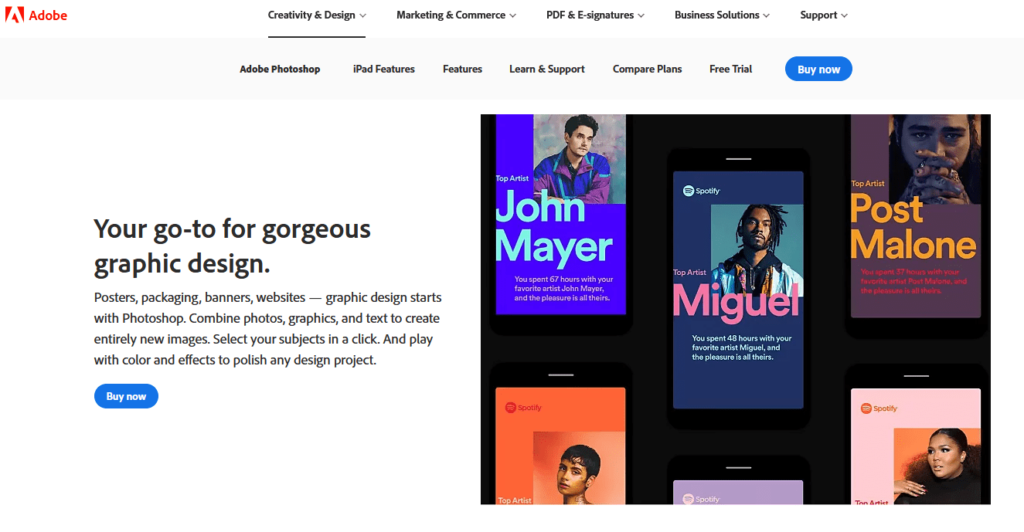
The options feel almost unlimited with this tool because it allows you to create all sorts of prints, patterns, and images for your design project. Photoshop was created for professional photographers and designers, so you can trust that it is the top choice for creating web graphics and images.
By mastering this program, you can create truly authentic designs for your website that you won’t find anywhere else.
3. Flowmapp
As a beginner, you may not know the importance of mapping out your website’s sitemap until it’s too late. Avoid learning this mistake the hard way, and trust us when we say that Flowmapp is a tool that will make building your website much easier for you.
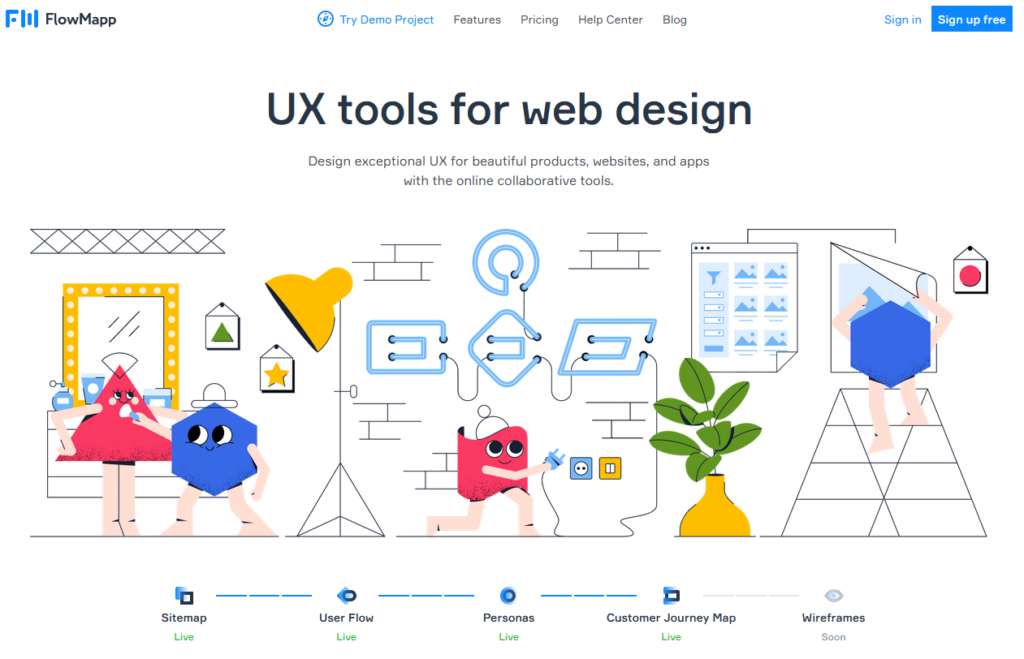
If you’re building a site for a client, Flowmapp allows you to build out the sitemap and share it with your client so they can see the list of pages on the site and how they will be grouped together. And if you’re building a site for yourself, Flowmapp will help you get the flow of your website sorted out so that people who come onto your page can have a nice, smooth experience.
In addition to that, Flowmapp has a tool called User Flow that you use to simulate a user’s journey on your site and, from that, create a conversion strategy that will help you get more out of your site.
4. Sketch
If you are a designer planning to use vector UI designs, Sketch needs to be in your toolbox.
Sketch can be used along with Photoshop or instead of it. Sketch features tools specifically for web design, so it is easy to access the most commonly used tools within Sketch to build your site. In addition to that, Sketch makes it easy to export designs to different formats and makes it easy to preview designs in your browser to see what they will look like to a user.
The only issue people run into with Sketch is that it is only available to Mac users. Thus, if you have a PC, Photoshop will be your go-to. Or you can work from Sketch files and then import the designs to another tool.
The Basics of Website Design
Now that you know some of the tools that can help you build your website, it’s time to get into the basics of website design.
The idea of building a website sounds great, sure. But when it comes time to actually making it, you may be asking yourself, ‘Where do I start?’ This is a common question for those new to web design, so that’s why a guide like this is so useful.
Read on to find the basics you need to understand to get your website started.
#1. Start Simple
There are some beautiful websites out there on the internet that have every detail down to an art. However, chances are good the first iteration of those sites was nowhere near as awe-inspiring.
When looking to build your first website, you may have a dream or a vision of what you want your site to look like, and that’s great—as long as what you have in mind is basic enough for you to create.
Things can get complicated quickly when building a site, and as a beginner, this is not the headache you need. Instead, focus on creating a simple website that allows you to understand the basics of web design, and then you can grow from there for future websites.
Blogs are a great starting point for new web designers as there are plenty of blog templates that make it easy for you to create one without starting from scratch. If blogs aren’t your cup of tea, then consider creating a website that shows off your photography skills or another hobby of yours.
By starting with something simple, you can first master the basics and then add new steps to take your skill level up little by little.
#2. Find Inspiration
As a beginner web designer, chances are good that you have come across some beautiful websites that have inspired you to pursue this journey of design. And it’s a good idea to keep a list of the sites that have brought you inspiration.
Pinterest is another place where inspiration flows like a river, and all sorts of beautiful designs can be found there.
Use this inspiration to get an idea of what you want your site to look like. As mentioned above, aim for more simple inspiration sites initially, and as your skills improve, you can work toward the more complex.
#3. Understand UX (User Experience)
Having a website that looks good is a goal of a web designer, but it is important to remember that having a website that serves your audience well is equally, if not more, important. How a user interacts with and experiences your website is called ‘user experience,’ or UX for short.
The focus of UX is seeing your design through the eyes of a visitor to your website and understanding the experience they have on your page. This includes things such as:
- Font
- Layout
- Images
- Color scheme
- Content
- And more
The user experience is created by all of the above, which means you need to have a good handle on the type of experience you are looking to create, and how you will bring it to life.
#4. Understand UI (User Interface)
While the way the website looks to a user is important, the way the website is arranged and functions are essential, too. This is referred to as ‘user interface,’ or UI.
The goal of UI is to provide a visitor to your website with the tools they need to experience your website as smoothly and easily as possible. This means having buttons that are easy to see and click on and design choices that serve a clear purpose. It means a logical flow of your site. It means high functionality of interactive elements and much more.
By mastering the user interface of your website, you are ensuring that any visitor to your site has as good of an experience as possible, and hopefully one that will bring them back.
#5. Easy Layout
Few things can make someone leave your website faster than a poor layout. If your website feels jumbled and it is unclear how someone can best utilize it, then they will click out of your site. Since that’s not what you want, you need to pick a simple layout that keeps things uncomplicated.
There is no need to get overly complicated with your website layout, especially as a beginner. First, think about what are the important things you want people to see. Why did they come to your site in the first place? Make that clear with your layout.
Also, you want to build your website in grids. Grids are pleasing to the eye and make sense visually, as they create a sense of order on the pages.
Take the Quick Sprout home page, for example.
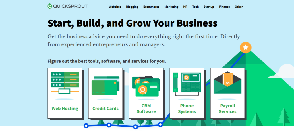
When you arrive at this page, you can see very clearly what your options are. You can see what you’re looking for and click on it to move to the next step. This is a great example of an easy layout that provides a smooth experience for the user.
#6. Pick Solid Color Scheme
While you have every color of the rainbow and then some to choose from with your site, that does not mean you should use them.
You should do the opposite. Before building your website, choose a color scheme that is clean and simple.
For a lot of designers, that means opting for a monochrome theme. This means you choose one color as your base color and then create both darker and lighter versions of this color to create different hues that work together. The monochrome approach to color will always provide you with a very clean and classy look.
Another option is to choose complementary colors. The way to do this is by using a color wheel and picking colors on opposite sides of the wheel. The way that the wheel is designed means that these contrasting colors work well together.
#7. Clear Fonts
You know how frustrating it is to try and decipher someone’s handwriting. You don’t want visitors to your website to suffer through the same thing simply because you didn’t take the time to pick a clear font.
Fonts hold more power on your website than you may imagine. Here’s why.
Fonts determine the tone of your website. If you’re making a site geared toward kids, you want fonts that are fun and loud. However, if you’re making a site geared toward adults and has a more serious subject matter, you’ll want professional and clear fonts.
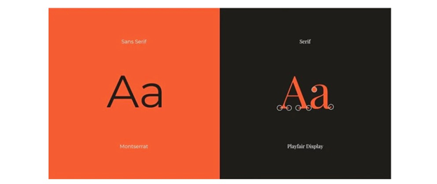
You may have heard the terms ‘serif’ and ‘sans serif,’ so let’s get into what they mean.
Serif fonts have a decorative taper on the letter’s stem, and sans serif fonts do not (hence the use of ‘sans’ in the name). Serif fonts have a more traditional and professional feel, while sans serif fonts have a more modern and sophisticated feel.
Here is a visual example from Canva.
#8. Get Feedback
Once you finish your website, take a moment to congratulate yourself and celebrate! However, before making your site live, make sure you get some feedback from others.
This may be one of the hardest steps of building a website. You have put your heart, soul, and countless hours of work into building this, and opening up your work for criticism can be hard. However, it is necessary.
Look to people whose input you trust and who you think will be best about giving you constructive criticism, and won’t simply tell you it looks great when it doesn’t. To get through this final step of the process, you must accept that any criticism and ideas for changes are not a personal attack but rather input on making the site the great product you want it to be.
3 Tips for Great Website Design
Feeling like you’re almost ready to get started on your first website? Read through these tips and tricks that will make your website design experience a good one before you do. These will help you improve and will have a big impact on the websites you create.
#1. Keep Homepage Minimalistic
The homepage is the first page people will see of your website, and seeing a bunch of clutter may cause them to run for the hills. There is enough clutter in peoples’ lives that you don’t need to add to it with a messy homepage.
Here are some ways to achieve that minimalistic homepage look:
- Without having to scroll, the visitor should know what your website is all about
- Spread out content and include white space
- Include high-quality images
- Insert a call-to-action (CTA), whether that’s signing up for a newsletter or filling out a form to get more information
#2. Include Photos to Break Up Text
Going to a site that is covered in text will overwhelm the visitor. If you have a lot of information you need to present on your website, photos will be your friend. Use images to create space in between text and to make your website look more visually pleasing.
Even if your site doesn’t have a lot of copy on it, include visuals to bring it to life.
#3. Make Your Website Responsive
It seems that more and more people are using phones to access websites, so it is vital that you make your website so that it looks great on phones as well as on computers and tablets. The term for this is ‘mobile responsive.’
Here are some things to keep in mind:
- Design your website for phones first because space on phones is more limited. You can add more elements to the design for computers once you have the mobile one mastered.
- Don’t forget about tablets. People also use tablets to access websites, so be sure your website is compatible with that screen size.
from Quick Sprout https://ift.tt/3dlIH9r
via IFTTT


